AAMutPlot.scale_ranking
- AAMutPlot.scale_ranking(df_impact, top_n=20, ax=None, figsize=(6, 5), color=None)[source]
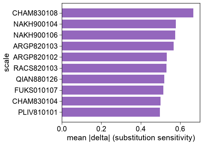
Plot the per-scale ranking of substitution sensitivity.
A horizontal bar chart of the
top_nscales with the largest mean absolute substitution delta, ordered most-sensitive first.- Parameters:
df_impact (pd.DataFrame) – Substitution-impact table produced by
AAMut.run().top_n (int, default=20) – Number of most sensitive scales to show.
ax (Axes, optional) – Pre-defined Axes object to plot on. If
None, a new one is created.figsize (tuple, default=(6, 5)) – Figure dimensions (width, height) in inches (used when
axisNone).color (str, optional) – Bar color. If
None, the TMD color is used.
- Returns:
fig (Figure) – Figure object containing the plot.
ax (Axes) – Axes object of the scale-ranking plot.
Notes
Returned as a
(fig, ax)pair (seeAAMutPlotfor the shared return contract).
Examples
:meth:
AAMutPlot.scale_rankingplots the most substitution-sensitive scales.import matplotlib.pyplot as plt import aaanalysis as aa aa.plot_settings() df_impact = aa.AAMut().run(from_aa=["M", "L", "K"], to_aa=["V", "A", "D"]) aa.AAMutPlot().scale_ranking(df_impact=df_impact, top_n=10) plt.tight_layout() plt.show()
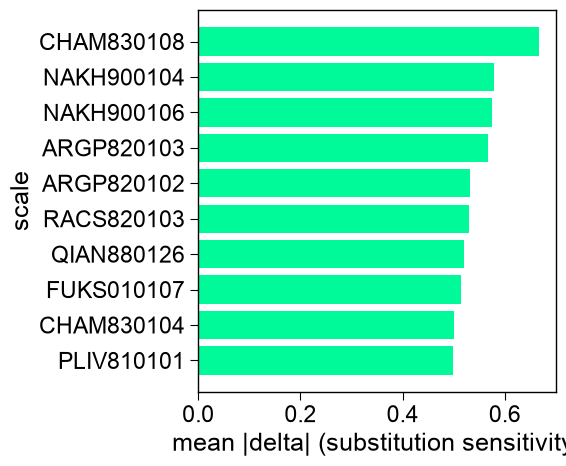
# color sets the bar color (default: TMD color); figsize sets the figure size in inches
aa.plot_settings()
aa.AAMutPlot().scale_ranking(df_impact=df_impact, top_n=10,
                            color="tab:purple", figsize=(7, 5))
plt.tight_layout()
plt.show()