AAclustPlot.centers
- AAclustPlot.centers(X=None, *, labels, df_scales=None, component_x=1, component_y=2, ax=None, figsize=(7, 6), legend=True, dot_size=100, dot_alpha=0.75, palette=None)[source]
Create a Principal Component Analysis (PCA) plot of clustering results with cluster centers highlighted.
Projects
Xinto the chosen PCA components and overlays the computed cluster centers as distinct markers, coloured by cluster label. UseAAclust.comp_centers()to obtain the centers shown here, or pass labels directly fromAAclust.fit().Added in version 0.1.0.
- Parameters:
X (array-like, shape (n_samples, n_features), optional) – Feature matrix with the clustered samples in rows and features in columns, used as-is (no transpose). This is the form for proteins and other per-sample matrices — e.g. a CPP feature matrix, pooled protein embeddings, or structural features, one row per protein. For amino acid scales pass
df_scalesinstead. Provide exactly one ofXordf_scales.labels (array-like, shape (n_samples,)) – Cluster labels (typically
aac.labels_), one per clustered sample — i.e. per row ofXor per column ofdf_scales. IfNone, no grouping is used.df_scales (pd.DataFrame, shape (n_letters, n_scales), optional) – Amino acid scales DataFrame with amino acids in rows and scale IDs in columns, as returned by
load_scales(). It is transposed internally to the feature matrix, so you never call.Tyourself. Provide exactly one ofXordf_scales.component_x (int, default=1) – Index of the PCA component for the x-axis. Must be >= 1.
component_y (int, default=2) – Index of the PCA component for the y-axis. Must be >= 1.
ax (Axes, optional) – Pre-defined Axes object to plot on. If
None, a new Axes object is created.figsize (tuple, default=(7, 6)) – Figure dimensions (width, height) in inches.
legend (bool, default=True) – Whether to show the legend.
dot_size (int, default=100) – Size of the plotted dots.
dot_alpha (float or int, default=0.75) – The transparency alpha value [0-1] of the plotted dots.
palette (list, optional) – Colormap for the labels or list of colors. If
None, a default colormap is used.
- Returns:
fig (Figure) – Figure object containing the PCA plot.
ax (Axes) – PCA plot axes object.
Notes
Returned as a
(fig, ax)pair (seeAAclustPlotfor the shared return contract); the PCA-component DataFrame shown here is stored on the instance asdf_components_.Pass scales via
df_scales(transposed for you) and proteins / embeddings / CPP features viaX(a samples-by-features matrix, used as-is) — never transpose manually.Ensure X and labels are in the same order to avoid mislabeling.
See also
See the tutorial for more information.
See colormaps from matplotlib in
matplotlib.colors.ListedColormap.
Examples
We first create an example dataset for the
AAclustPlot().centers()method, which visualizes cluster ‘centers’ as obtained by theAAclust().comp_centers()method:from sklearn.decomposition import PCA, KernelPCA, FastICA, TruncatedSVD, NMF import matplotlib.pyplot as plt import aaanalysis as aa aa.options["verbose"] = False # Obtain example scale dataset df_scales = aa.load_scales() X = df_scales.T # Fit AAclust model retrieve labels to compute centers aac = aa.AAclust() labels = aac.fit(X, n_clusters=5).labels_
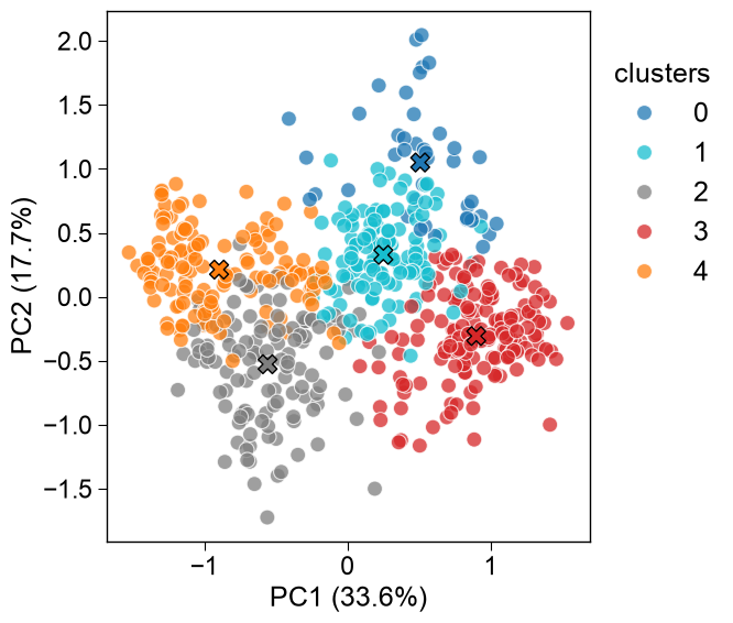
All data points are visualized in the PCA plot including the cluster centers highlighted by an ‘x’. The scales DataFrame can be passed directly via
df_scales(transposed internally), so the manualdf_scales.Tis no longer needed — only the clusterlabelsare supplied:aac_plot = aa.AAclustPlot(model_class=PCA) aa.plot_settings() fig, ax = aac_plot.centers(df_scales=df_scales, labels=labels) plt.show() # DataFrame for respective components are returned df_components = aac_plot.df_components_ aa.display_df(df_components, n_rows=10, show_shape=True)

DataFrame shape: (586, 2)
PC1 (33.6%) PC2 (17.7%) 1 -0.181292 0.579504 2 0.823876 -0.591823 3 0.723627 -0.838029 4 0.860664 -0.746315 5 0.645413 0.481089 6 1.266436 -0.148832 7 -0.753006 0.412799 8 -1.074425 0.348078 9 0.501059 0.261917 10 1.304114 -0.139382 Equivalently, pass a feature matrix directly as
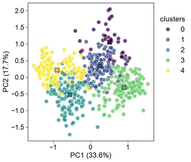
X(samples × features, used as-is — no transpose). This is the form for proteins / embeddings / CPP features (one row per protein). HereXisdf_scalestransposed, so it matches thedf_scalescall above:aac_plot.centers(X, labels=labels) plt.show()

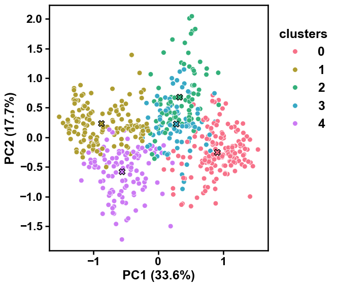
Select other PCs using the
component_xandcomponent_yparameters:aac_plot.centers(X, labels=labels, component_x=3, component_y=4) plt.show()

To compare the feature space compression of different Transformer models in a single plot, you can use the
axandlegendparameters:list_models = [KernelPCA, FastICA, TruncatedSVD, NMF] model_names = ["KernelPCA", "FastICA", "TruncatedSVD", "NMF"] dict_models = dict(zip(model_names, list_models)) fig, axes = plt.subplots(4, 1, figsize=(7, 14)) for i, model_name in enumerate(dict_models): ax = axes[i] aac_plot = aa.AAclustPlot(model_class=dict_models[model_name]) # Set legend only for first subplot aac_plot.centers(X, labels=labels, ax=ax, legend=i==0) plt.tight_layout() plt.show() plt.close()
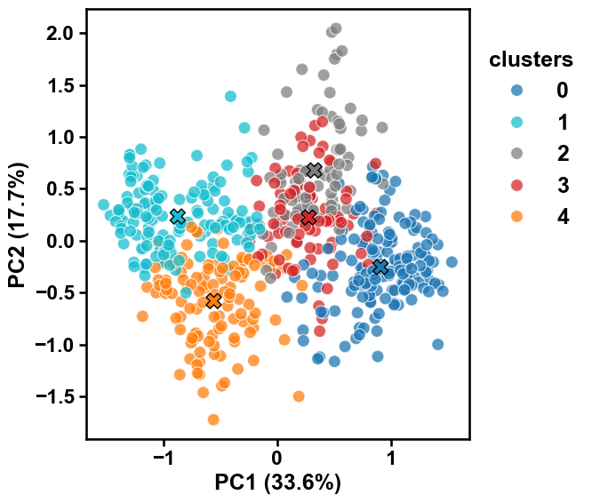
Adjust the style of the scatter plot using the
dot_sizeanddot_alphaarguments to change the size of the dots and their transparency:aac_plot = aa.AAclustPlot(model_class=PCA) aac_plot.centers(X, labels=labels, dot_size=50, dot_alpha=1) plt.show()
The cluster colors can be adjusted by the
paletteargument by providing either a list of colors or a color map:colors = aa.plot_get_clist(n_colors=5) aac_plot.centers(X, labels=labels, palette=colors) plt.show() aac_plot.centers(X, labels=labels, palette="viridis") plt.show()