AAclustPlot.correlation
- AAclustPlot.correlation(df_corr, labels, labels_ref=None, cluster_x=False, method='average', xtick_label_rotation=90, ytick_label_rotation=0, bar_position='left', bar_colors='tab:gray', bar_width_x=0.1, bar_spacing_x=0.1, bar_width_y=0.1, bar_spacing_y=0.1, vmin=-1.0, vmax=1.0, cmap='viridis', kwargs_heatmap=None)[source]
Heatmap for correlation matrix with colored sidebar to label clusters.
Renders the correlation DataFrame produced by
AAclust.comp_correlation()as a seaborn heatmap, annotating rows and columns with coloured sidebars that group samples by their cluster label. Columns can optionally be hierarchically clustered viacluster_x.Added in version 0.1.0.
- Parameters:
df_corr (pd.DataFrame, shape (n_samples, n_clusters)) – DataFrame with correlation matrix. Rows typically correspond to scales and columns to clusters.
labels (array-like, shape (n_samples,)) – Cluster labels determining the grouping and coloring of the side colorbar. It should have the same length as number of rows in
df_corr(n_samples).labels_ref (array-like, shape (n_clusters,), optional) – Cluster labels comprising unique values from ‘labels’. Length must match with ‘n_clusters’ in
df_corr.cluster_x (bool, default=False) – If
True, x-axis (clusters) values are clustered. Disabled for pairwise correlation.method ({'single', 'complete', 'average', 'weighted', 'centroid', 'median', 'ward'}, default='average') – Linkage method from
scipy.cluster.hierarchy.linkage()used for clustering.xtick_label_rotation (int, default=90) – Rotation of x-tick labels (names of clusters).
ytick_label_rotation (int, default=0) – Rotation of y-tick labels (names of samples).
bar_position (str or list of str, default='left') – Position of the colored sidebar (
left,right,top, orbottom). IfNone, no sidebar is added.bar_colors (str or list of str, default='tab:gray') – Either a single color or a list of colors for each unique label in
labels.bar_width_x (float, default=0.1) – Width of the x-axis sidebar, must be >= 0.
bar_spacing_x (float, default=0.1) – Space between the heatmap and the colored x-axis sidebar, must be >= 0.
bar_width_y (float, default=0.1) – Width of the y-axis sidebar, must be >= 0.
bar_spacing_y (float, default=0.1) – Space between the heatmap and the colored y-axis sidebar, must be >= 0.
vmin (float, default=-1.0) – Minimum value of the color scale in
seaborn.heatmap().vmax (float, default=1.0) – Maximum value of the color scale in
seaborn.heatmap().cmap (str, default='viridis') – Colormap to be used for the
seaborn.heatmap().kwargs_heatmap (dict, optional) – Dictionary with keyword arguments for adjusting heatmap (
seaborn.heatmap()).
- Returns:
fig (Figure) – Figure object containing the correlation heatmap.
ax (Axes) – Axes object with the correlation heatmap.
Notes
Returned as a
(fig, ax)pair (seeAAclustPlotfor the shared return contract).Ensure
labelsanddf_corrare in the same order to avoid mislabeling.bar_tick_labels=Truewill remove tick labels and set them as text for optimal spacing so that they can not be adjusted or retrieved afterward (e.g., via ax.get_xticklabels()).
See also
seaborn.heatmap(): Seaborn function for creating heatmaps.
Examples
To showcase the
AAclustPlot().correlation()method, we create an example dataset and obtained a DataFrame with pairwise correlations (df_corr) using theAAclust().correlation()method:import matplotlib.pyplot as plt import aaanalysis as aa aa.options["verbose"] = False # Obtain example scale dataset df_scales = aa.load_scales(unclassified_out=True).T.sample(50).T df_cat = aa.load_scales(name="scales_cat") dict_scale_name = dict(zip(df_cat["scale_id"], df_cat["subcategory"])) names = [dict_scale_name[s] for s in list(df_scales)] X = df_scales.T # Fit AAclust model and retrieve labels, cluster names, and df_corr aac = aa.AAclust() labels = aac.fit(X, n_clusters=8).labels_ print(labels) df_corr, labels_sorted = aac.comp_correlation(X=X, labels=labels)
[1 1 2 5 3 4 1 5 5 4 1 6 3 1 5 2 6 3 0 2 2 2 2 2 1 5 6 7 6 5 0 6 4 3 3 2 1
 1 0 6 0 3 6 4 3 1 0 0 6 0]
The pair-wise Pearson correlation can now be visualized using the
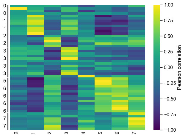
AAclustPlot().correlation()method. Provide the labels sorted as indf_corr.aac_plot = aa.AAclustPlot() aa.plot_settings(font_scale=0.7, weight_bold=False, no_ticks=True) aac_plot.correlation(df_corr=df_corr, labels=labels_sorted) plt.show()

Gray bars indicate the clusters. To change their position or provide multiple bars, use the
bar_positionparameter and adjust their width and spacing by usingbar_width_x,bar_width_y,bar_spacing_x, andbar_spacing_yaac_plot.correlation(df_corr=df_corr, labels=labels_sorted, bar_position=["left", "top"], bar_width_x=1, bar_width_y=0.5, bar_spacing_x=1, bar_spacing_y=0.5) plt.show()

To obtain the correlation between each scale (y-axis) and the medoids (x-axis), we obtain the medoids using the
AAclust().comp_medoids()andAAclust().comp_correlation()methods.X_ref, labels_ref = aac.comp_medoids(X, labels=labels) # Creat correlation DataFrane between scales and medoids df_corr, labels_sorted = aac.comp_correlation(X=X, labels=labels, X_ref=X_ref, labels_ref=labels_ref) # Plot correlation aac_plot.correlation(df_corr=df_corr, labels=labels_sorted) plt.tight_layout() plt.show()
We can re-clustered the x-axis values be setting
cluster_x=True. Thescipy.cluster.hierarchy.linkagemethod is internally used, for which the linkage method can be selected by themethodparameter (default=average):aac_plot.correlation(df_corr=df_corr, labels=labels_sorted, cluster_x=True, method="ward") plt.tight_layout() plt.show()

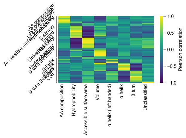
To show the names of scales (y-axis) and cluster (x-axis), provide them to the
AAclust().comp_correlation()method. The cluster labels (labels_ref) must be given to theAAclustPlot().correlation()method. Thextick_label_rotationparameter can be used to rotate the x-ticks:# Creat correlation DataFrane between scales and medoids cluster_names = aac.name_clusters(X, labels=labels, names=names) dict_cluster = dict(zip(labels, cluster_names)) names_ref = [dict_cluster[i] for i in labels_ref] df_corr, labels_sorted = aac.comp_correlation(X=X, labels=labels, X_ref=X_ref, labels_ref=labels_ref, names=names, names_ref=names_ref) # Plot correlation aac_plot.correlation(df_corr=df_corr, labels=labels_sorted, labels_ref=labels_ref, xtick_label_rotation=45) plt.tight_layout() plt.show()

If the columns of
df_corrcontain the cluster labels,labels_refdoes not need to be provided. The clusters can be colored using thebar_colorsparameter.# Plot correlation without cluster names df_corr, labels_sorted = aac.comp_correlation(X=X, labels=labels, X_ref=X_ref, labels_ref=labels_ref) n_clusters = len(set(labels_sorted)) colors = aa.plot_get_clist(n_colors=n_clusters) aac_plot.correlation(df_corr=df_corr, labels=labels_sorted, xtick_label_rotation=0, bar_colors=colors, bar_position=["left", "bottom"], bar_width_x=1, bar_width_y=0.2) plt.tight_layout() plt.show() # Plot correlation with cluster names df_corr, labels_sorted = aac.comp_correlation(X=X, labels=labels, X_ref=X_ref, labels_ref=labels_ref, names=names, names_ref=names_ref) n_clusters = len(set(labels_sorted)) colors = aa.plot_get_clist(n_colors=n_clusters) aac_plot.correlation(df_corr=df_corr, labels=labels_sorted, xtick_label_rotation=45, labels_ref=labels_ref, bar_colors=colors, bar_position=["left", "bottom"], bar_width_x=1, bar_width_y=0.2) plt.tight_layout() plt.show()


While
vmin,vmax, anxcmapcan be directly adjusted, further keyword arguments for thesns.heatmap()function can be provided by thekwargs_heatmapargument:df_corr, labels_sorted = aac.comp_correlation(X=X, labels=labels, X_ref=X_ref, labels_ref=labels_ref, names=names, names_ref=names_ref) # Plot correlation aac_plot.correlation(df_corr=df_corr, labels=labels_sorted, labels_ref=labels_ref, xtick_label_rotation=45, vmin=-0.5, vmax=0.5, cmap="cividis", kwargs_heatmap=dict(linecolor="black")) plt.tight_layout() plt.show()

Further parameters.
AAclustPlot.correlationalso accepts:ytick_label_rotation— Rotation of y-tick labels (names ofsamples).# Further parameters: ytick_label_rotation rotates the y-tick labels (the sample names). # (df_corr above has named string columns, so labels_ref is supplied as in the cells above.) import matplotlib.pyplot as plt aac_plot.correlation(df_corr=df_corr, labels=labels_sorted, labels_ref=labels_ref, ytick_label_rotation=45) plt.tight_layout() plt.show()