dPULearnPlot.pca
- static dPULearnPlot.pca(df_pu, labels=None, figsize=(5, 5), pc_x=1, pc_y=2, show_pos_mean_x=True, show_pos_mean_y=True, colors=None, names=None, df_pu_add=None, names_add=None, colors_add=None, legend=True, legend_y=-0.15, kwargs_scatterplot=None)[source]
Principal component analysis (PCA) plot for set of identified negatives.
This method visualizes the differences between the set of identified negatives (labeled by 0) and the positive (1) and the unlabeled (2) sample groups. The selected principal components (PCs) represent a lower-dimensional feature space. Optionally, the average PC value for the positive samples can be shown, which was used for
PCA-based identificationof negatives.Added in version 0.1.0.
- Parameters:
df_pu (pd.DataFrame, shape (n_samples, pca_features)) – A DataFrame with the PCA-transformed features obtained from
dPULearn.df_pu_.figsize (tuple, default=(5, 5)) – Figure dimensions (width, height) in inches.
labels (array-like, shape (n_samples,)) – Dataset labels of samples in
df_pu. Labels should contain 0 (identified negative) and 1 (positive). Unlabeled samples (2) can also be provided.pc_x (int, default=1) – Index of the principal component (PC) to show at the x-axis.
pc_y (int, default=2) – Index of the principal component (PC) to show at the y-axis.
show_pos_mean_x (bool, default=True) – If
True, the mean of the x-axis PC values across the positive sample group is shown on the plot.show_pos_mean_y (bool, default=True) – If
True, the mean of the y-axis PC values across the positive sample group is shown on the plot.colors (list of str, optional) – List of colors for identified negatives (0), positive samples (1), and unlabeled samples (2).
names (list of str, optional) – List of dataset names for identified negatives, positive samples, and unlabeled samples.
df_pu_add (pd.DataFrame or list of pd.DataFrame, optional) – One or more groups of held-out samples projected into the fitted PC space (the output of
dPULearn.project()), each overlaid as an additional group on top of thedf_pusamples. Each DataFrame must carry the selectedPCivalue columns (same names asdf_pu). IfNone(default), the plot is byte-identical to the three-group figure.names_add (str or list of str, optional) – Name(s) for the projected extra group(s) in
df_pu_add(shown in the legend). Defaults to"Projected"(single group) or"Projected i"(multiple).colors_add (str or list of str, optional) – Color(s) for the projected extra group(s) in
df_pu_add. Defaults to the ground-truth negative color for a single group, or a distinct color list for multiple groups.legend (bool, default=True) – If
True, legend is set under dissimilarity measures.legend_y (float, default=-0.15) – Legend position regarding the plot y-axis applied if
legend=True.kwargs_scatterplot (dict, optional) – Dictionary with keyword arguments for adjusting scatter plot (
matplotlib.pyplot.scatter()).
- Returns:
fig (Figure) – Figure object containing the plot.
ax (Axes) – PCA plot axes object.
Notes
Returned as a
(fig, ax)pair (seedPULearnPlotfor the shared return contract).
See also
dPULearnfor details on the data structure ofdf_pu.matplotlib.pyplot.scatter()for scatter plot arguments.
Examples
To get insights into the identification process by the
dPULearn().fit()method, you can create a Principal Component Analysis (PCA) plot for identified negative, positive, and unlabeled dataset groups. To this end, we load an example dataset and perform aPCA-based identificationof negatives:import matplotlib.pyplot as plt import aaanalysis as aa aa.options["verbose"] = False # Dataset with positive (γ-secretase substrates) # and unlabeled data (proteins with unknown substrate status) df_seq = aa.load_dataset(name="DOM_GSEC_PU") labels = df_seq["label"].to_numpy() n_pos = sum([x == 1 for x in labels]) df_feat = aa.load_features(name="DOM_GSEC") sf = aa.SequenceFeature() df_parts = sf.get_df_parts(df_seq=df_seq) X = sf.feature_matrix(features=df_feat["feature"], df_parts=df_parts) # PCA-based identification of 'n_pos' negatives dpul = aa.dPULearn().fit(X, labels=labels, n_neg=n_pos) df_pu = dpul.df_pu_ labels = dpul.labels_
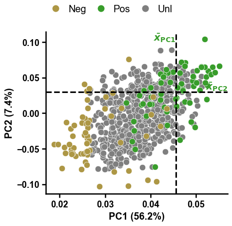
To visualize all identified negatives within the compressed feature space represented by the first two Principal Components (PCs), you can use the
dPULearnPlot().pca()method:dpul_plot = aa.dPULearnPlot() dpul_plot.pca(df_pu=df_pu, labels=labels) plt.tight_layout() plt.show()
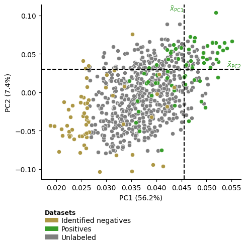
Which can be easily adjusted by our
aa.plot_settings()function:aa.plot_settings(font_scale=0.8) dpul_plot.pca(df_pu=df_pu, labels=labels) plt.tight_layout() plt.show()

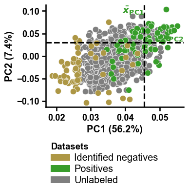
The dashed lines indicate the mean values across the positive samples for the PC1 and PC2, based on which the samples from the unlabeled group with the greatest distance were identified as reliable negatives by dPULearn. This becomes more clear using boolean masks and the
show_pos_mean_xandshow_pos_mean_yparameters:# Filter only positives and negatives selected based on PC1 mask1 = [x in ["PC1", None] for x in df_pu["selection_via"]] mask2 = [x in [0, 1] for x in labels] mask = [m1 and m2 for m1, m2 in zip(mask1, mask2)] dpul_plot.pca(df_pu=df_pu[mask], labels=labels[mask], show_pos_mean_y=False) plt.tight_layout() plt.show() # Filter only positives and negatives selected based on PC1 mask1 = [x in ["PC2", None] for x in df_pu["selection_via"]] mask = [m1 and m2 for m1, m2 in zip(mask1, mask2)] dpul_plot.pca(df_pu=df_pu[mask], labels=labels[mask], show_pos_mean_x=False, legend=False) plt.tight_layout() plt.show()


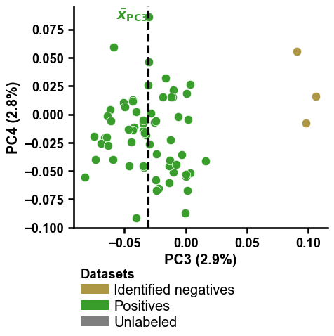
You can change the PCs to be shown on the x- and y-axis by providing integers numbers to the
pc_xandpc_yparameters:mask1 = [x in ["PC3", None] for x in df_pu["selection_via"]] mask2 = [x in [0, 1] for x in labels] mask = [m1 and m2 for m1, m2 in zip(mask1, mask2)] dpul_plot.pca(df_pu=df_pu[mask], labels=labels[mask], pc_x=3, pc_y=4, show_pos_mean_y=False) plt.tight_layout() plt.show() mask1 = [x in ["PC4", None] for x in df_pu["selection_via"]] mask2 = [x in [0, 1] for x in labels] mask = [m1 and m2 for m1, m2 in zip(mask1, mask2)] dpul_plot.pca(df_pu=df_pu[mask], labels=labels[mask], pc_x=3, pc_y=4, show_pos_mean_x=False, legend=False) plt.tight_layout() plt.show()

Adjustment of
colorsandnamesmust be aligned:colors = ["r", "black", "b"] names = ["Red group", "Black group", "Blue group"] dpul_plot.pca(df_pu=df_pu, labels=labels, colors=colors, names=names) plt.tight_layout() plt.show()

The legend can be shifted along the y-axis using
legend_y(default=-0.15), useful if thefigsize(default=(5,5)) is adjusted:dpul_plot.pca(df_pu=df_pu, labels=labels, figsize=(4, 4), legend_y=-0.3) plt.tight_layout() plt.show()
The scatter plot using the
args_scatterparameter, which is a key word argument dictionary passed to the internally called theplt.scatterclass:dpul_plot.pca(df_pu=df_pu, labels=labels, kwargs_scatterplot={"s": 25, "edgecolor": "black"}) plt.tight_layout() plt.show()

To change the legend, just disable it (setting
legend=False) and re-create it using theaa.plot_legend()function:DICT_COLOR = aa.plot_get_cdict() dict_color = {"Neg": DICT_COLOR["SAMPLES_REL_NEG"], "Pos": DICT_COLOR["SAMPLES_POS"], "Unl": DICT_COLOR["SAMPLES_UNL"]} dpul_plot.pca(df_pu=df_pu, labels=labels, legend=False) aa.plot_legend(dict_color=dict_color, y=1.2, handlelength=1, marker="o") plt.tight_layout() plt.show()
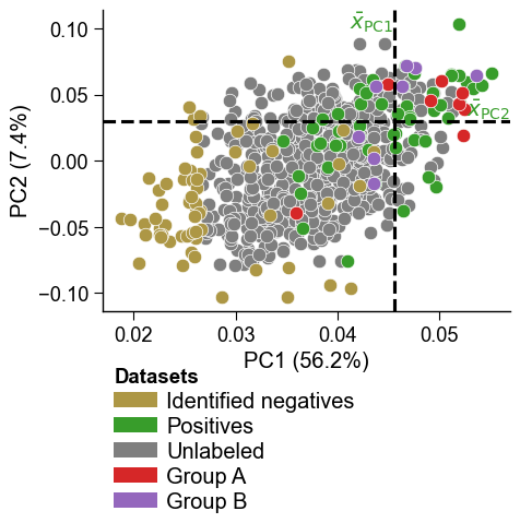
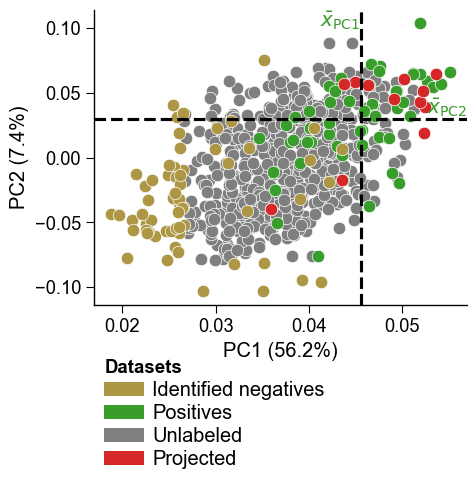
Held-out samples projected into the same PC space with
dPULearn().project()can be overlaid as one or more additional groups usingdf_pu_add(withnames_addandcolors_add). This reproduces a four-group PCA overlay in a single call. Withdf_pu_add=None(default) the plot is unchanged. Here we project some proteins as a demonstration extra group:df_proj = dpul.project(X[:12]) dpul_plot.pca(df_pu=df_pu, labels=labels, df_pu_add=df_proj, names_add="Projected", colors_add="tab:red") plt.tight_layout() plt.show()
Multiple projected groups are supported by passing a list to
df_pu_addwith matchingnames_addandcolors_add:dpul_plot.pca(df_pu=df_pu, labels=labels, df_pu_add=[dpul.project(X[:8]), dpul.project(X[8:16])], names_add=["Group A", "Group B"], colors_add=["tab:red", "tab:purple"]) plt.tight_layout() plt.show()