AAPredPlot
- class AAPredPlot[source]
Bases:
objectPlotting class for
AAPredevaluation and prediction results [Breimann25].The single home for prediction figures, dispatched by
kindfrom three methods:predict_sample()visualizes single-protein positional predictions: the per-residue profile (kind='window') and the domain boundary-sensitivity curve (kind='domain').predict_group()visualizes across-samples predictions: score histograms (kind='hist'), ranked candidates (kind='ranking'), two-predictor scatters (kind='scatter'), survival curves (kind='cutoff'), and explanation-similarity clustermaps (kind='clustermap').eval()visualizes model/feature-set evaluation: metric bars per model (kind='eval') and grouped benchmark comparisons (kind='comparison').
Added in version 1.1.0.
See also
AAPred: the logic class whose results this visualizes.
Methods
eval(df_eval[, kind, ax, figsize, ...])Visualize model / feature-set evaluation, dispatched by
kind.predict_group(data[, kind, ax, figsize, ...])Visualize across-samples predictions, dispatched by
kind.predict_sample([data, kind, ax, figsize, ...])Visualize single-protein positional predictions as a multi-track sequence viewer.
- __init__()[source]
See also
AAPred: the logic class whose results this visualizes.
Examples
The
AAPredPlotclass visualizesAAPredresults. We first build the feature matrix and an evaluation table:The big picture — three methods, by what you look at.
AAPredPlotvisualizesAAPredresults:``predict_sample`` — a local view of one protein: a multi-track sequence viewer (prediction profile + CPP importance + subcategory profiles + your annotation tracks + the sequence). Kinds:
window,domain.``predict_group`` — a global view across many proteins: the distribution and ranking of per-protein scores. Kinds:
hist,ranking,scatter,cutoff,clustermap.``eval`` — model / feature-set evaluation: metric bars per model, or grouped benchmark comparisons. Kinds:
eval,comparison.
local vs. global (
predict_samplevs.predict_group) mirrors per-sample SHAP vs. dataset-wide importance.import aaanalysis as aa aa.options["verbose"] = False # Disable verbosity # DOM_GSEC example dataset + its feature set (see [Breimann25]_) df_seq = aa.load_dataset(name="DOM_GSEC") labels = df_seq["label"].to_list() df_feat = aa.load_features(name="DOM_GSEC").head(20) # Build the CPP feature matrix sf = aa.SequenceFeature() df_parts = sf.get_df_parts(df_seq=df_seq) X = sf.feature_matrix(features=df_feat["feature"], df_parts=df_parts) aapred = aa.AAPred(random_state=42) df_eval = aapred.eval(X, labels)
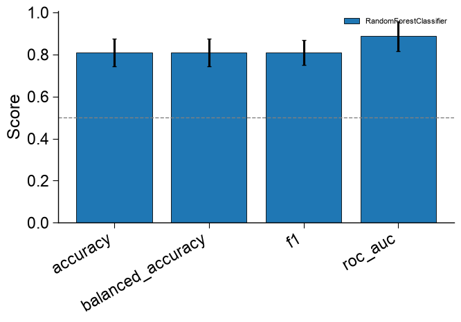
The evaluation table is shown as a grouped bar plot:
import matplotlib.pyplot as plt
aa.plot_settings()
aapred_plot = aa.AAPredPlot()
aapred_plot.eval(df_eval, baseline=0.5)
plt.tight_layout()
plt.show()