AAPredPlot.predict_sample
- static AAPredPlot.predict_sample(data=None, kind='window', ax=None, figsize=None, entry=None, list_annotations=None, threshold=None, color=None, xlabel=None, ylabel=None, df_seq=None, df_scales=None, df_cat=None, subcats=None, df_feat=None, highlight=None, zoom=False)[source]
Visualize single-protein positional predictions as a multi-track sequence viewer.
One entry point for the three positional figures;
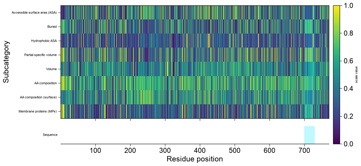
kindselects the base renderer. For'window'/'domain'datais the prediction frame fromAAPred.predict(); the base profile is stacked, top to bottom, with optional extra tracks that all share the residue-position x-axis: a CPP-importance profile (df_feat), one subcategory scale profile per entry insubcats, the user annotation tracks (list_annotations), and a sequence row at the bottom. Any track whose inputs are not provided is simply omitted.'window'— per-residue profile fromAAPred.predict()(level='window');datais thedf_windowframe (columnsentry,position,score). The x-axis is the residue position, so every extra track aligns residue-by-residue.'domain'— boundary-sensitivity curve fromAAPred.predict()(level='domain');datais thedf_domainframe (columnsentry,offset,score,is_best). The x-axis is the boundary offset; the residue-anchored tracks (subcategory, sequence) map each offset to residuetmd_start + offsetand therefore needdf_seqwith atmd_startcolumn.'sequence'— a CPP-feature-map-style heatmap over the complete protein sequence; rows are subcategories (subcats, or every subcategory indf_catcapped at 25 whensubcats=None), columns are the residue positions1..len(sequence), and each cell is that subcategory’s mean scale value at that residue (the same per-residue subcategory profile the line tracks use, stacked into a matrix). It needs onlydf_seq(plusdf_scales/df_cat, default-loaded when omitted);datais optional and, when given as adf_windowframe, is drawn as a thin prediction track above the heatmap. The sequence row is drawn below the heatmap andhighlight/zoombehave exactly as for the other kinds (cyan spans over the residue columns; zoom reveals the letters).
Added in version 1.1.0.
- Parameters:
data (pd.DataFrame, optional) – Prediction frame for the selected
kind: thedf_window('window') ordf_domain('domain') output ofAAPred.predict(). Required for those two kinds; optional forkind='sequence'(which only needsdf_seq), where adf_windowframe is drawn as a thin prediction track above the heatmap.kind (str, default="window") – Which positional figure to draw; one of
window,domain,sequence.ax (matplotlib.axes.Axes, optional) – Axes to draw on. If
None, a new figure and axes are created. When given, only the base profile is drawn (the stacked extra tracks need their own figure).figsize (tuple, optional) – Figure size when
axisNone. IfNone, a per-kind default is used; the figure grows in height for each extra track.entry (str, optional) – Protein to plot; required only when
dataholds more than oneentry.list_annotations (list of dict, optional) – Per-position annotation tracks; each dict has
values(aligned to the plotted positions),label(str), an optionalcolor(numeric line tracks) and optionalcmap(non-numeric/categorical tracks drawn as animshowstrip).threshold (int or float, optional) – (
kind='window') Score drawn as a horizontal dashed decision line.color (str, optional) – Base line color; defaults to a house color.
xlabel (str, optional) – x-axis label; defaults to a per-kind label.
ylabel (str, optional) – y-axis label; defaults to a per-kind label.
df_seq (pd.DataFrame, optional) – DataFrame containing an
entrycolumn of unique protein identifiers and asequencecolumn (and, forkind='domain',tmd_start), used to draw the subcategory profiles and the sequence row. Required for those tracks and required forkind='sequence'(it supplies the residue sequence spanned by the heatmap).df_scales (pd.DataFrame, optional) – Amino-acid scale matrix (letters x scales) for the subcategory profiles / heatmap cells. Defaults to the bundled
load_scales()when this isNoneand it is needed (i.e.subcatsis given, or always forkind='sequence').df_cat (pd.DataFrame, optional) – Scale classification (
scale_id/subcategory) mapping each subcategory to its scales. Defaults to the bundledload_scales(name='scales_cat')when this isNoneand it is needed (subcatsgiven, or always forkind='sequence').subcats (list of str, optional) – Subcategory names; one scale-profile line track is added per name (needs
df_seq). Forkind='sequence'these become the heatmap rows;Noneuses every subcategory indf_cat(capped at 25, with a verbose note when capped).df_feat (pd.DataFrame, optional) – CPP feature frame (with a
positionscolumn and afeat_importanceorabs_auccolumn) mapped onto positions to draw the CPP-importance track.highlight (tuple or list of tuple, optional) – One or more
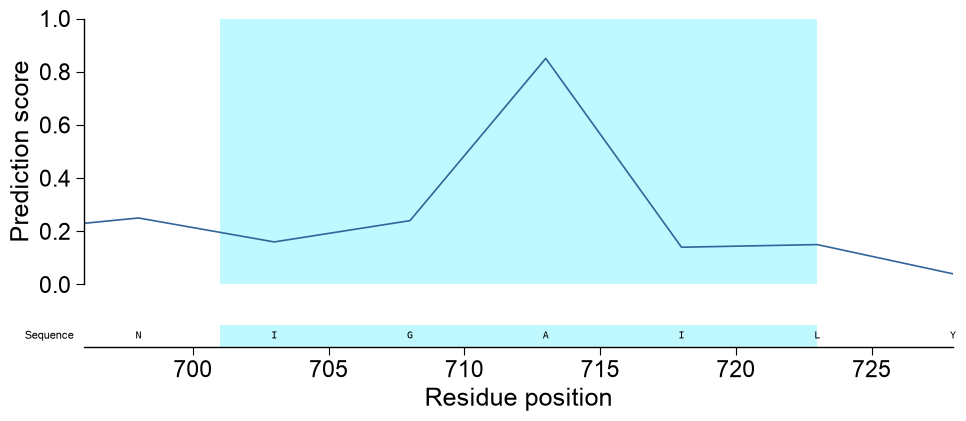
(start, stop)regions (1-based, inclusive) shaded as a bright-cyan vertical span across every track (base, importance, subcategory, annotation and sequence rows), so single or multiple parts are marked consistently down the whole stack. The bounds are given in the plot’s x-axis units: residue positions forkind='window'and boundary offsets forkind='domain'. Eachstart/stopmust be an integer withstart <= stop.zoom (bool, default=False) – If
Trueandhighlightis given, restrict the shared x-axis to the highlighted region(s) (from the minimumstartto the maximumstop, padded by a few residues and clamped to the data range). Because the visible window then shortens, the sequence row renders per-residue letters for the zoomed span. Applies to both kinds; a no-op whenhighlightisNone.
- Returns:
fig (matplotlib.figure.Figure) – The figure.
ax (matplotlib.axes.Axes) – The base-profile axes (the top track).
See also
AAPred.predict()for the predictions this visualizes.AAPredPlot.predict_group()for across-samples figures.AAPredPlot.eval()for evaluation figures.CPPStructurePlot.plot_linked()/CPPStructurePlot.map_structure(): pass the samehighlight(start, stop)regions to mirror the cyan selection shaded here on the 3D protein structure (sharedCOLOR_LINK_HIGHLIGHT).
Examples
AAPredPlot().predict_sample(data, kind=...)is a multi-track sequence viewer for single-protein positional predictions: the per-residue profile (kind='window') and the domain boundary-sensitivity curve (kind='domain').kindselects the base renderer anddatais the matching :meth:AAPred.predictframe; the base profile is stacked with optional extra tracks that share the residue-position x-axis (a CPP-importance profile, subcategory scale profiles, user annotation tracks, and a sequence row). We first fit anAAPredand generate the predictions to visualize (see [Breimann25]):``predict_sample`` = the local (single-protein) view. One stacked, residue-aligned figure; add only the tracks you need (any omitted input is simply skipped):
base — the prediction:
kind='window'(per-residue profile) or'domain'(boundary curve).CPP importance (
df_feat), subcategory profiles (subcats+ scales), annotation tracks (list_annotations— topology, pLDDT, flexibility, …), and the sequence row.
Contrast with
predict_group(many proteins at once) andeval(model comparison).import numpy as np import pandas as pd import matplotlib.pyplot as plt import aaanalysis as aa aa.options["verbose"] = False # Disable verbosity aa.plot_settings() # DOM_GSEC example dataset, its feature set, and the AAontology scales (see [Breimann25]_) df_seq = aa.load_dataset(name="DOM_GSEC") labels = df_seq["label"].to_list() df_feat = aa.load_features(name="DOM_GSEC").head(20) df_scales = aa.load_scales() # amino-acid scale matrix (letters x scales) df_cat = aa.load_scales(name="scales_cat") # scale classification (scale_id -> subcategory) sf = aa.SequenceFeature() X = sf.feature_matrix(features=df_feat, df_parts=sf.get_df_parts(df_seq=df_seq)) aapred = aa.AAPred(df_feat=df_feat, random_state=42).fit(X, labels) aapred_plot = aa.AAPredPlot() # Per-residue and per-domain predictions for one protein (APP, P05067) one = df_seq[df_seq["entry"] == "P05067"] df_window = aapred.predict(one[["entry", "sequence"]], level="window", tmd_len=15, step=5) df_window_view = aapred.predict(one[["entry", "sequence"]], level="window", tmd_len=15, step=40) df_domain = aapred.predict(one, level="domain", window=5)
Per-residue profile.
kind='window'draws the profile with an optional decisionthreshold, annotation tracks (list_annotations), a linecolorand axis labels;entryselects the protein whendataholds several. Numeric annotation tracks render as line profiles:n_pos = len(df_window) list_annotations = [{"values": np.linspace(0, 1, n_pos), "label": "pLDDT", "color": "tab:orange"}] aapred_plot.predict_sample(data=df_window, kind="window", entry="P05067", threshold=0.5, list_annotations=list_annotations, color="tab:green", figsize=(10, 4.5), xlabel="Residue position", ylabel="Prediction score") plt.tight_layout() plt.show()
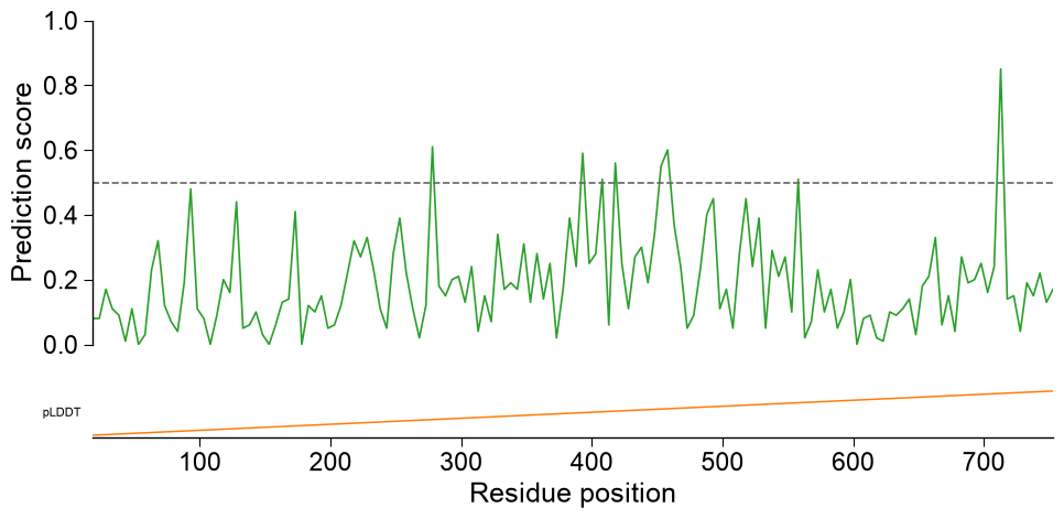
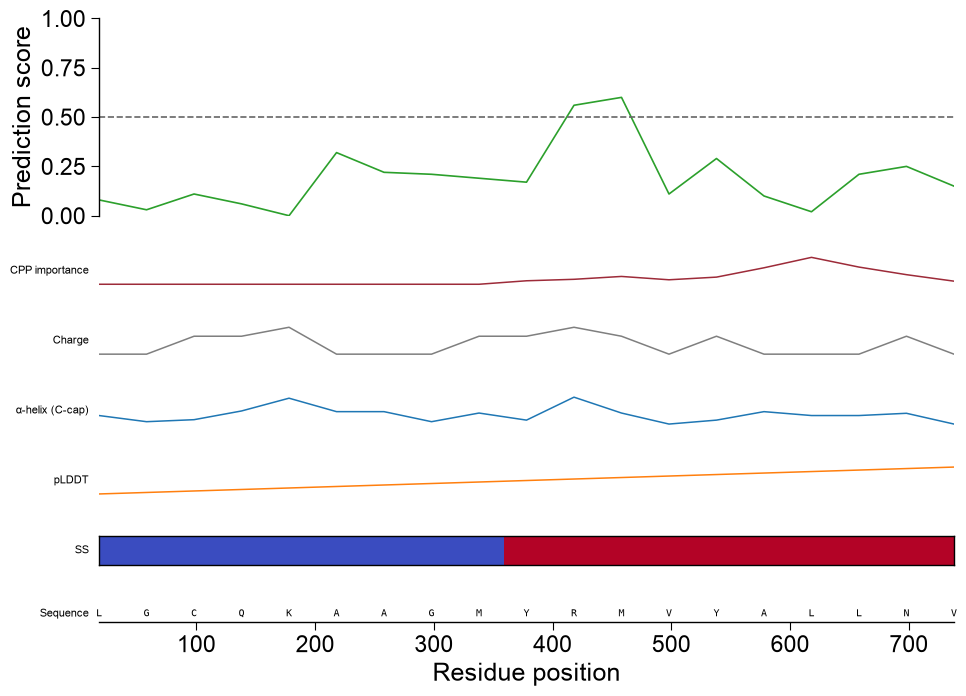
Multi-track sequence viewer. Pass
df_featto add a CPP-importance track,subcats(withdf_seq,df_scalesanddf_cat) to add one subcategory scale-profile track per name, anddf_seqto draw the sequence row at the bottom (letters shown for short regions). Non-numericlist_annotationsvalues fall back to a categoricalimshowstrip:subcats = list(pd.unique(df_feat["subcategory"]))[:2] n_view = len(df_window_view) tracks = [{"values": np.linspace(0, 1, n_view), "label": "pLDDT", "color": "tab:orange"}, {"values": ["H"] * (n_view // 2) + ["E"] * (n_view - n_view // 2), "label": "SS", "cmap": "coolwarm"}] aapred_plot.predict_sample(data=df_window_view, kind="window", entry="P05067", threshold=0.5, df_seq=one, df_scales=df_scales, df_cat=df_cat, subcats=subcats, df_feat=df_feat, list_annotations=tracks, color="tab:green") plt.tight_layout() plt.show()
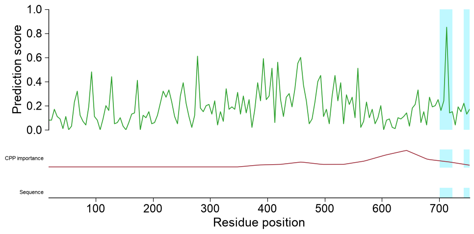
Highlight regions and zoom. Pass
highlightone(start, stop)tuple, or a list of them (1-based, inclusive residue positions), to shade those regions as a bright-cyan span across every track, so single or multiple parts are marked consistently down the whole stack. Setzoom=Trueto restrict the shared x-axis to the highlighted region(s); because the visible window shrinks, the sequence row then renders per-residue letters:# TMD boundaries of APP (P05067) frame the regions of interest tmd_start, tmd_stop = int(one["tmd_start"].iloc[0]), int(one["tmd_stop"].iloc[0]) # (a) mark two regions (the TMD and a downstream stretch) across every track aapred_plot.predict_sample(data=df_window, kind="window", entry="P05067", df_seq=one, df_feat=df_feat, color="tab:green", highlight=[(tmd_start, tmd_stop), (tmd_stop + 20, tmd_stop + 45)]) plt.tight_layout() plt.show() # (b) zoom into the TMD so the per-residue sequence letters become readable aapred_plot.predict_sample(data=df_window, kind="window", entry="P05067", df_seq=one, highlight=(tmd_start, tmd_stop), zoom=True) plt.tight_layout() plt.show()
Boundary sensitivity.
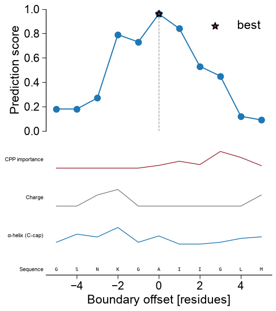
kind='domain'shows how the score depends on the exact domain boundary; the best offset is starred. The same extra tracks apply, with each offset mapped to residuetmd_start + offset:aapred_plot.predict_sample(data=df_domain, kind="domain", entry="P05067", color="tab:blue", df_seq=one, df_scales=df_scales, df_cat=df_cat, subcats=subcats, df_feat=df_feat, figsize=(6, 4.5), xlabel="Boundary offset [residues]", ylabel="Prediction score") plt.tight_layout() plt.show()
``kind=’sequence’`` renders a CPP-feature-map-style heatmap over the whole protein: rows are subcategories, columns are residue positions, and each cell is that subcategory’s mean scale value at the residue. Pass
subcatsto choose the rows (orsubcats=Nonefor all, capped):from aaanalysis.data_handling import load_scales df_cat = load_scales(name="scales_cat") subcats = list(dict.fromkeys(df_cat["subcategory"]))[:8] aa.AAPredPlot().predict_sample(kind="sequence", df_seq=df_seq.head(1), subcats=subcats, highlight=(700, 730)) plt.tight_layout() plt.show()