AAPredPlot.predict_group
- static AAPredPlot.predict_group(data, kind='hist', ax=None, figsize=None, labels=None, bins=20, thresholds=None, band=False, dict_color=None, col_name='name', col_score='score', col_group=None, col_std=None, group_order=None, colors=None, cutoffs=(50, 80), top_n=None, ascending=False, title=None, scores_y=None, marker_size=30, diagonal=True, n_steps=101, names=None, cmap='GnBu', cbar_label='Pearson correlation (r)', xlabel=None, ylabel=None)[source]
Visualize across-samples predictions, dispatched by
kind.One entry point for every group figure;
kindselects the renderer anddatais its primary input:'hist'— histogram of per-sample scores;datais thescoresarray. By default class-separated bylabels; withband=Truethe bars are instead colored by the confidence band they fall into (delimited bythresholds), for scoring unlabeled samples. Useslabels,bins,thresholds,band,dict_color,colors,cmap,xlabel,ylabel.'ranking'— ranked-candidate horizontal bars;datais a per-sampledf_pred. Usescol_name,col_score,col_group,col_std,colors,cutoffs,top_n,ascending,xlabel,title.'rank_scatter'— per-protein rank scatter: proteins ranked by their maximum score (x-axis = rank, y-axis = score) and colored by group, the standard sanity check for a deployed per-protein predictor;datais a per-proteindf_rank. Usescol_score,col_group(required here),group_order,dict_color,thresholds(drawn as horizontal score lines),marker_size,xlabel,ylabel.'scatter'— two-predictor agreement scatter;dataisscores_xand the requiredscores_ythe y-axis. Useslabels,dict_color,marker_size,diagonal,xlabel,ylabel.'cutoff'— survival curve of the scores;datais thescoresarray. Usesn_steps,thresholds,xlabel,ylabel.'clustermap'— explanation-similarity clustermap;datais the per-sample importance matrix. Usesnames,labels,colors,cmap,cbar_label,title,figsize(axis ignored: the clustermap owns its figure).
Added in version 1.1.0.
- Parameters:
data (pd.DataFrame or array-like) – Primary input for the selected
kind(see above): a per-sample score array ('hist'/'scatter'/'cutoff'), a per-sample ranking frame ('ranking'), a per-protein ranking frame ('rank_scatter'), or an importance matrix ('clustermap').kind (str, default="hist") – Which group figure to draw; one of
hist,ranking,rank_scatter,scatter,cutoff,clustermap.ax (matplotlib.axes.Axes, optional) – Axes to draw on. If
None, a new figure and axes are created (ignored forkind='clustermap', which always creates its own figure).figsize (tuple, optional) – Figure size when
axisNone. IfNone, a per-kind default is used.labels (array-like, optional) – (
kind='hist'/'scatter'/'clustermap') Per-sample class labels used to color/separate the data (adds a class legend / sidebars).bins (int, default=20) – (
kind='hist') Number of histogram bins.thresholds (int, float, or list, optional) – (
kind='hist'/'cutoff') One or more score values drawn as vertical dashed lines; withkind='hist'andband=Truethey also delimit the confidence bands. (kind='rank_scatter') Drawn as horizontal dashed lines on the score axis.band (bool, default=False) –
(
kind='hist') IfTrue, color each histogram bar by the confidence band it falls into (bands delimited bythresholds) instead of splitting bylabels. Requiresthresholdsand is mutually exclusive withlabels.Added in version 1.1.0.
dict_color (dict, optional) – (
kind='hist'/'scatter') Mappinglabel -> color; defaults to the locked positive/negative sample palette. (kind='rank_scatter') Mappinggroup -> color; canonical group names (substrate,non-substrate,hold-out) default to the locked sample palette, with a fallback palette for other groups.col_name (str, default="name") – (
kind='ranking') Column with the per-item labels shown as y-tick labels.col_score (str, default="score") – (
kind='ranking') Column with the numeric prediction score used to rank the bars. (kind='rank_scatter') Column with the per-protein max score ranked on the y-axis.col_group (str, optional) – (
kind='ranking') Column whose distinct values color the bars (adds a class legend). (kind='rank_scatter') Column with the per-protein group label used for coloring (required for this kind).col_std (str, optional) – (
kind='ranking') Column with per-item standard deviations, drawn as error bars.group_order (list of str, optional) – (
kind='rank_scatter') Order in which groups are colored, drawn, and legended; defaults to first-appearance order indata.colors (dict or list, optional) – (
kind='ranking'/'clustermap') Agroup/label -> colormapping; defaults to the house categorical palette. (kind='hist'withband=True) A list of one color per band (low to high score); defaults to a sampling ofcmap.cutoffs (tuple, optional) – (
kind='ranking') x-positions of dashed confidence cut-off lines.top_n (int, optional) – (
kind='ranking') If given, keep only the toptop_nranked items.ascending (bool, default=False) – (
kind='ranking') Sort order;Falseranks the highest score first (on top).title (str, optional) – (
kind='ranking'/'clustermap') Axes/figure title.scores_y (array-like, optional) – (
kind='scatter', required there) Per-sample scores of the second predictor (y-axis).marker_size (int or float, default=30) – (
kind='scatter'/'rank_scatter') Scatter marker size.diagonal (bool, default=True) – (
kind='scatter') IfTrue, draw they = xagreement line.n_steps (int, default=101) – (
kind='cutoff') Number of evenly spaced cutoffs between the min and max score.names (list of str, optional) – (
kind='clustermap') Per-sample tick labels; defaults to positional indices.cmap (str, default="GnBu") – (
kind='clustermap') Colormap for the correlation heatmap. (kind='hist'withband=Trueand nocolors) Colormap sampled for the per-band colors.cbar_label (str, default="Pearson correlation (r)") – (
kind='clustermap') Label of the colorbar.xlabel (str, optional) – x-axis label; defaults to a per-kind label.
ylabel (str, optional) – y-axis label; defaults to a per-kind label.
- Returns:
fig (matplotlib.figure.Figure) – The figure.
ax (matplotlib.axes.Axes) – The axes with the requested plot.
See also
AAPred.predict()for the predictions this visualizes.AAPredPlot.predict_sample()for single-protein positional figures.AAPredPlot.eval()for evaluation figures.
Examples
AAPredPlot().predict_group(data, kind=...)is the single entry point for across-samples prediction figures:kindselects the renderer anddatais its input. We first fit anAAPredand score the whole group to visualize (see [Breimann25]):``predict_group`` = the global (across-proteins) view of per-protein prediction scores. Pick the
kind:'hist'— score distribution, class-separated (labels) or confidence-banded (band=True).'ranking'— ranked candidates (horizontal bars).'rank_scatter'— per-protein rank scatter (max score vs rank, colored by group).'scatter'— two-predictor agreement.'cutoff'— survival curve over a score threshold.'clustermap'— samples clustered by explanation similarity.
Contrast with
predict_sample(one protein along its sequence) andeval(model comparison).import numpy as np import pandas as pd import matplotlib.pyplot as plt import aaanalysis as aa aa.options["verbose"] = False # Disable verbosity aa.plot_settings() # DOM_GSEC example dataset + its feature set (see [Breimann25]_) df_seq = aa.load_dataset(name="DOM_GSEC") labels = df_seq["label"].to_list() df_feat = aa.load_features(name="DOM_GSEC").head(20) sf = aa.SequenceFeature() X = sf.feature_matrix(features=df_feat, df_parts=sf.get_df_parts(df_seq=df_seq)) aapred = aa.AAPred(df_feat=df_feat, random_state=42).fit(X, labels) aapred_plot = aa.AAPredPlot() # Per-protein scores for the group plots scores = aapred.predict(df_seq, level="sequence")["score"].to_numpy()
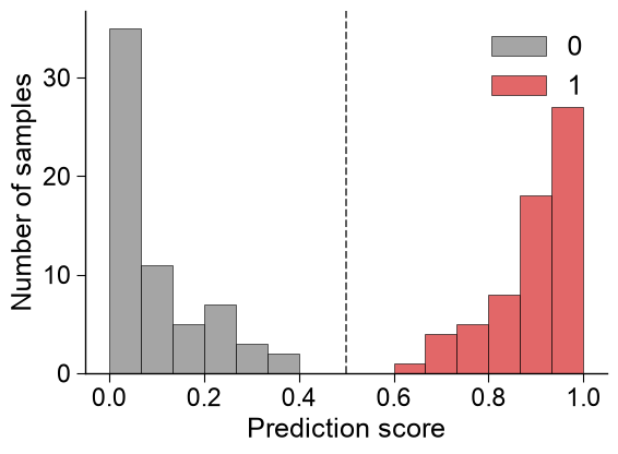
Score histogram.
kind='hist'separates the score distribution by class (labels), withbins, decisionthresholdsand a per-classdict_color:aapred_plot.predict_group(data=scores, kind="hist", labels=labels, bins=15, thresholds=[0.5], dict_color={1: "tab:red", 0: "tab:gray"}, figsize=(6, 4.5), xlabel="Prediction score", ylabel="Number of samples") plt.tight_layout() plt.show()
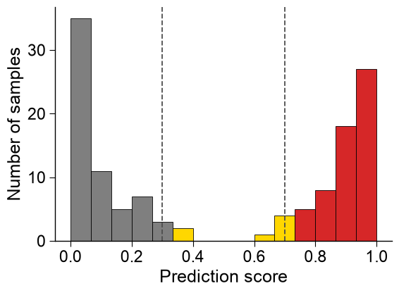
Confidence-banded histogram. When scoring unlabeled candidates there is no class to separate by, so
band=Trueinstead colors each bar by the confidence band it falls into (delimited bythresholds). Band colors are sampled fromcmapunless an explicitcolorslist (one per band, low to high score) is given:# Same scores, colored by confidence band (no labels): low / medium / high, split at 0.3 and 0.7. aapred_plot.predict_group(data=scores, kind="hist", band=True, thresholds=[0.3, 0.7], bins=15, colors=["tab:gray", "gold", "tab:red"], figsize=(6, 4.5), xlabel="Prediction score", ylabel="Number of samples") plt.tight_layout() plt.show()
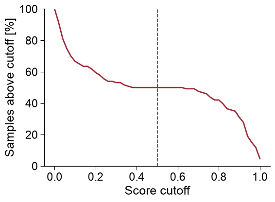
Survival curve.
kind='cutoff'shows the percentage of samples scoring at or above each cutoff (n_stepscontrols the resolution):aapred_plot.predict_group(data=scores, kind="cutoff", n_steps=51, thresholds=[0.5], figsize=(6, 4.5), xlabel="Score cutoff", ylabel="Samples above cutoff [%]") plt.tight_layout() plt.show()
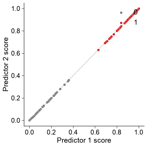
Two-predictor agreement.
kind='scatter'compares two predictors per sample;datais the x-axis and the requiredscores_yis the y-axis, with they = xdiagonal,marker_sizeanddict_color:scores_y = aapred.predict(df_seq, level="sequence", list_parts=["tmd", "jmd_n_tmd_n", "tmd_c_jmd_c"])["score"].to_numpy() aapred_plot.predict_group(data=scores, kind="scatter", scores_y=scores_y, labels=labels, dict_color={1: "tab:red", 0: "tab:gray"}, marker_size=40, diagonal=True, xlabel="Predictor 1 score", ylabel="Predictor 2 score") plt.tight_layout() plt.show()
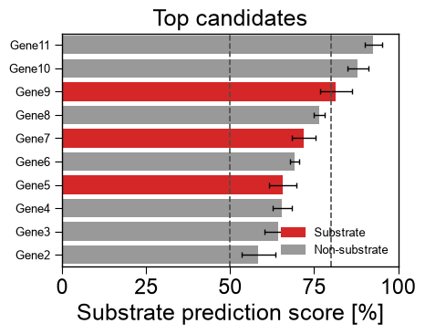
Ranked candidates.
kind='ranking'ranks samples as horizontal bars colored by class, reading columns by name (col_name,col_score,col_group,col_std) withcolors, confidencecutoffs,top_nandascendingorder:rng = np.random.RandomState(0) df_rank = pd.DataFrame({ "name": [f"Gene{i}" for i in range(12)], "score": np.sort(rng.uniform(30, 95, 12)), "group": rng.choice(["Substrate", "Non-substrate"], 12), "std": rng.uniform(1, 5, 12), }) aapred_plot.predict_group(data=df_rank, kind="ranking", col_name="name", col_score="score", col_group="group", col_std="std", colors={"Substrate": "tab:red", "Non-substrate": "0.6"}, cutoffs=(50, 80), top_n=10, ascending=False, figsize=(5, 4), xlabel="Substrate prediction score [%]", title="Top candidates") plt.tight_layout() plt.show()
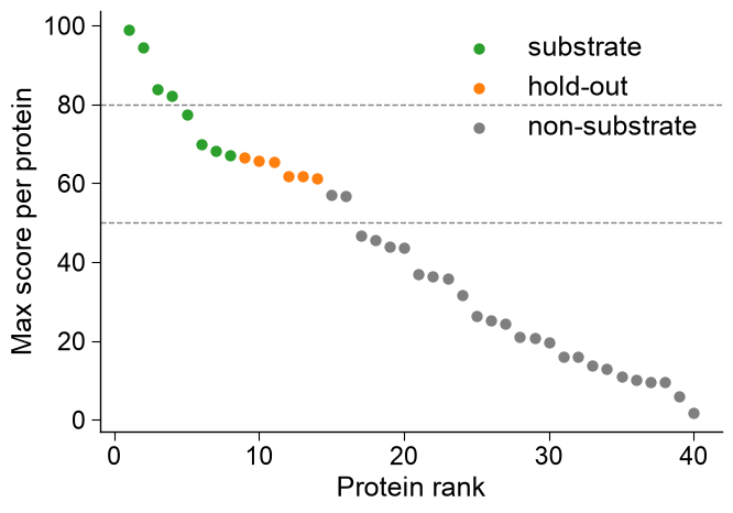
Per-protein rank scatter.
kind='rank_scatter'is the standard sanity check for a deployed per-protein predictor: proteins are ranked by their maximumcol_score(x-axis = rank, y-axis = score) and colored bycol_group.group_orderfixes the color/legend order,dict_coloroverrides the canonical group colors (substrate/non-substrate/hold-outdefault to the locked sample palette),thresholdsdraws horizontal cut-off lines, andmarker_sizesizes the points. This is the population view; contrastkind='ranking'above, which draws one horizontal bar per candidate.# Per-protein max score + group -> the deployed-predictor rank scatter (a different figure # than kind="ranking": one point per protein, ranked, not one bar per candidate). df_prot = pd.DataFrame({ "score": np.sort(rng.uniform(0, 100, 40))[::-1], "group": ["substrate"] * 8 + ["hold-out"] * 6 + ["non-substrate"] * 26, }) aapred_plot.predict_group(data=df_prot, kind="rank_scatter", col_score="score", col_group="group", group_order=["substrate", "hold-out", "non-substrate"], dict_color={"substrate": "tab:green", "hold-out": "tab:orange", "non-substrate": "tab:gray"}, thresholds=[50, 80], marker_size=35, xlabel="Protein rank", ylabel="Max score per protein") plt.tight_layout() plt.show()
Explanation similarity.
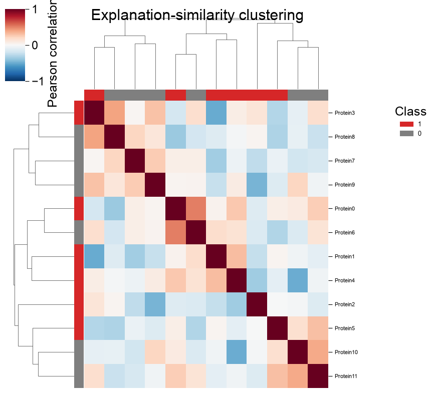
kind='clustermap'clusters samples by why the model scores them, the correlation of their per-sample importance vectors, withnames, classlabels/colors,cmap,cbar_labelandtitle(datais the importance matrix; the clustermap owns its figure, soaxis ignored):block_a = rng.normal(0.6, 0.2, size=(6, 20)) block_b = rng.normal(-0.6, 0.2, size=(6, 20)) data = np.vstack([block_a, block_b]) imp_labels = np.array([1] * 6 + [0] * 6) names = [f"Protein{i}" for i in range(12)] aapred_plot.predict_group(data=data, kind="clustermap", names=names, labels=imp_labels, colors={1: "tab:red", 0: "tab:gray"}, cmap="RdBu_r", figsize=(8, 8), cbar_label="Pearson correlation (r)", title="Explanation-similarity clustering") plt.show()