ReliabilityModelPlot.reliability_diagram
- static ReliabilityModelPlot.reliability_diagram(df_eval, *, figsize=(5, 5), color='tab:blue', label='model', title=None, ax=None)[source]
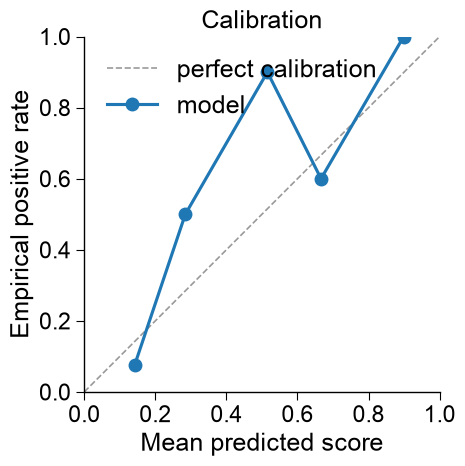
Calibration curve — mean predicted score vs. empirical positive rate, per bin.
Points on the diagonal are perfectly calibrated; points below it mean the score overstates the true positive rate (over-confident), above it under-confident. When
df_evalcarries the Brier score and ECE rows (ReliabilityModel.eval(add_metrics=True)), both values are annotated in the curve’s legend entry. To compare the raw and the calibrated curve, draw both frames onto the sameaxwith distinctlabel/color; the perfect-calibration diagonal is drawn only once.Changed in version 1.2.0: Supports a custom curve label, displays the Brier score and expected calibration error when supplied, and permits several curves on one axes. Metric rows are excluded from the plotted points and annotate their curve’s legend entry; repeated calls on one
axretain a single perfect-calibration diagonal.- Parameters:
df_eval (pd.DataFrame) – Output of
ReliabilityModel.eval()(per-binmean_score/empirical_pos); either the raw-score or the calibrated-score table (use_calibrated=True).figsize (tuple of float, default=(5, 5)) – Figure width and height, each at least 1 (used only when
axisNone).color (str or tuple of float, default="tab:blue") – Matplotlib line/marker color of the model curve. A named or hexadecimal color string, or an RGB tuple with three components from 0 to 255, is accepted.
label (str, default="model") –
Legend label of the curve. The Brier score and expected calibration error are appended when present, so distinct labels identify raw and calibrated curves drawn on the same
ax.Added in version 1.2.0.
title (str, optional) – Axes title. If
None, do not set a title.ax (matplotlib.axes.Axes, optional) – Axes to draw on. If
None, a new figure and axes are created; otherwisefigsizedoes not resize the supplied axes’ figure.
- Returns:
fig (matplotlib.figure.Figure) – The created (or parent) figure.
ax (matplotlib.axes.Axes) – The axes drawn on.
- Raises:
ValueError – If
df_evalis not a DataFrame or lacks thebin/mean_score/empirical_poscolumns;figsizeis not a tuple of two positive numbers;coloris not a matplotlib color;labelor non-Nonetitleis not a string; oraxis not a matplotlibAxes.
Examples
ReliabilityModelPlot().reliability_diagram()draws the calibration curve fromReliabilityModel.eval()— mean predicted score vs. empirical positive rate, against the diagonal of perfect calibration.import aaanalysis as aa import numpy as np import matplotlib.pyplot as plt from sklearn.datasets import make_classification aa.options["verbose"] = False aa.plot_settings() X, labels = make_classification(n_samples=160, n_features=10, n_informative=6, random_state=42) X_train, labels_train = X[:120], labels[:120] # include one clearly out-of-distribution sample so the trust status is visible X_new = np.vstack([X[120:], (X_train[labels_train == 1][0] + 20.0)[None, :]]) rm = aa.ReliabilityModel(random_state=42).fit(X=X_train, labels=labels_train) df_rel = rm.predict(X=X_new) df_eval = rm.eval(X=X[120:], labels=labels[120:])
aa.ReliabilityModelPlot().reliability_diagram(df_eval=df_eval, figsize=(5, 5),
                                              color="tab:blue", label="model",
                                              title="Calibration", ax=None)
plt.tight_layout()
plt.show()
To compare the raw and the calibrated score, evaluate both with
add_metrics=Trueand draw the two tables onto the same axes with distinctlabel/color. The Brier score and the expected calibration error (ECE) are annotated in each curve’s legend entry, and the diagonal is drawn once. An over-confident naive Bayes model makes the gap visible:from sklearn.naive_bayes import GaussianNB X, labels = make_classification(n_samples=600, n_features=20, n_informative=3, n_redundant=15, class_sep=0.8, random_state=0) rm = aa.ReliabilityModel(random_state=42).fit(X=X[:400], labels=labels[:400], model=GaussianNB(), n_bootstrap=0) df_eval_raw = rm.eval(X=X[400:], labels=labels[400:], add_metrics=True) df_eval_cal = rm.eval(X=X[400:], labels=labels[400:], add_metrics=True, use_calibrated=True) rm_plot = aa.ReliabilityModelPlot() fig, ax = rm_plot.reliability_diagram(df_eval=df_eval_raw, figsize=(5.5, 5.5), color="tab:red", label="raw") rm_plot.reliability_diagram(df_eval=df_eval_cal, color="tab:blue", label="calibrated", title="Raw vs. calibrated", ax=ax) plt.tight_layout() plt.show()
