ReliabilityModelPlot.trust_map
- static ReliabilityModelPlot.trust_map(df_rel, figsize=(5.5, 5), title=None, ax=None)[source]
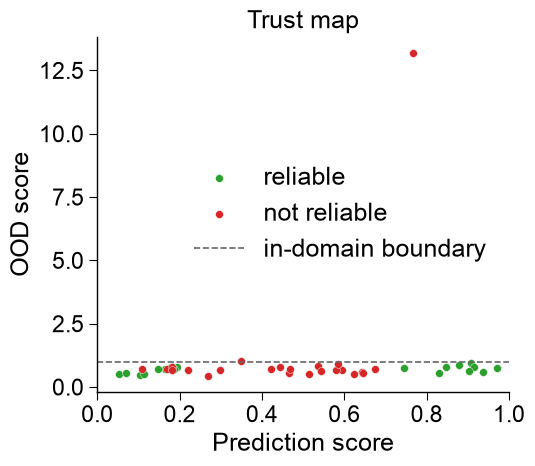
Score vs. OOD-score scatter colored by
reliable— the two trust axes at a glance.A point high on the x-axis (confident) but above the in-domain boundary (out-of-domain) is the untrustworthy, extrapolated prediction.
- Parameters:
df_rel (pd.DataFrame) – Output of
ReliabilityModel.predict()(needsscore,ood_score,reliable).figsize (tuple, default=(5.5, 5)) – Figure size (used only when
axisNone).title (str, optional) – Axes title.
ax (matplotlib.axes.Axes, optional) – Axes to draw on; a new figure is created if
None.
- Returns:
fig (matplotlib.figure.Figure) – The created (or parent) figure.
ax (matplotlib.axes.Axes) – The axes drawn on.
Examples
ReliabilityModelPlot().trust_map()plots prediction score vs. OOD score, colored by thereliableflag — a confident point above the in-domain boundary is an untrustworthy extrapolation.import aaanalysis as aa import numpy as np import matplotlib.pyplot as plt from sklearn.datasets import make_classification aa.options["verbose"] = False aa.plot_settings() X, labels = make_classification(n_samples=160, n_features=10, n_informative=6, random_state=42) X_train, labels_train = X[:120], labels[:120] # include one clearly out-of-distribution sample so the trust status is visible X_new = np.vstack([X[120:], (X_train[labels_train == 1][0] + 20.0)[None, :]]) rm = aa.ReliabilityModel(random_state=42).fit(X=X_train, labels=labels_train) df_rel = rm.predict(X=X_new) df_eval = rm.eval(X=X[120:], labels=labels[120:])
aa.ReliabilityModelPlot().trust_map(df_rel=df_rel, figsize=(5.5, 5),
                                    title="Trust map", ax=None)
plt.tight_layout()
plt.show()