plot_eval
- plot_eval(df_eval, metric=None, score_col=None, figsize=None)[source]
Decompose a
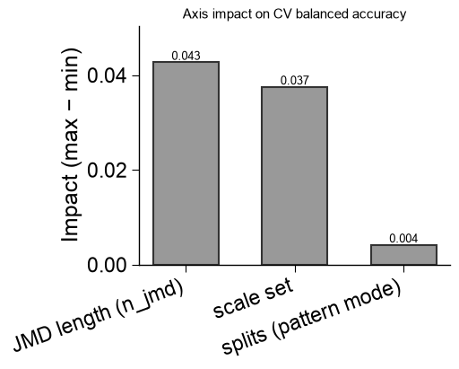
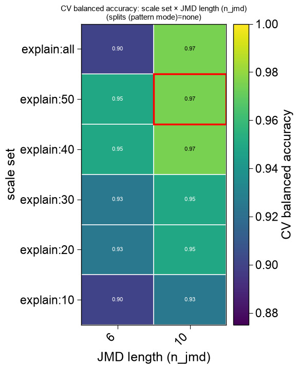
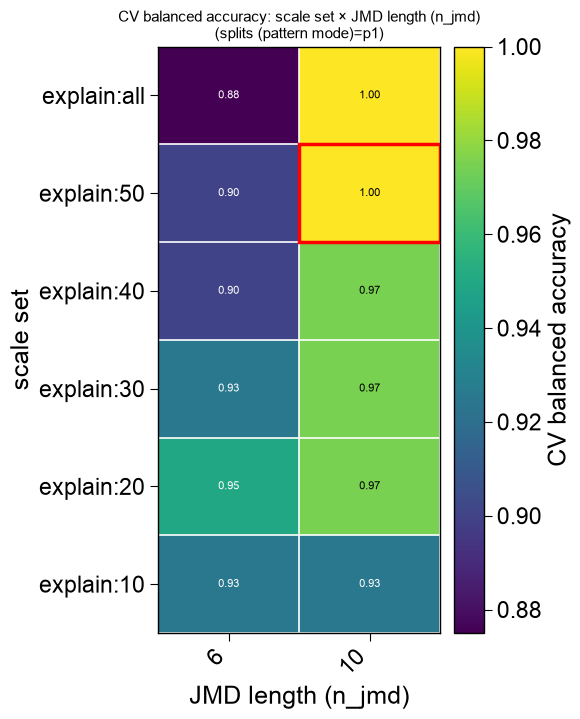
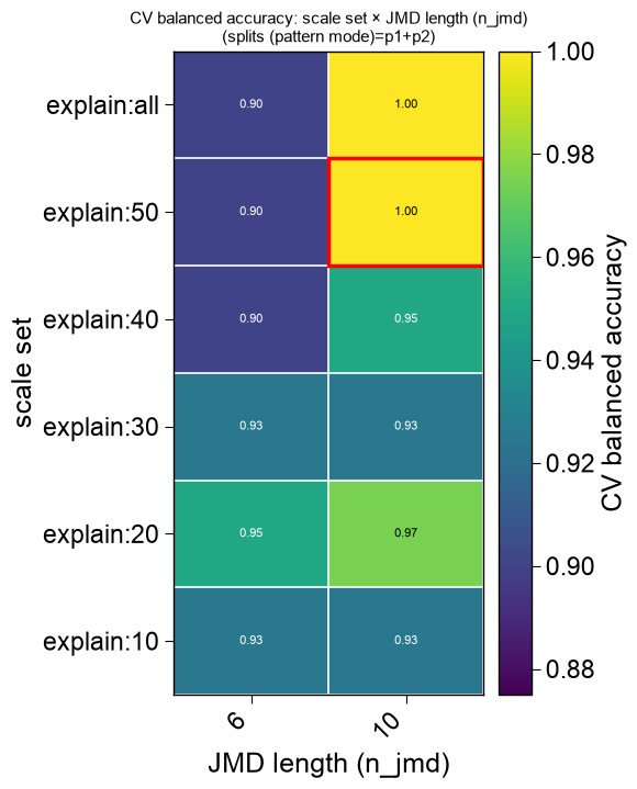
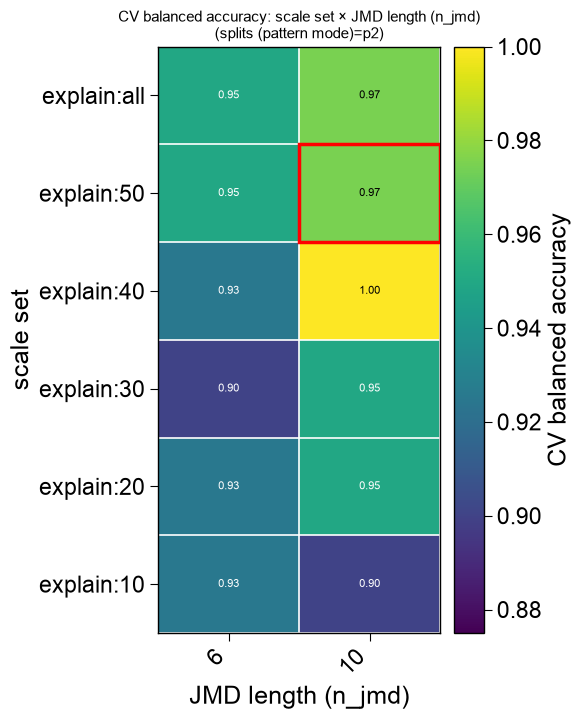
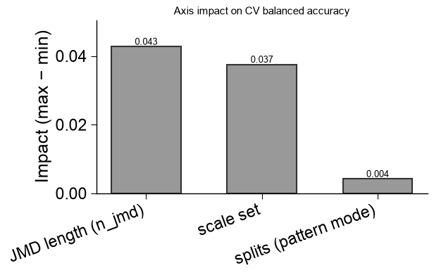
find_features()sweep into a set of publication-ready evaluation figures.The high-dimensional structural sweep (Part x Split x Scale) is decomposed rather than crammed into one plot: the two most-informative axes (largest marginal-mean impact on the score) become each heatmap’s rows and columns, and the least-informative axis becomes the slice — one clean 2D
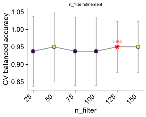
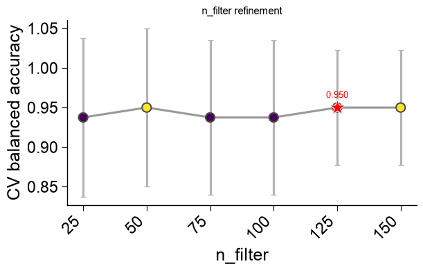
viridisheatmap per slice level, all sharing a single color scale so panels are directly comparable, every cell annotated with its score and the selected configuration boxed. Alongside the heatmaps it returns a marginal-impact bar panel (how much each lever moves the score) and an ``n_filter`` refinement panel. Every figure is returned separately so each can be saved and placed individually in a publication.- Parameters:
df_eval (pd.DataFrame) – Per-configuration sweep table — the third return value of
find_features()(with astagecolumn and one<metric>_meancolumn per metric), or any compatible eval table. Anis_selectedcolumn (if present) marks the winner; otherwise the maximum score is used.metric (str, optional) – Metric whose
<metric>_meancolumn is colored. IfNone, the first*_meancolumn.score_col (str, optional) – Explicit score column to color by (overrides
metric).figsize (tuple of float, optional) – Per-figure size in inches. If
None, a size is derived from each panel’s grid.
- Returns:
figs – The evaluation figures (heatmap slices, then the marginal-impact panel, then the
n_filterpanel). Empty when no axis varies (a single configuration, e.g.search="fast").- Return type:
See also
find_features(): the CPP AutoML pipeline whosedf_evalthis visualizes; it attaches these figures to the returnedaxasax.evalwhenplot=True.
Examples
ap.plot_evalturns a :func:ap.find_featuressweep table (df_eval) into a set of publication-ready evaluation figures. The high-dimensional Part × Split × Scale grid is decomposed into clean 2Dviridisheatmaps — the two most-informative axes on each panel, the least-informative as the slice — sharing one color scale with the selected configuration starred, plus a marginal-impact panel and ann_filterpanel. It returns the list of figures, so each can be saved and placed individually in a paper.find_features(plot=True)calls it for you and attaches the figures asax.eval.import matplotlib.pyplot as plt import aaanalysis as aa import aaanalysis.pipe as ap aa.options["verbose"] = False aa.plot_settings() df_seq = aa.load_dataset(name="DOM_GSEC", n=20) labels = df_seq["label"].to_list() # A balanced search sweeping the Split pattern modes and the Scale sets (two structural axes). df_feat, ax, df_eval = ap.find_features(labels=labels, df_seq=df_seq, search="balanced", kws={"n_split_max": 15}, plot=False, random_state=42, n_jobs=1) aa.display_df(df_eval, n_rows=10, show_shape=True)
DataFrame shape: (61, 14)
stage list_parts split_types pattern_mode n_split_max scale n_jmd n_filter n_features balanced_accuracy_mean balanced_accuracy_std is_pareto is_selected rank 1 sensitivity tmd,jmd_n_tmd_n,tmd_c_jmd_c Segment,Pattern p1 15 explain:50 10 150 150 1.000000 0.000000 True False 1 2 sensitivity tmd,jmd_n_tmd_n,tmd_c_jmd_c Segment,Pattern p1 15 explain:all 10 150 150 1.000000 0.000000 True False 2 3 sensitivity tmd,jmd_n_tmd_n,tmd_c_jmd_c Segment,PeriodicPattern p2 15 explain:40 10 150 150 1.000000 0.000000 True False 3 4 sensitivity tmd,jmd_n_tmd_n,tmd_c_jmd_c Segment,Pattern...PeriodicPattern p1+p2 15 explain:50 10 150 150 1.000000 0.000000 True False 4 5 sensitivity tmd,jmd_n_tmd_n,tmd_c_jmd_c Segment,Pattern...PeriodicPattern p1+p2 15 explain:all 10 150 150 1.000000 0.000000 True False 5 6 n_filter tmd,jmd_n_tmd_n,tmd_c_jmd_c Segment,Pattern p1 15 explain:50 10 125 125 1.000000 0.000000 True False 6 7 n_filter tmd,jmd_n_tmd_n,tmd_c_jmd_c Segment,Pattern p1 15 explain:50 10 150 150 1.000000 0.000000 True False 7 8 refine tmd,jmd_n_tmd_n,tmd_c_jmd_c Segment,Pattern p1 15 explain:50 10 125 82 1.000000 0.000000 True True 8 9 sensitivity tmd,jmd_n_tmd_n,tmd_c_jmd_c Segment none 15 explain:40 10 150 150 0.975000 0.050000 False False 9 10 sensitivity tmd,jmd_n_tmd_n,tmd_c_jmd_c Segment none 15 explain:50 10 150 150 0.975000 0.050000 False False 10 Calling
plot_evalon the table returns the list of figures (heatmap slice(s), then the marginal-impact panel, then then_filterpanel).plt.show()renders them all:figs = ap.plot_eval(df_eval) print(f"{len(figs)} publication eval figures") plt.show()
6 publication eval figures
Color by a specific
metric(when several were optimized), pin the score column withscore_col, or set the per-figurefigsize. Each figure is a standalonematplotlib.figure.Figureyou can save for a publication:figs = ap.plot_eval(df_eval, metric="balanced_accuracy", figsize=(5, 4)) # figs[0].savefig("sweep_heatmap.png", dpi=300, bbox_inches="tight") print(f"saved-ready figures: {len(figs)}") plt.show()
saved-ready figures: 6