plot_legend
- plot_legend(ax=None, dict_color=None, list_cat=None, labels=None, loc='upper left', loc_out=False, frameon=False, y=None, x=None, n_cols=3, labelspacing=0.2, columnspacing=1.0, handletextpad=0.8, handlelength=2.0, fontsize=None, fontsize_title=None, weight_font='normal', weight_title='normal', marker=None, marker_size=10, lw=0, linestyle=None, edgecolor=None, hatch=None, hatchcolor='white', title=None, title_align_left=True, keep_legend=False, **kwargs)[source]
Set an independently customizable plot legend.
Legends can be flexibly adjusted based categories and colors provided in
dict_colordictionary. This functions comprises the most convenient settings forfunc:`matplotlib.pyplot.legend.Added in version 0.1.0.
- Parameters:
ax (Axes, optional) – The axes to attach the legend to. If not provided, the current axes will be used.
dict_color (dict, optional) – A dictionary mapping categories to colors.
list_cat (list of str, optional) – List of categories to include in the legend (keys of
dict_color).labels (list of str, optional) – Legend labels corresponding to given categories.
loc (int or str, default='upper left') – Location for the legend.
loc_out (bool, default=False) – If
True, sets automaticallyx=0andy=-0.25if they areNone.frameon (bool, default=False) – If
True, a figure background patch (frame) will be drawn.y (int or float, optional) – The y-coordinate for the legend’s anchor point.
x (int or float, optional) – The x-coordinate for the legend’s anchor point.
n_cols (int, default=3) – Number of columns in the legend, at least 1.
labelspacing (int or float, default=0.2) – Vertical spacing between legend items.
columnspacing (int or float, default=1.0) – Horizontal spacing between legend columns.
handletextpad (int or float, default=0.8) – Horizontal spacing between legend handle (marker) and label.
handlelength (int or float, default=2.0) – Length of legend handle.
fontsize (int or float, optional) – Font size of the legend text.
fontsize_title (int or float, optional) – Font size of the legend title.
weight_font (str, default='normal') – Weight of the font.
weight_title (str, default='normal') – Font weight for the legend title.
marker (str, int, or list, optional) – Handle marker for legend items. Lines (‘-’) only visible if
lw>0.marker_size (int, float, or list, optional) – Marker size of legend items.
lw (int or float, default=0) – Line width for legend items. If negative, corners are rounded.
linestyle (str or list, optional) – Style of line. Only applied to lines (
marker='-').edgecolor (str, optional) – Edge color of legend items. Not applicable to lines.
hatch (str or list, optional) – Filling pattern for default marker. Only applicable when
marker=None.hatchcolor (str, default='white') – Hatch color of legend items. Only applicable when
marker=None.title (str, optional) – Legend title.
title_align_left (bool, default=True) – Whether to align the title to the left.
keep_legend (bool, default=False) – If
True, keep existing legend (must be within plot) and add a new one.**kwargs – Further key word arguments for
matplotlib.axes.Axes.legend.
- Returns:
ax – The axes object on which legend is applied to.
- Return type:
Axes
Notes
Markers can be None (default), lines (‘-’) or one of the matplotlib markers.
See also
More examples in Plotting Prelude.
Hatches, which are filling patterns.
matplotlib.lines.Line2Dfor available marker shapes and line properties.matplotlib.axes.Axes, which is the core object in matplotlib.matplotlib.pyplot.gca()to get the current Axes instance.
Examples
AAanalysis provides the capability to create a legend independently of the plotted object, enabling flexible legend creation using the
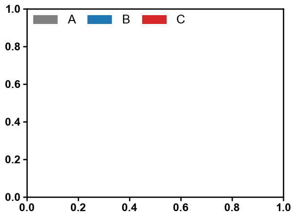
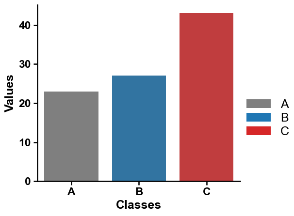
aa.plot_legend()method. First, create a default seaborn plot:import matplotlib.pyplot as plt import seaborn as sns import aaanalysis as aa data = {'Classes': ['A', 'B', 'C'], 'Values': [23, 27, 43]} colors = aa.plot_get_clist() aa.plot_settings() sns.barplot(x='Classes', y='Values', data=data, palette=colors, hue="Classes", legend=False) sns.despine()

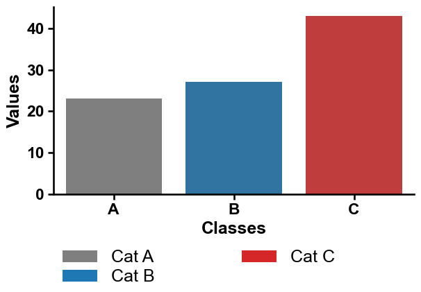
You then just need to provide a color dictionary (
dict_color):list_cat = ["A", "B", "C"] dict_color = dict(zip(list_cat, colors)) aa.plot_legend(dict_color=dict_color) plt.tight_layout() plt.show()
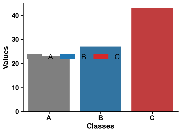
You can adjust the location by using the
locparameter:list_cat = ["A", "B", "C"] dict_color = dict(zip(list_cat, colors)) sns.barplot(x='Classes', y='Values', data=data, palette=colors, hue="Classes", legend=False) sns.despine() aa.plot_legend(dict_color=dict_color, loc="center left") plt.tight_layout() plt.show()
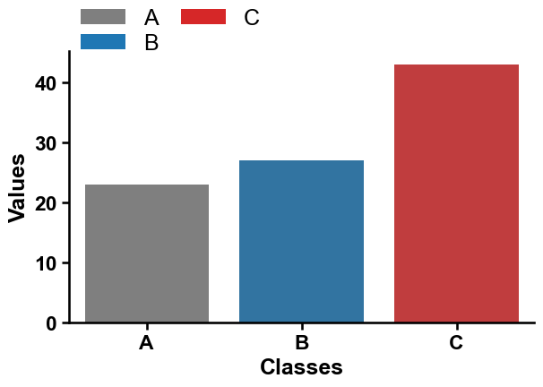
You can adjust the number of columns (
n_cols) or the y-axis position (y=1.1, top):sns.barplot(x='Classes', y='Values', data=data, palette=colors, hue="Classes", legend=False) sns.despine() aa.plot_legend(dict_color=dict_color, ncol=2, y=1.2) plt.tight_layout() plt.show()
Setting the legend on the right middle can be achieved by using
x=1andy=0.5.sns.barplot(x='Classes', y='Values', data=data, palette=colors, hue="Classes", legend=False) sns.despine() aa.plot_legend(dict_color=dict_color, ncol=1, y=0.5, x=1) plt.tight_layout() plt.show()
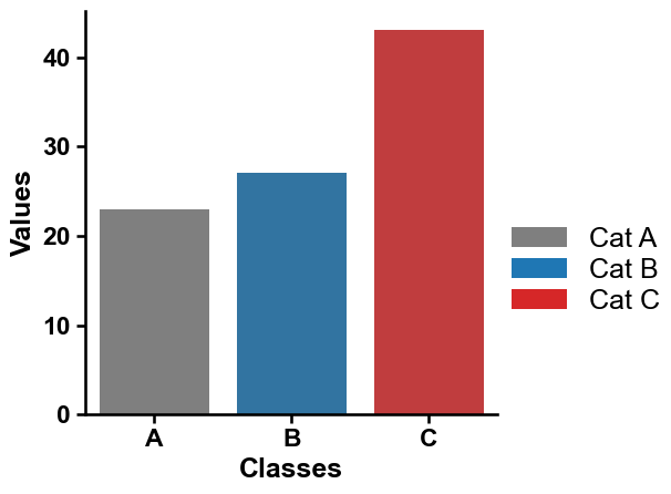
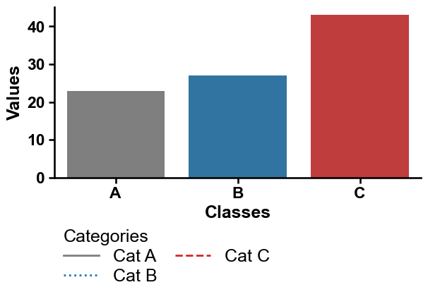
Categories can be independently labeled using
labels:sns.barplot(x='Classes', y='Values', data=data, palette=colors, hue="Classes", legend=False) sns.despine() labels = ["Cat A", "Cat B", "Cat C"] aa.plot_legend(dict_color=dict_color, ncol=1, y=0.5, x=1, labels=labels) plt.tight_layout() plt.show()
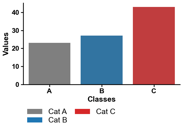
The legend can be directly set in the left under the plot using
loc_out=True:sns.barplot(x='Classes', y='Values', data=data, palette=colors, hue="Classes", legend=False) sns.despine() aa.plot_legend(dict_color=dict_color, ncol=2, loc_out=True, labels=labels) plt.tight_layout() plt.show()
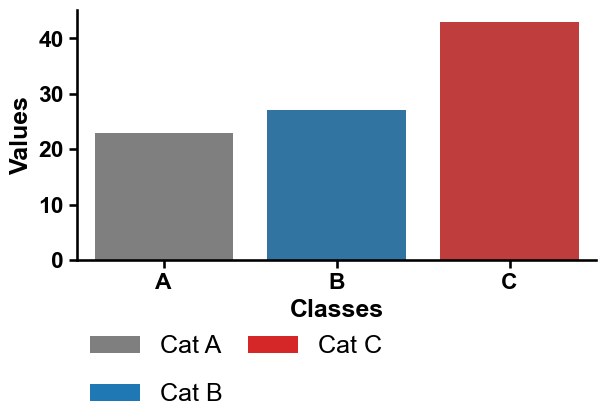
We provide four spacing and length options. First,
labelspacing(default=0.2):sns.barplot(x='Classes', y='Values', data=data, palette=colors, hue="Classes", legend=False) sns.despine() aa.plot_legend(dict_color=dict_color, ncol=2, loc_out=True, labels=labels, labelspacing=1) plt.tight_layout() plt.show()
Second,
columnspacing(default=1.0):sns.barplot(x='Classes', y='Values', data=data, palette=colors, hue="Classes", legend=False) sns.despine() aa.plot_legend(dict_color=dict_color, ncol=2, loc_out=True, labels=labels, columnspacing=5) plt.tight_layout() plt.show()
Third, spacing between handles (i.e., the colored legend boxes) and the legend text labels using
handletextpad(default=0.8):sns.barplot(x='Classes', y='Values', data=data, palette=colors, hue="Classes", legend=False) sns.despine() aa.plot_legend(dict_color=dict_color, ncol=2, loc_out=True, labels=labels, handletextpad=0) plt.tight_layout() plt.show()

Fourth, the length of the legend handles can be adjusted using
handlelength(default=2):sns.barplot(x='Classes', y='Values', data=data, palette=colors, hue="Classes", legend=False) sns.despine() aa.plot_legend(dict_color=dict_color, ncol=2, loc_out=True, labels=labels, handlelength=1, handletextpad=0) plt.tight_layout() plt.show()

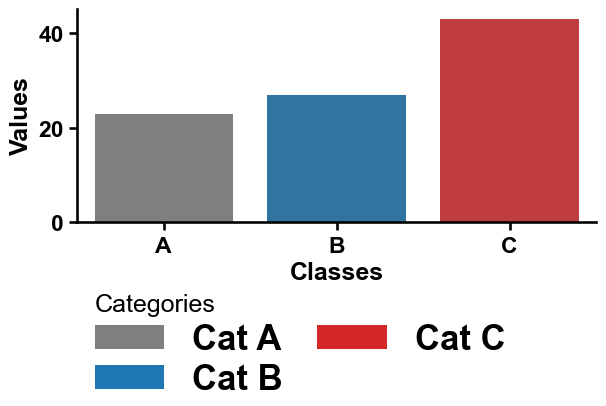
The
titleof the legend can be set and automatically aligned to the left usingtitle_align_left=True:sns.barplot(x='Classes', y='Values', data=data, palette=colors, hue="Classes", legend=False) sns.despine() aa.plot_legend(dict_color=dict_color, ncol=2, loc_out=True, labels=labels, title="Categories", title_align_left=True) plt.tight_layout() plt.show()

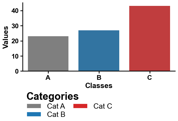
Adjust the general fontsize and weight using
fontsize(default=None, i.e., default fontsize of matplotlib or fontsize adjusted byaa.plot_settings()) andfontsize_weight(default=‘normal’):sns.barplot(x='Classes', y='Values', data=data, palette=colors, hue="Classes", legend=False) sns.despine() aa.plot_legend(dict_color=dict_color, ncol=2, loc_out=True, labels=labels, title="Categories", title_align_left=True, fontsize=25, weight_font="bold") plt.tight_layout() plt.show()
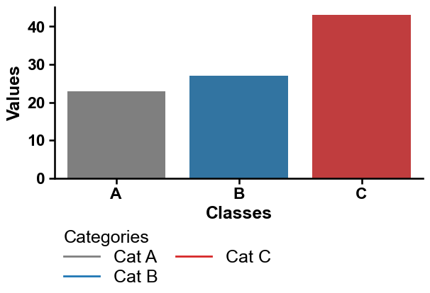
Or you can adjust only the font of the legend title using
fontsize_titleandtitle_weight:sns.barplot(x='Classes', y='Values', data=data, palette=colors, hue="Classes", legend=False) sns.despine() aa.plot_legend(dict_color=dict_color, ncol=2, loc_out=True, labels=labels, title="Categories", title_align_left=True, fontsize_title=25, weight_font="bold") plt.tight_layout() plt.show()

The edges of the handles can be adjusted using linewidth (
lw) andedgecolor:sns.barplot(x='Classes', y='Values', data=data, palette=colors, hue="Classes", legend=False) sns.despine() aa.plot_legend(dict_color=dict_color, ncol=2, loc_out=True, labels=labels, title="Categories", title_align_left=True, fontsize_title=25, weight_title="bold", lw=2, edgecolor="black") plt.tight_layout() plt.show()
The legend handle (here called ‘markers’) can be adjusted using
markers(e.g., ‘-’ for lines) andmarker_size(default=10):sns.barplot(x='Classes', y='Values', data=data, palette=colors, hue="Classes", legend=False) sns.despine() aa.plot_legend(dict_color=dict_color, ncol=2, loc_out=True, labels=labels, title="Categories", marker='*', marker_size=15) plt.tight_layout() plt.show()

Lines can be selected using
marker='-'if linewidth (lw, default=0) is >0:sns.barplot(x='Classes', y='Values', data=data, palette=colors, hue="Classes", legend=False) sns.despine() aa.plot_legend(dict_color=dict_color, ncol=2, loc_out=True, labels=labels, title="Categories", marker='-', lw=2) plt.tight_layout() plt.show()
The style of the lines can be adjusted for each line individually by using
linestyle:sns.barplot(x='Classes', y='Values', data=data, palette=colors, hue="Classes", legend=False) sns.despine() aa.plot_legend(dict_color=dict_color, ncol=2, loc_out=True, labels=labels, title="Categories", marker='-', lw=2, linestyle=["-", ":", "--"]) plt.tight_layout() plt.show()
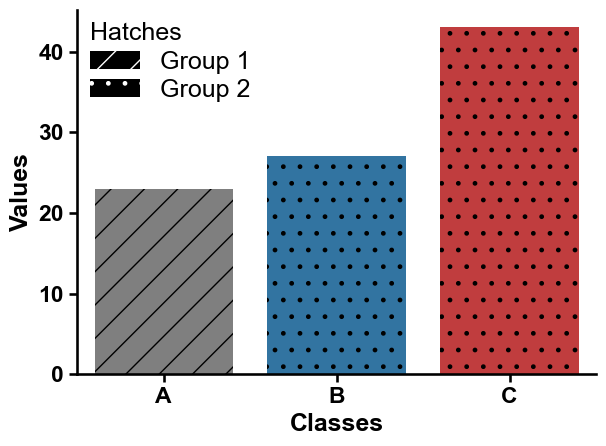
Finally, you can add a
hatch(i.e., filling pattern of markers) and adjust theirhatchcolor:ax = sns.barplot(x='Classes', y='Values', data=data, palette=colors, hue="Classes", legend=False) # Create hatches hatches = ['/', '.', '.'] for bars, hatch in zip(ax.containers, hatches): for bar in bars: bar.set_hatch(hatch) sns.despine() dict_color_hatches = {"Group 1": "black", "Group 2": "black"} aa.plot_legend(dict_color=dict_color_hatches, n_cols=1, hatch=["/", "."], title="Hatches") plt.tight_layout() plt.show()
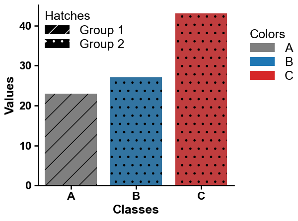
You can include a new legend while keeping the existing one by setting
keep_legend=True:ax = sns.barplot(x='Classes', y='Values', data=data, palette=colors, hue="Classes", legend=False) # Create hatches hatches = ['/', '.', '.'] for bars, hatch in zip(ax.containers, hatches): for bar in bars: bar.set_hatch(hatch) sns.despine() dict_color_hatches = {"Group 1": "black", "Group 2": "black"} aa.plot_legend(ax=ax, dict_color=dict_color_hatches, ncol=1, hatch=["/", "."], title="Hatches") aa.plot_legend(ax=ax, dict_color=dict_color, ncol=1, y=0.9, x=1.05, title="Colors", keep_legend=True) plt.tight_layout() plt.show()
Further parameters.
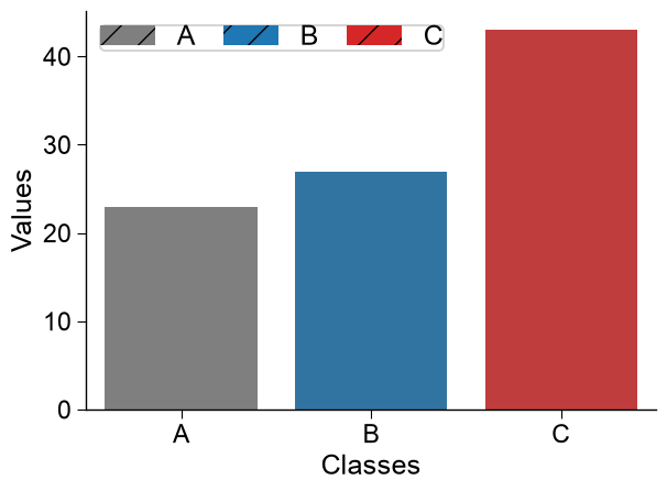
plot_legendalso accepts:frameon— IfTrue, a figure background patch (frame) will be drawn.# Further parameters: frameon draws a background frame around the legend, and hatchcolor # sets the color of the hatch pattern lines (visible when a hatch is used). list_cat = ["A", "B", "C"] dict_color = dict(zip(list_cat, colors)) sns.barplot(x="Classes", y="Values", data=data, palette=colors, hue="Classes", legend=False) sns.despine() aa.plot_legend(dict_color=dict_color, hatch="/", hatchcolor="black", frameon=True) plt.tight_layout() plt.show()