plot_settings
- plot_settings(font_scale=1, font='Arial', weight_bold=False, adjust_only_font=False, adjust_further_elements=True, grid=False, grid_axis='y', no_ticks=False, short_ticks=False, no_ticks_x=False, short_ticks_x=False, no_ticks_y=False, short_ticks_y=False, show_options=False)[source]
Configure general plot settings.
This function modifies the global settings of
matplotlibandseabornlibraries. It adjusts font embedding for vector formats like PDF and SVG, ensuring compatibility and editability across various viewers and editing software.Added in version 0.1.0.
- Parameters:
font_scale (int or float, default=1) – Scaling factor to scale the size of font elements. Consistent with
seaborn.set_context().font ({'Arial', 'Courier New', 'DejaVu Sans', 'Times New Roman', 'Verdana'}, default='Arial') – Name of text font. Common options are ‘Arial’ or ‘DejaVu Sans’ (Matplotlib default).
weight_bold (bool, default=False) – If
True, font and line elements are bold.adjust_only_font (bool, default=False) – If
True, only the font style will be adjusted, leaving other elements unchanged.adjust_further_elements (bool, default=True) – If
True, makes additional visual and layout adjustments to the plot (errorbars, legend).grid (bool, default=False) – If
True, display the grid in plots.grid_axis ({'y', 'x', 'both'}, default='y') – Choose the axis (‘y’, ‘x’, ‘both’) to apply the grid to.
no_ticks (bool, default=False) – If
True, remove all tick marks on both x and y axes.short_ticks (bool, default=False) – If
True, display short tick marks on both x and y axes. Is ignored ifno_ticks=True.no_ticks_x (bool, default=False) – If
True, remove tick marks on the x-axis.short_ticks_x (bool, default=False) – If
True, display short tick marks on the x-axis. Is ignored ifno_ticks=True.no_ticks_y (bool, default=False) – If
True, remove tick marks on the y-axis.short_ticks_y (bool, default=False) – If
True, display short tick marks on the y-axis. Is ignored ifno_ticks=True.show_options (bool, default=False) – If
True, show all plot runtime configurations of matplotlib.
Notes
grid_axiswork only for axis with numerical values.
See also
More examples in Plotting Prelude.
seaborn.set_context(), wherefont_scaleis utilized.matplotlib.rcParams, which manages the global settings inmatplotlib.
Examples
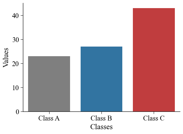
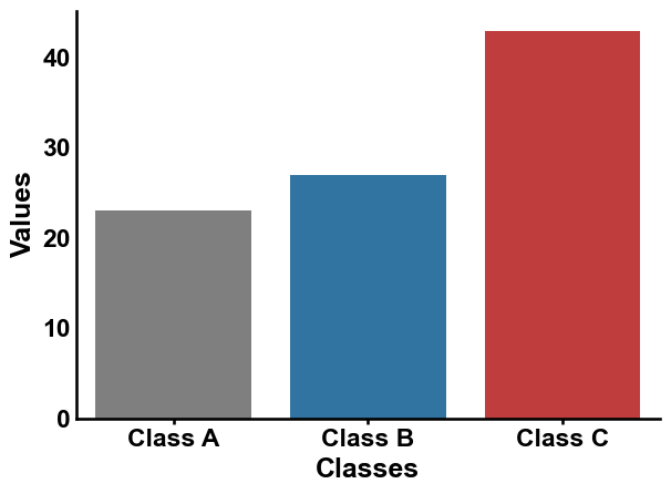
A default seaborn barplot can be created as follows:
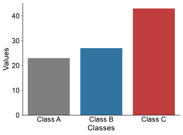
import matplotlib.pyplot as plt
import seaborn as sns
data = {'Classes': ['Class A', 'Class B', 'Class C'], 'Values': [23, 27, 43]}
sns.barplot(x="Classes", y="Values", data=data)
sns.despine()
plt.tight_layout()
plt.show()

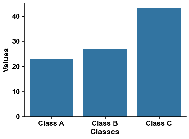
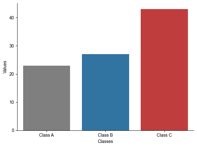
Adjust plots with AAanalysis using
aa.plot_settings():import aaanalysis as aa aa.plot_settings() sns.barplot(x="Classes", y="Values", data=data) sns.despine() plt.tight_layout() plt.show()
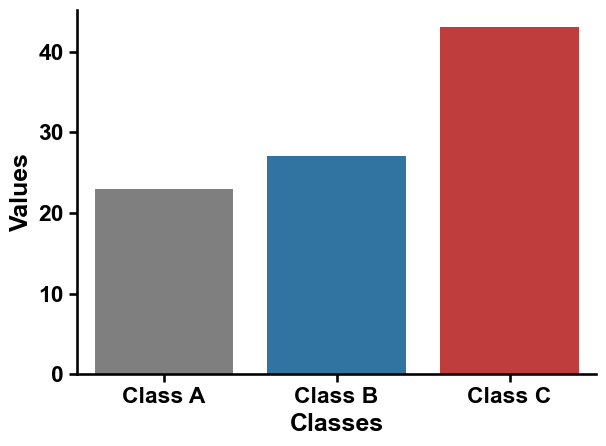
You can add our default colors using the
aa.plot_get_clist()method:colors = aa.plot_get_clist(n_colors=3) sns.barplot(x="Classes", y="Values", data=data, palette=colors, hue="Classes") sns.despine() plt.tight_layout() plt.show()
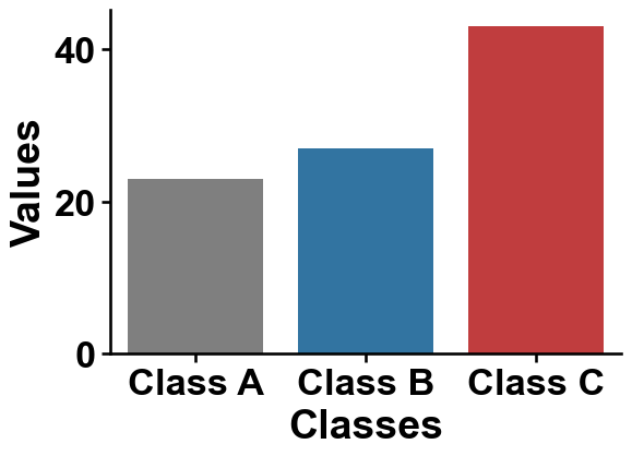
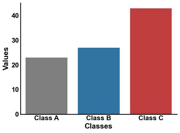
Adjust the font scale for all plot texts using a scaling factor called
font_scale:aa.plot_settings(font_scale=1.5) sns.barplot(x="Classes", y="Values", data=data, palette=colors, hue="Classes") sns.despine() plt.tight_layout() plt.show()
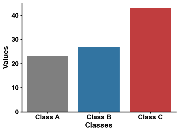
The font type and style can be adjusted by the
fontandweight_boldarguments:aa.plot_settings(font="Times New Roman", weight_bold=False) sns.barplot(x="Classes", y="Values", data=data, palette=colors, hue="Classes") sns.despine() plt.tight_layout() plt.show()
If you only want to change the
fonttype, you can setadjust_only_font=True:aa.plot_settings(adjust_only_font=True, font="Arial") sns.barplot(x="Classes", y="Values", data=data, palette=colors, hue="Classes") sns.despine() plt.tight_layout() plt.show()
Grid can be enabled by
grid=Trueand thegrid-axiscan be ‘x’, ‘y’, or ‘both’:aa.plot_settings(grid=True, grid_axis="y") sns.barplot(x="Classes", y="Values", data=data, palette=colors, hue="Classes") sns.despine() plt.tight_layout() plt.show()

The x- any y-ticks can be easily adjusted. Remove all ticks by
no_ticks=True:aa.plot_settings(no_ticks=True) sns.barplot(x="Classes", y="Values", data=data, palette=colors, hue="Classes") sns.despine() plt.tight_layout() plt.show()
Or shorten all via
short_ticks=True:aa.plot_settings(short_ticks=True) sns.barplot(x="Classes", y="Values", data=data, palette=colors, hue="Classes") sns.despine() plt.tight_layout() plt.show()
This can as well be applied separately for the x- and y-axis:
aa.plot_settings(short_ticks_x=True, no_ticks_y=True)
sns.barplot(x="Classes", y="Values", data=data, palette=colors, hue="Classes")
sns.despine()
plt.tight_layout()
plt.show()
Further parameters.
plot_settingsalso accepts:adjust_further_elements— IfTrue, makes additional visual and layout adjustments to the plot (errorbars, legend);no_ticks_x— IfTrue, remove tick marks on the x-axis;short_ticks_y— IfTrue, display short tick marks on the y-axis;show_options— IfTrue, show all plot runtime configurations of matplotlib.# Further parameters: adjust_further_elements tweaks errorbar/legend layout, no_ticks_x # removes x-axis ticks, short_ticks_y shortens y-axis ticks, and show_options can print # the active matplotlib runtime configuration (kept False here to avoid a long output). aa.plot_settings(adjust_further_elements=True, no_ticks_x=True, short_ticks_y=True, show_options=False) sns.barplot(x="Classes", y="Values", data=data, palette=colors, hue="Classes") sns.despine() plt.tight_layout() plt.show()