plot_rank
- plot_rank(df_rank, col_score='score', col_group='group', group_order=None, dict_color=None, threshold=None, ax=None, figsize=(7, 5), marker_size=25, xlabel='Protein rank', ylabel='Max score per protein', fontsize_labels=None)[source]
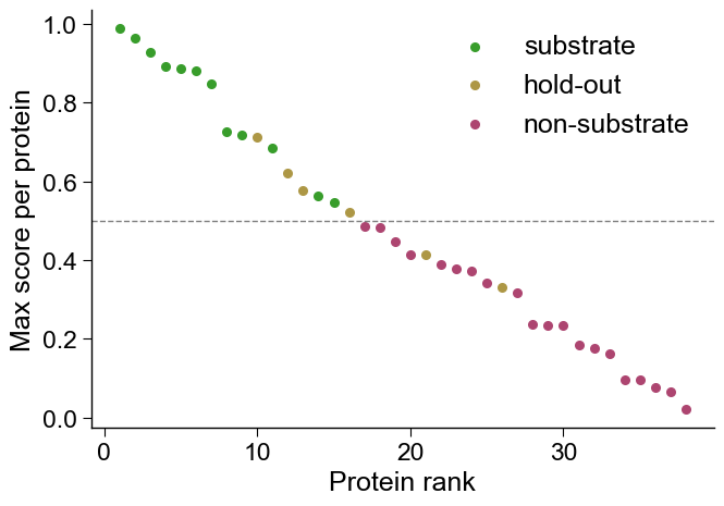
Plot a per-protein rank scatter: max-score-per-protein sorted by score, colored by group.
The single most useful sanity check for a deployed per-protein predictor — proteins are ranked by their maximum score and colored by membership in groups such as substrate / hold-out / non-substrate, with optional threshold lines for the deployment caller.
Added in version 1.1.0.
- Parameters:
df_rank (pd.DataFrame, shape (n_proteins, n_info)) – One row per protein; must contain
col_score(the protein’s max score) andcol_group(its group label).col_score (str, default="score") – Column with the per-protein score used for ranking (descending) on the y-axis.
col_group (str, default="group") – Column with the per-protein group label used for coloring.
group_order (list of str, optional) – Order in which groups are colored / drawn. Defaults to first-appearance order.
dict_color (dict, optional) – Mapping
group -> color(overrides the canonical defaults). Canonical group names (substrate,non-substrate,hold-out) default to the locked sample palette.threshold (int, float, or list, optional) – One or more y-values drawn as horizontal threshold lines.
ax (matplotlib.axes.Axes, optional) – Axes to draw on. If
None, a new figure and axes are created.figsize (tuple, default=(7, 5)) – Figure size when
axisNone.marker_size (int or float, default=25) – Scatter marker size.
xlabel (str) – Axis labels.
ylabel (str) – Axis labels.
fontsize_labels (int or float, optional) – Font size for the axis labels (matplotlib default if
None).
- Returns:
fig (matplotlib.figure.Figure) – The figure.
ax (matplotlib.axes.Axes) – The axes with the rank scatter.
See also
aaanalysis.plot_get_clist()for the fallback color palette.aaanalysis.comp_per_protein_ap()/aaanalysis.comp_detection_metrics()for the numeric companions to this visual check.
Examples
The
aa.plot_rank()function gives a per-protein rank scatter: each protein’s maximum prediction score is plotted against its rank (highest score first), colored by group (e.g. substrate / hold-out / non-substrate), with optional threshold lines for the deployment caller. It is the single most useful sanity check for a deployed per-protein predictor and pairs with the numeric metrics inaa.comp_per_protein_ap/aa.comp_detection_metrics.import numpy as np import pandas as pd import matplotlib.pyplot as plt import aaanalysis as aa aa.plot_settings() rng = np.random.default_rng(42) df_rank = pd.DataFrame({ "score": np.concatenate([rng.uniform(0.5, 1.0, 12), rng.uniform(0.3, 0.8, 6), rng.uniform(0.0, 0.5, 20)]), "group": ["substrate"] * 12 + ["hold-out"] * 6 + ["non-substrate"] * 20, }) fig, ax = aa.plot_rank(df_rank=df_rank, threshold=0.5) plt.tight_layout() plt.show()
Further parameters.
plot_rankalso accepts:col_score— Column with the per-protein score used for ranking (descending) on the y-axis;col_group— Column with the per-protein group label used for coloring;group_order— Order in which groups are colored / drawn;dict_color— Mappinggroup -> color(overrides the canonical defaults);figsize— Figure size whenaxisNone;marker_size— Scatter marker size;xlabel;ylabel;fontsize_labels— Font size for the axis labels (matplotlib default ifNone).