CPPPlot.eval
- static CPPPlot.eval(df_eval, figsize=(6, 4), dict_xlims=None, legend=True, legend_y=-0.3, dict_color=None, list_cat=None)[source]
Plot evaluation output of Comparative Physicochemical Profiling (CPP) comparing multiple sets of identified feature sets.
Evaluation measures are categorized into two groups:
Discriminative Power measures (‘range_ABS_AUC’ and ‘avg_MEAN_DIF’), which assess the effectiveness of the feature set in distinguishing between the test and reference datasets.
Redundancy measures (‘n_clusters’, ‘avg_n_feat_per_clust’, and ‘std_n_feat_per_clust’), which evaluate the internal redundancy of a feature set using Pearson correlation-based clustering.
Added in version 0.1.0.
- Parameters:
df_eval (pd.DataFrame, shape (n_feature_sets, n_metrics)) –
DataFrame with evaluation measures for sets of identified features. Each row corresponds to a specific feature set. required ‘columns’ are:
’name’: Name of the feature set.
’n_features’: Number of features per scale category given as list.
’range_ABS_AUC’: Quintile range of absolute Area Under the Curve (AUC) among all features (min, 25%, median, 75%, max).
’avg_MEAN_DIF’: Two mean differences averaged across all features (for positive and negative ‘mean_dif’)
’n_clusters’: Optimal number of clusters.
’avg_n_feat_per_clust’: Average number of features per cluster.
’std_n_feat_per_clust’: Standard deviation of feature number per cluster
figsize (tuple, default=(6, 4)) – Figure dimensions (width, height) in inches.
dict_xlims (dict, optional) – A dictionary containing x-axis limits for subplots. Keys should be the subplot axis number ({0, 1, 2, 3, 4}) and values should be tuple specifying (
xmin,xmax). IfNone, x-axis limits are auto-scaled.legend (bool, default=True) – If
True, scale category legend is set under number of features measures.legend_y (float, default=-0.3) – Legend position regarding the plot y-axis applied if
legend=True.dict_color (dict, optional) – Color dictionary of scale categories for legend. Default from
plot_get_cdict()withname='DICT_CAT'.list_cat (list of str, optional) – List of scale categories for which feature numbers are shown.
- Returns:
fig (Figure) – Figure object for evaluation plot
ax (array of Axes) – Array of Axes objects, each representing a subplot within the figure.
Notes
Altering
figsizeheight could result in unappropriated legend spacing. This can be adjusted by thelegend_yparameter together with using thematplotlib.pyplot.subplots_adjust()function, here used with (wspace=0.25, hspace=0, bottom=0.35) parameter settings.
See also
CPP.eval(): the respective computation method.
Examples
To demonstrate the
CPPPlot().eval()method, we first create a list of features sets using theDOM_GSEC_PUfeature data set (see [Breimann25]):import aaanalysis as aa aa.options["verbose"] = False df_seq = aa.load_dataset(name="DOM_GSEC", n=50) labels = df_seq["label"].to_list() sf = aa.SequenceFeature() df_parts = sf.get_df_parts(df_seq=df_seq) df_feat = aa.load_features() # Feature sets with varying length list_df_feat = [df_feat, df_feat.head(100), df_feat.head(50), df_feat.head(25)] # Feature sets with varying scale categories list_cat = ['ASA/Volume', 'Conformation', 'Energy','Polarity'] list_df_feat.extend([df_feat[df_feat["category"].isin(list_cat)], df_feat[df_feat["category"].isin(list_cat[0:2])]])
We can now create the
df_evalDataFrame, which contains different evaluation measures for comparing the feature datasets, by using theCPP().eval()method:cpp = aa.CPP(df_parts=df_parts) df_eval = cpp.eval(list_df_feat=list_df_feat, labels=labels) aa.display_df(df_eval)
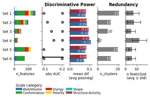
name n_features avg_ABS_AUC range_ABS_AUC avg_MEAN_DIF n_clusters avg_n_feat_per_clust std_n_feat_per_clust 1 Set 1 (150, [18, 0, 56, 27, 0, 16, 17, 16, 0, 0, 0, 0]) 0.164000 [0.126, 0.142, 0.162, 0.181, 0.244] (np.float64(0.083), np.float64(-0.08)) 25 6.000000 3.790000 2 Set 2 (100, [12, 0, 33, 21, 0, 11, 13, 10, 0, 0, 0, 0]) 0.178000 [0.149, 0.162, 0.174, 0.188, 0.244] (np.float64(0.086), np.float64(-0.087)) 14 7.140000 4.950000 3 Set 3 (50, [6, 0, 18, 13, 0, 5, 4, 4, 0, 0, 0, 0]) 0.195000 [0.174, 0.181, 0.188, 0.205, 0.244] (np.float64(0.096), np.float64(-0.095)) 12 4.170000 3.160000 4 Set 4 (25, [4, 0, 7, 8, 0, 2, 3, 1, 0, 0, 0, 0]) 0.209000 [0.189, 0.197, 0.205, 0.215, 0.244] (np.float64(0.1), np.float64(-0.108)) 2 12.500000 6.500000 5 Set 5 (117, [18, 0, 56, 27, 0, 16, 0, 0, 0, 0, 0, 0]) 0.165000 [0.126, 0.142, 0.164, 0.182, 0.244] (np.float64(0.084), np.float64(-0.079)) 17 6.880000 4.140000 6 Set 6 (74, [18, 0, 56, 0, 0, 0, 0, 0, 0, 0, 0, 0]) 0.161000 [0.126, 0.137, 0.156, 0.18, 0.243] (np.float64(0.085), np.float64(-0.073)) 18 4.110000 2.540000 df_evalcan now be supplied to theCPPPlot().eval()method to visualize the evaluation:import matplotlib.pyplot as plt cpp_plot = aa.CPPPlot() cpp_plot.eval(df_eval=df_eval) plt.show()
Ticks and the fontsize can be adjusted using the
plot_settings()functions.aa.plot_settings(font_scale=0.7, short_ticks_x=True, no_ticks_y=True, weight_bold=False) cpp_plot.eval(df_eval=df_eval) plt.show()
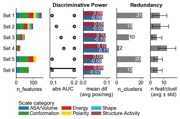
Explanation of Evaluation Plot
The visualization provides insights into feature set characteristics, displayed from left to right:
Number of Features per Scale Category: Displayed as a stacked bar chart.
Range of Absolute AUC Values: Includes minimum, 25%, median, 75%, and maximum values.
Mean Difference: The average difference between the test and the reference dataset, with positive values in red and negative values in blue.
Number of Clusters: Based on Pearson correlation between the features.
Average Number of Features per Cluster.
Metrics (b) and (c) gauge the Discriminative Power of the feature sets (higher is better), while (d) and (e) assess the Numerical Redundancy, with fewer features per cluster indicating greater diversity.
The
figsizecan be adjusted:cpp_plot.eval(df_eval=df_eval, figsize=(7, 3)) plt.show()

This might lead to an unappropriated legend spacing. The y position of the legend can be controlled using the
legend_y(default=-0.3) parameter. In addition, we recommend to use the :func:matplotlib.pyplot.subplots_adjustto adjust the bottom spacing of the figure:cpp_plot.eval(df_eval=df_eval, figsize=(7, 3), legend_y=-0.4) plt.subplots_adjust(wspace=0.25, hspace=0, bottom=0.4) plt.show()

Alternatively, you can simply remove the legend setting
legend=Falsecpp_plot.eval(df_eval=df_eval, figsize=(7, 3), legend=False) plt.show()

Customize the the x-limits of each subplot using the
dict_xlimsparameter:dict_xlims = {0: (0, 50), 3: (0, 35)} # Adjust first and fourth subplot cpp_plot.eval(df_eval=df_eval, figsize=(7, 3), legend=False, dict_xlims=dict_xlims) plt.show()

You can change the colors of the scale categories using the
dict_colorargument. We first get the default scale category color dictionary using theplt_get_cdictfunction withname='DICT_CAT'and a new color list usingplot_get_clist:dict_color = aa.plot_get_cdict(name="DICT_CAT") list_colors = aa.plot_get_clist(n_colors=len(dict_color)) # New color dict dict_color = dict(zip(dict_color, list_colors)) cpp_plot.eval(df_eval=df_eval, dict_color=dict_color) plt.show()

cpp = aa.CPP(df_parts=df_parts)
df_eval = cpp.eval(list_df_feat=list_df_feat, labels=labels, list_cat=list_cat[0:4])
cpp_plot.eval(df_eval=df_eval, list_cat=list_cat[0:4])
plt.show()

To adjust the set names, provide the customized names via the
names_feature_setsargument to theCPP().eval()method:cpp = aa.CPP(df_parts=df_parts) names_feature_sets = [f"Feature set {i}" for i in range(1, 7)] df_eval = cpp.eval(list_df_feat=list_df_feat, labels=labels, names_feature_sets=names_feature_sets) cpp_plot.eval(df_eval=df_eval) plt.show()

If only a subset of scale categories should be considered, the
list_catargument should be adjusted in both theCPP().eval()and theCPPPlot().eval()method: