CPPPlot.profile
- CPPPlot.profile(df_feat, shap_plot=False, col_imp='feat_importance', normalize=True, ax=None, figsize=None, cell_size=None, start=1, tmd_len=20, tmd_seq=None, jmd_n_seq=None, jmd_c_seq=None, tmd_color='mediumspringgreen', jmd_color='blue', tmd_seq_color='black', jmd_seq_color='white', seq_size='auto', seq_char_fill=None, fontsize_tmd_jmd=None, weight_tmd_jmd='normal', add_xticks_pos=False, highlight_tmd_area=True, highlight_alpha=0.15, add_legend_cat=False, dict_color=None, legend_kws=None, bar_width=0.75, edge_color=None, grid_axis=None, ylim=None, xtick_size=11.0, xtick_width=2.0, xtick_length=5.0, ytick_size=None, ytick_width=None, ytick_length=5.0, sample_kws=None)[source]
Plot CPP/-SHAP profile showing feature importance/impact per residue position.
Aggregates the
col_impvalues fromdf_featper residue position and displays them as a bar chart aligned to the TMD-JMD sequence. This reveals which positions carry the most discriminative signal fromCPP.run()(group-level) or SHAP-enriched feature tables (sample-level whenshap_plot=True).Added in version 0.1.0.
- Parameters:
df_feat (pd.DataFrame, shape (n_features, n_feature_info)) – Feature DataFrame with a unique identifier, scale information, statistics, and positions for each feature. Must also include either
feat_importanceorfeat_impactcolumn.shap_plot (bool, default=False) –
Set the analysis type: CPP Analysis (if
False) for group-level or CPP-SHAP Analysis for sample-level (or subgroup-level) results:CPP Analysis
col_imp: Refers to the group-level feat_importance column (shown in gray), depicted by gray bars for each residue position.
CPP-SHAP Analysis
col_imp: Enables the selection of specific feature impacts from a feat_impact_’name’ column for an individual sample, where positive (red) and negative (blue) feature impacts are visualized by +/- bars.
col_imp (str or None, default='feat_importance') – Column name in
df_featfor feature importance/impact values. Must match with theshap_plotsetting. IfNone, the number of features per residue position will be shown.normalize (bool, default=True) – If
True, normalizes aggregated numerical values to a total of 100%.ax (Axes, optional) – Pre-defined Axes object to plot on. If
None, a new Axes object is created.figsize (tuple, optional) – Figure dimensions (width, height) in inches. When
None(default) and the globalauto_fontoption is enabled, the width tracks the sequence length (narrowing for a short sequence, widening for a long one; height and fonts fixed); any explicitfigsizeis honored as a fixed size. Withauto_fontdisabled,Nonefalls back to(7, 5).cell_size (tuple, optional) –
Target
(width, height)in inches of one grid cell; only the width (per-position column) applies to the single-row profile. When given, the profile width is sized to this per-position width regardless ofauto_font.None(default) uses a calibrated default on theauto_fontpath. Ignored when an explicitaxis passed.Added in version 1.1.0.
Changed in version 1.1.0: Defaults to
Noneand participates inauto_font; explicitfigsizewins.start (int, default=1) – Position label of first residue position (starting at N-terminus).
tmd_len (int, default=20) – Length of target middle domain (TMD) to be depicted (>0). Must match with all feature from
df_feat.tmd_seq (str, optional) – TMD sequence for specific sample.
jmd_n_seq (str, optional) – Juxta middle domain (JMD) N-terminal sequence for specific sample. Length must match with ‘jmd_n_len’ attribute.
jmd_c_seq (str, optional) – JMD C-terminal sequence for specific sample. Length must match with ‘jmd_c_len’ attribute.
tmd_color (str, default='mediumspringgreen') – Color for TMD.
jmd_color (str, default='blue') – Color for JMDs.
tmd_seq_color (str, default='black') – Color for TMD sequence.
jmd_seq_color (str, default='white') – Color for JMD sequence.
seq_size (str, int, or float, optional) – Residue-letter size.
"auto"(default) fits the letters to the grid cell and steps the size down for short TMDs. A value in(0, 1]sets the letter height to that fraction of the cell height (e.g.0.9); a value> 1is an absolute font size in points. The"auto"and fractional modes keep the letters from overlapping; an absolute point size is used as given.seq_char_fill (bool, optional) –
If
True, the sequence renders as a continuous, gap-free colored band (one full-width cell per residue) with the letters drawn on top. IfFalse, each residue gets its own glyph-sized colored box. IfNone(default), follows theauto_fontoption (on when auto-sizing is enabled, off otherwise).Added in version 1.1.0.
fontsize_tmd_jmd (int or float, optional) – Font size (>=0) for the part labels: ‘JMD-N’, ‘TMD’, ‘JMD-C’. If
None, optimized automatically.weight_tmd_jmd ({'normal', 'bold'}, default='normal') – Font weight for the part labels: ‘JMD-N’, ‘TMD’, ‘JMD-C’.
add_xticks_pos (bool, default=False) – If
True, include x-tick positions when TMD-JMD sequence is given.highlight_tmd_area (bool, default=True) – If
True, highlights the TMD area on the plot.highlight_alpha (float, default=0.15) – The transparency alpha value [0-1] for TMD area highlighting.
add_legend_cat (bool, default=False) – If
True, the scale categories are indicated as stacked bars and a legend is added. IfTrue, ensure thatshap_plot=False.dict_color (dict, optional) – Color dictionary of scale categories for legend. Default from
plot_get_cdict()withname='DICT_CAT'.legend_kws (dict, optional) – Keyword arguments for the legend passed to
plot_legend().edge_color (str, optional) – Color of the bar edges.
grid_axis ({'x', 'y', 'both', None}, default=None) – Axis on which the grid is drawn if not
None.ylim (tuple, optional) – Y-axis limits. If
None, y-axis limits are set automatically.xtick_size (int or float, default=11.0) – Size of x-tick labels (>0).
xtick_width (int or float, default=2.0) – Width of the x-ticks (>0).
xtick_length (int or float, default=5.0) – Length of the x-ticks (>0).
ytick_size (int or float, optional) – Size of y-tick labels (>0).
ytick_width (int or float, optional) – Width of the y-ticks (>0).
ytick_length (int or float, default=5.0) – Length of the y-ticks (>0).
sample_kws (dict, optional) – Structured bundle selecting one sample for a sample-level CPP-SHAP profile — the bundled alternative to providing the TMD-JMD sequences directly. Fixed keys:
sample(anentryname orname-column valuestr, or a row-positionint),df_seqanddf_parts. When given,col_impis resolved tofeat_impact_<entry>, the TMD-JMD sequence parts are read fromdf_partsviaSequenceFeature.get_seq_kws(), andshap_plotis set toTrueautomatically. It overrides any explicitly passedtmd_seq/jmd_n_seq/jmd_c_seq. Because the displayed sequence must stay faithful to thedf_partsthe features map to, the sequence’s own lengths set the geometry;tmd_len/jmd_n_len/jmd_c_lenapply only when no sequence is shown. See the keyword-dict parameters overview.
- Returns:
fig (Figure) – The Figure object for the CPP profile plot.
ax (Axes) – CPP profile plot axes object.
Notes
tmd_seq_colorandjmd_seq_colorare applicable only whentmd_seq,jmd_n_seq, andjmd_c_seqare provided.
Warning
If
ylimdoes not match with minimum and/or maximum of aggregate numerical values across all residue position, aUserWarningis raised andylimwill be adjusted automatically.
Examples
To demonstrate the
CPPPlot().profile()method, we first load the exampleDOM_GSECdataset and its respective features (see [Breimann25]):import matplotlib.pyplot as plt import aaanalysis as aa aa.options["verbose"] = False df_seq = aa.load_dataset(name="DOM_GSEC") df_feat = aa.load_features(name="DOM_GSEC") df_feat = df_feat.sort_values(by="feat_importance", ascending=False).reset_index(drop=True) aa.display_df(df_feat, show_shape=True, n_rows=7)
DataFrame shape: (150, 15)
feature category subcategory scale_name scale_description abs_auc abs_mean_dif mean_dif std_test std_ref p_val_mann_whitney p_val_fdr_bh positions feat_importance feat_importance_std 1 TMD_C_JMD_C-Seg...,11)-LIFS790102 Conformation β-strand β-strand Conformational ...n-Sander, 1979) 0.189000 0.125674 0.125674 0.183876 0.218813 0.000001 0.000039 28,29 4.729200 4.776785 2 TMD_C_JMD_C-Seg...2,3)-CHOP780212 Conformation β-sheet (C-term) β-turn (1st residue) Frequency of th...-Fasman, 1978b) 0.199000 0.065983 -0.065983 0.087814 0.105835 0.000000 0.000016 27,28,29,30,31,32,33 4.106000 5.236574 3 TMD_C_JMD_C-Seg...3,4)-HUTJ700102 Energy Entropy Entropy Absolute entrop...Hutchens, 1970) 0.229000 0.098224 0.098224 0.106865 0.124608 0.000000 0.000001 31,32,33,34,35 3.111200 3.109955 4 TMD_C_JMD_C-Seg...2,3)-AURR980110 Conformation α-helix α-helix (middle) Normalized posi...ora-Rose, 1998) 0.211000 0.077355 0.077355 0.102965 0.107453 0.000000 0.000005 27,28,29,30,31,32,33 3.048800 3.623912 5 TMD_C_JMD_C-Pat...4,8)-JANJ790102 Energy Free energy (unfolding) Transfer free e...(TFE) to inside Transfer free e...y (Janin, 1979) 0.187000 0.144354 -0.144354 0.181777 0.233103 0.000001 0.000049 33,37 2.833600 3.640617 6 TMD_C_JMD_C-Pat...4,8)-KANM800103 Conformation α-helix α-helix Average relativ...sa-Tsong, 1980) 0.176000 0.087846 0.087846 0.140464 0.157561 0.000004 0.000113 24,28 2.704000 4.076269 7 TMD_C_JMD_C-Pat...,10)-LEVM760105 Shape Side chain length Side chain length Radius of gyrat... (Levitt, 1976) 0.149000 0.073526 0.073526 0.133612 0.157088 0.000090 0.000714 31,34,38 2.050800 2.338278 CPP Analysis
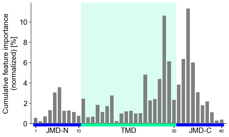
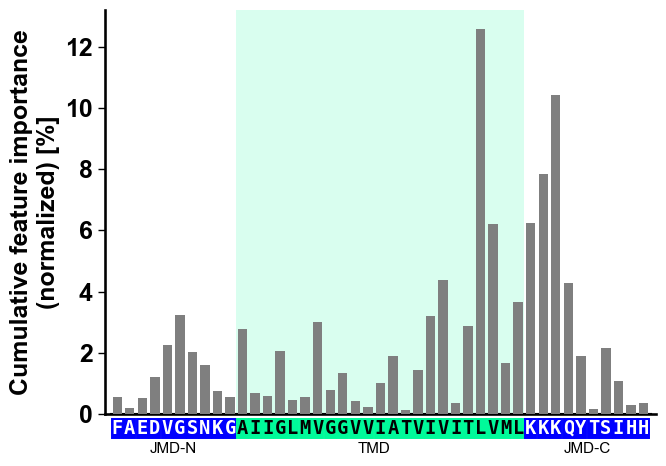
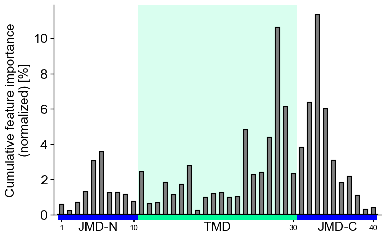
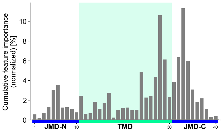
The group-level feature impact per residue position can be visualized by providing the
df_featDataFrame:# Plot CPP profile at group-level cpp_plot = aa.CPPPlot() aa.plot_settings() cpp_plot.profile(df_feat=df_feat) plt.tight_layout() plt.show()

You can show the number of features per residue position instead of the feature importance by setting
col_imp=None(default=‘feat_importance’):# Show number of features per position cpp_plot.profile(df_feat=df_feat, col_imp=None) plt.tight_layout() plt.show()

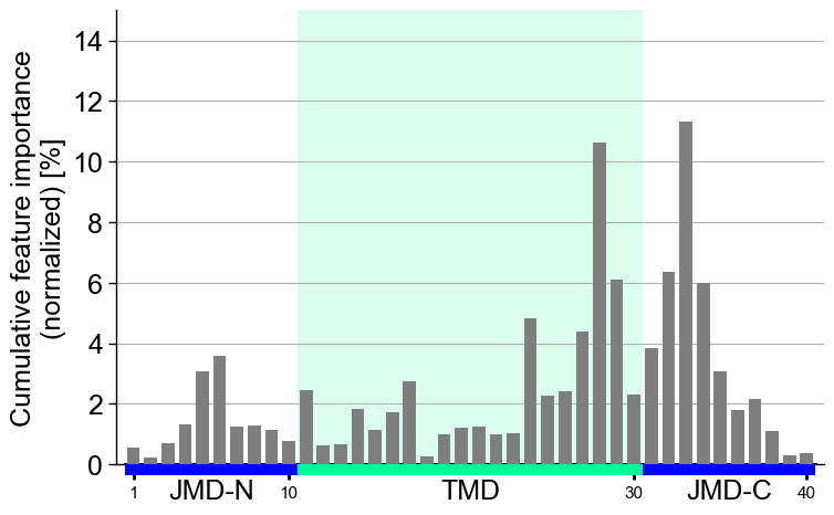
The feature importance displayed is normalized by default, meaning that all values sum up to a total of 100%. You can turn off this normalization by setting
normalize=False(default=‘True’), useful when showing a feature subset. We set a similarylimto keep the results comparable:# Show top 10 features df_top10 = df_feat.head(10) cpp_plot.profile(df_feat=df_top10, normalize=False, ylim=(0, 11)) plt.tight_layout() plt.show()
You can adjust the
figsize(default=(7, 5)),start(default=1) position, andtmd_len(default=20) as follows:# Increase width of figure, start at 11 position and double tmd length cpp_plot.profile(df_feat=df_feat, figsize=(8, 4), start=11, tmd_len=40) plt.tight_layout() plt.show()

Hold each per-position column at a fixed width with
cell_size(only the width applies to the single-row profile); the profile widens or narrows with the sequence length.# Fix the per-position column width (cell_size width; height ignored for the profile) cpp_plot.profile(df_feat=df_feat, cell_size=(0.16, 0.2)) plt.tight_layout() plt.show()
CPP Analysis (sample-level)
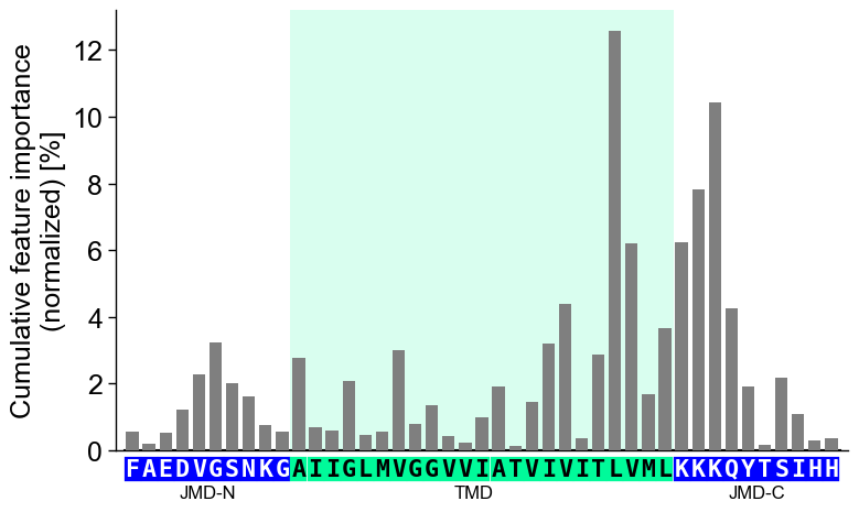
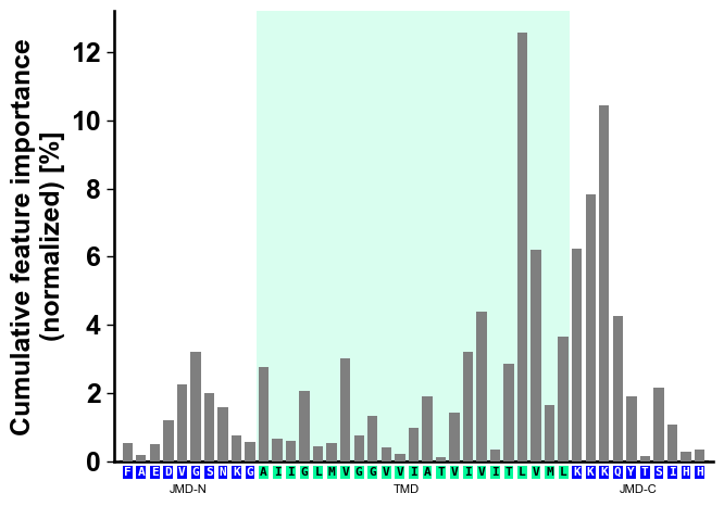
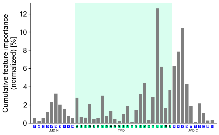
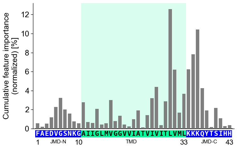
You can visualize how the general feature importance is translated onto the sequence of a specific sample. To this end, you need to provide the corresponding sequence parameters:
jmd_n_seq,tmd_seq, andjmd_c_seq:# Get sequence parts of first sample sf = aa.SequenceFeature() df_parts = sf.get_df_parts(df_seq=df_seq) seq_kws = sf.get_seq_kws(df_seq=df_seq, df_parts=df_parts, sample=0) jmd_n_seq, tmd_seq, jmd_c_seq = seq_kws["jmd_n_seq"], seq_kws["tmd_seq"], seq_kws["jmd_c_seq"] print("Sequence parts of first sample") print(seq_kws) # Plot CPP profile for first sample cpp_plot.profile(df_feat=df_feat, **seq_kws) plt.show()
Sequence parts of first sample
{'jmd_n_seq': 'FAEDVGSNKG', 'tmd_seq': 'AIIGLMVGGVVIATVIVITLVML', 'jmd_c_seq': 'KKKQYTSIHH'}

You can customize the following color parameters:
tmd_color(default=‘mediumspringgreen’),jmd_color(default=‘blue’),tmd_seq_color(default=‘black’), andjmd_seq_color(default=‘white’):# Change default TMD-JMD colors cpp_plot.profile(df_feat=df_feat, **seq_kws, tmd_color="orange", jmd_color="white", tmd_seq_color="blue", jmd_seq_color="blue") plt.show()
By default (
seq_size="auto") the residue letters are fit to the grid cell and stepped down for a short TMD; setverbose=Trueto see the chosen size. You can override it: a value in(0, 1]sets the letter height to that fraction of the cell (e.g.0.9), and a value> 1is an absolute font size in points.# seq_size accepts a cell-height fraction (<= 1) or an absolute point size (> 1) cpp_plot.profile(df_feat=df_feat, **seq_kws, seq_size=0.9) # 90% of the cell height plt.show() cpp_plot.profile(df_feat=df_feat, **seq_kws, seq_size=8) # 8 pt (absolute) plt.show()
However, this can lead to lead to non-optimal spacing between the sequence characters. Adjust the font size of the part labels (‘JMD-N’, ‘TMD’, ‘JMD-C’) by setting
fontsize_tmd_jmd, which is by default set to the optimized sequence size:cpp_plot.profile(df_feat=df_feat, **seq_kws, fontsize_tmd_jmd=11) plt.show()

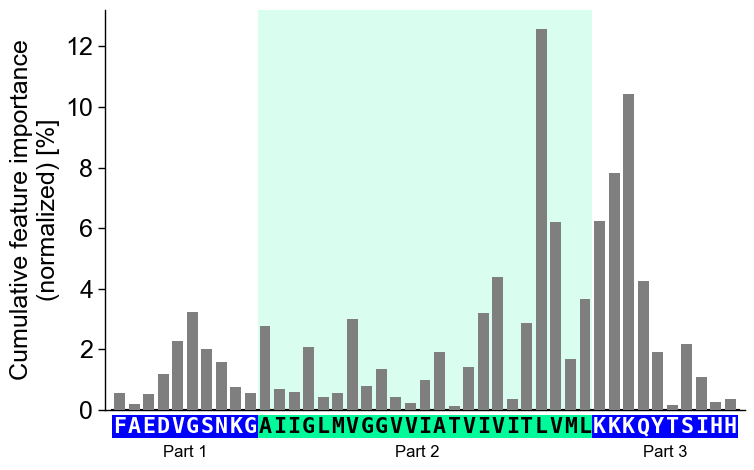
The part labels can only be changed globally using
optionsas follows:# Adjust part names globally aa.options["name_jmd_n"] = "Part 1" aa.options["name_tmd"] = "Part 2" aa.options["name_jmd_c"] = "Part 3" cpp_plot.profile(df_feat=df_feat, **seq_kws) plt.show()
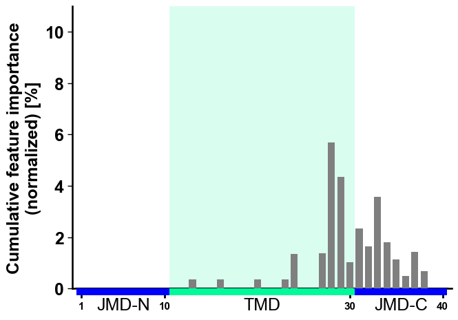
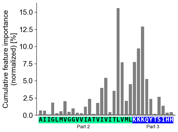
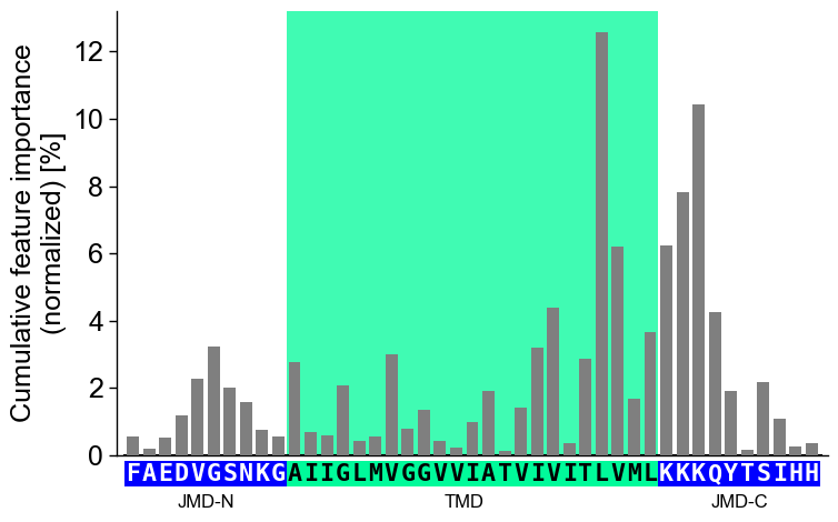
You can focus on only the Target Middle Domain (TMD) by setting the size of the JMDs to 0. Disable the highlight of the TMD by setting
highlight_tmd_area=False(default=True):# Show only features from TMD and JMD-N cpp_plot = aa.CPPPlot(jmd_n_len=0, jmd_c_len=10) mask = ~df_feat["feature"].str.contains("JMD_N") cpp_plot.profile(df_feat=df_feat[mask], tmd_seq=tmd_seq, jmd_c_seq=jmd_c_seq, highlight_tmd_area=False) plt.show()
Display the xtick positions in addition to the sequence by setting
add_xticks_pos=True(default=False):# Set parts back to default aa.options["name_jmd_n"] = "JMD-N" aa.options["name_tmd"] = "TMD" aa.options["name_jmd_c"] = "JMD-C" cpp_plot = aa.CPPPlot() cpp_plot.profile(df_feat=df_feat, **seq_kws, add_xticks_pos=True) plt.show()
Change the transparency of the TMD highlighting area using the
highlight_alpha(default=0.15) parameter:# Change transparency of TMD area cpp_plot.profile(df_feat=df_feat, **seq_kws, highlight_alpha=0.75) plt.show()
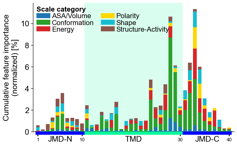
CPP Analysis
You can represent the scale category for each feature at each residue position as a stacked bar chart. To do this, set
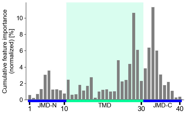
add_legend_cat, which also automatically includes the corresponding legend:# Add scale classification cpp_plot.profile(df_feat=df_feat, add_legend_cat=True) plt.show()
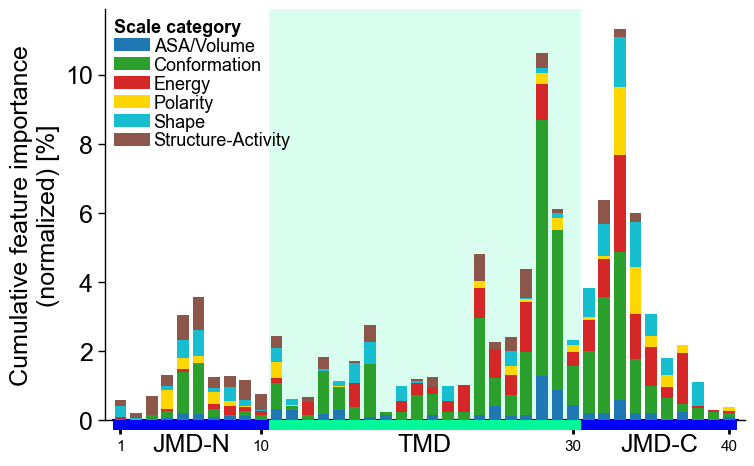
Adjust the legend by the
legend_kwsparameter:# Adjust legend, colors can be changed by 'dict_color' legend_kws = dict(n_cols=1, fontsize=13, fontsize_title=13) cpp_plot.profile(df_feat=df_feat, add_legend_cat=True, legend_kws=legend_kws) plt.show()
Adjust the
bar_width(default=0.75) and the baredge_color(dfault=None) as follows:# Make edges black cpp_plot.profile(df_feat=df_feat, bar_width=0.5, edge_color="black") plt.show()
Show
grid_axis(default=None, disabled) and setylim, as exemplified here:# Adjust ylim cpp_plot.profile(df_feat=df_feat, grid_axis="y", ylim=(0, 15)) plt.show()
Following x-tick parameters can be adjusted:
xtick_size(default=11.0),xtick_width(default=2.0),xtick_length(default=5.0):# Adjust x-ticks cpp_plot.profile(df_feat=df_feat, xtick_size=20, xtick_width=4, xtick_length=10) plt.show()
Or the following y-tick parameters:
ytick_size(adheres to global settings),ytick_width(default=2.0), andytick_length(default=5.0):# Modify y-ticks cpp_plot.profile(df_feat=df_feat, ytick_size=20, ytick_width=4, ytick_length=10) plt.show()
CPP-SHAP analysis
Set
shap_plot=Truefor visualizing the sample-specific feature impact instead of the overall feature importance. To demonstrate this, we create the feature matrix for the DOM_GSEC example dataset (see [Breimann25]) using theSequenceFeature().feature_matrix()method:# Create feature matrix sf = aa.SequenceFeature() df_parts = sf.get_df_parts(df_seq=df_seq) X = sf.feature_matrix(features=df_feat["feature"], df_parts=df_parts)
Next, we must include the feature impact into the
df_featfor all samples using theShapModelmodel:labels = df_seq["label"].to_list() # Fit SHAP explainer to obtain SHAP values sm = aa.ShapModel() sm.fit(X, labels=labels) # Include feature impact for all samples df_feat = sm.add_feat_impact(df_feat=df_feat, drop=True) aa.display_df(df_feat, n_rows=5, n_cols=15)
feature category subcategory scale_name scale_description abs_auc abs_mean_dif mean_dif std_test std_ref p_val_mann_whitney p_val_fdr_bh positions feat_impact_Protein0 feat_impact_Protein1 1 TMD_C_JMD_C-Seg...,11)-LIFS790102 Conformation β-strand β-strand Conformational ...n-Sander, 1979) 0.189000 0.125674 0.125674 0.183876 0.218813 0.000001 0.000039 28,29 3.260000 3.210000 2 TMD_C_JMD_C-Seg...2,3)-CHOP780212 Conformation β-sheet (C-term) β-turn (1st residue) Frequency of th...-Fasman, 1978b) 0.199000 0.065983 -0.065983 0.087814 0.105835 0.000000 0.000016 27,28,29,30,31,32,33 3.170000 3.310000 3 TMD_C_JMD_C-Seg...3,4)-HUTJ700102 Energy Entropy Entropy Absolute entrop...Hutchens, 1970) 0.229000 0.098224 0.098224 0.106865 0.124608 0.000000 0.000001 31,32,33,34,35 1.500000 2.070000 4 TMD_C_JMD_C-Seg...2,3)-AURR980110 Conformation α-helix α-helix (middle) Normalized posi...ora-Rose, 1998) 0.211000 0.077355 0.077355 0.102965 0.107453 0.000000 0.000005 27,28,29,30,31,32,33 2.900000 1.680000 5 TMD_C_JMD_C-Pat...4,8)-JANJ790102 Energy Free energy (unfolding) Transfer free e...(TFE) to inside Transfer free e...y (Janin, 1979) 0.187000 0.144354 -0.144354 0.181777 0.233103 0.000001 0.000049 33,37 1.420000 1.490000 Finally, we can visualize the feature impact for a selected sample by providing the respective column name in
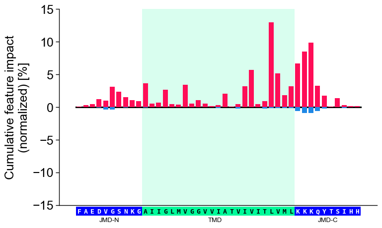
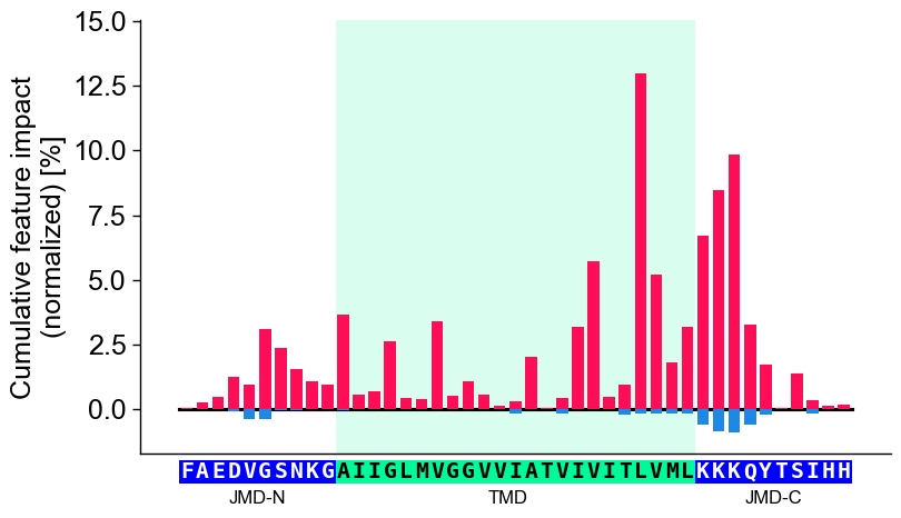
col_impand its sequence parameters together with settingshap_plot=True:# Plot CPP-SHAP profile for selected protein cpp_plot.profile(df_feat=df_feat, shap_plot=True, col_imp="feat_impact_Protein0", tmd_seq=tmd_seq, jmd_n_seq=jmd_n_seq, jmd_c_seq=jmd_c_seq) plt.show()

We recommend adjusting
ylimto ensure that 0 is centered in the middle of the y-axis:# Center y-axis cpp_plot.profile(df_feat=df_feat, shap_plot=True, col_imp="feat_impact_Protein0", tmd_seq=tmd_seq, jmd_n_seq=jmd_n_seq, jmd_c_seq=jmd_c_seq, ylim=(-15, 15)) plt.show()
Shortcut — the ``sample=`` parameter. As with the feature map,
sample=bundles the per-sample plumbing: it resolvescol_imp='feat_impact_<entry>', looks up the sample’s TMD-JMD parts, and setsshap_plot=True. It requires the impact column to be keyed by the entry name and bothdf_seqanddf_partsto resolve the parts. The explicit call and the shortcut are equivalent:# Name the per-sample impact column after the entry so the shortcut can resolve it entry = df_seq["entry"].iloc[0] df_feat = sm.add_feat_impact(df_feat=df_feat, samples=0, names=entry, drop=True) # Explicit: resolve the impact column and the TMD-JMD parts by hand seq_kws = sf.get_seq_kws(df_seq=df_seq, df_parts=df_parts, sample=0) cpp_plot.profile(df_feat=df_feat, shap_plot=True, col_imp=f"feat_impact_{entry}", **seq_kws) plt.tight_layout() plt.show() # Shortcut: sample= resolves col_imp, the sequence parts, and shap_plot=True cpp_plot.profile(df_feat=df_feat, sample_kws=dict(sample=entry, df_seq=df_seq, df_parts=df_parts)) plt.tight_layout() plt.show()

Further parameters.
CPPPlot.profilealso accepts:weight_tmd_jmd— Font weight for the part labels: ‘JMD-N’, ‘TMD’, ‘JMD-C’.# Further parameters: weight_tmd_jmd sets the font weight of the part labels (JMD-N, TMD, JMD-C) import matplotlib.pyplot as plt cpp_plot = aa.CPPPlot() df_feat_pf = aa.load_features(name="DOM_GSEC") cpp_plot.profile(df_feat=df_feat_pf, weight_tmd_jmd="bold") plt.tight_layout() plt.show()
# seq_char_fill controls how the residue sequence is drawn below the profile
cpp_plot.profile(df_feat=df_feat_pf, **seq_kws, seq_char_fill=False)  # per-residue box, small gap
plt.tight_layout()
plt.show()

cpp_plot.profile(df_feat=df_feat_pf, **seq_kws, seq_char_fill=True)  # continuous gap-free colored band
plt.tight_layout()
plt.show()