CPPPlot.feature_map
- CPPPlot.feature_map(df_feat, shap_plot=False, col_cat='subcategory', col_val='mean_dif', col_imp='feat_importance', name_test='TEST', name_ref='REF', figsize=None, cell_size=None, add_imp_bar_top=True, imp_bar_th=None, imp_bar_label_type='long', imp_ths=(0.2, 0.5, 1), imp_marker_sizes=(3, 5, 8), start=1, tmd_len=20, tmd_seq=None, jmd_n_seq=None, jmd_c_seq=None, tmd_color='mediumspringgreen', jmd_color='blue', tmd_seq_color='black', jmd_seq_color='white', seq_size='auto', fontsize_tmd_jmd=None, weight_tmd_jmd='normal', fontsize_titles=11, fontsize_labels=12, fontsize_annotations=11, fontsize_imp_bar=9, add_xticks_pos=False, grid_linewidth=0.01, grid_linecolor=None, border_linewidth=2, facecolor_dark=False, vmin=None, vmax=None, cmap=None, cmap_n_colors=101, cbar_pct=True, cbar_kws=None, cbar_xywh=(0.5, None, 0.2, None), dict_color=None, legend_kws=None, legend_xy=(-0.1, -0.01), legend_imp_xy=(1.25, 0), xtick_size=11.0, xtick_width=2.0, xtick_length=5.0, seq_char_fill=None, sample_kws=None)[source]
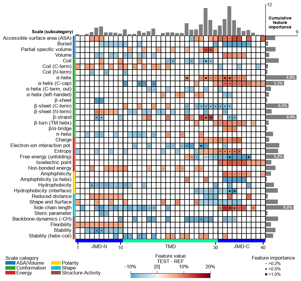
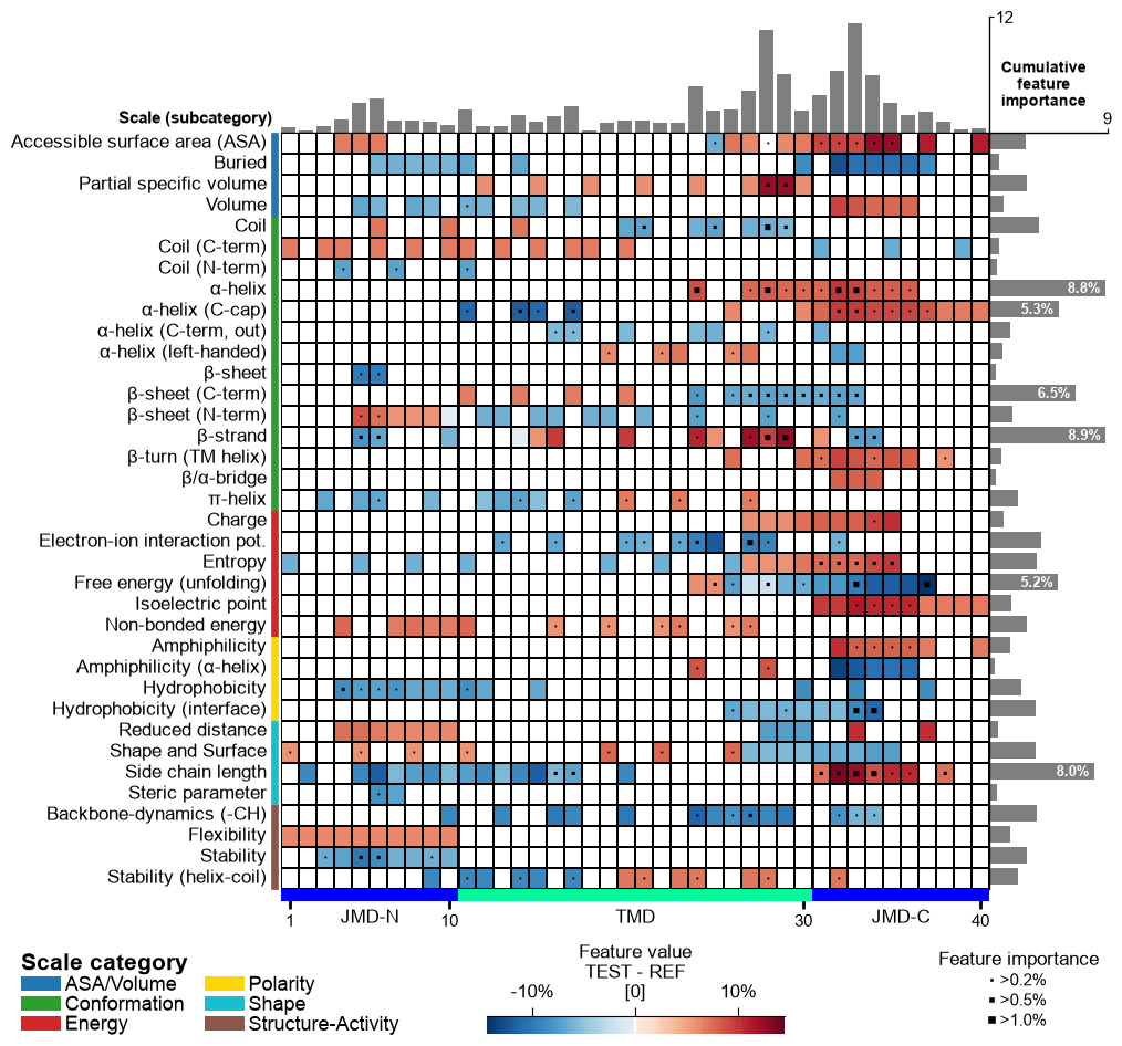
Plot Comparative Physicochemical Profiling (CPP) feature map showing feature value mean difference and feature importance per scale subcategory (y-axis) and residue position (x-axis).
Extends the heatmap layout by overlaying feature-importance markers on each cell and optionally adding cumulative importance bars at the top and right, providing a combined view of the direction and strength of each feature produced by
CPP.run(). At sample level (shap_plot=True) the cumulative bars stack the per-feature SHapley Additive exPlanations (SHAP) [Lundberg20] feature impact in one direction, colored by sign (positive in red, negative in blue) — the per-sample attribution obtained viaShapModel.Added in version 0.1.0.
- Parameters:
df_feat (pd.DataFrame, shape (n_feature, n_feature_info)) – Feature DataFrame with a unique identifier, scale information, statistics, and positions for each feature. Must also include a feature importance/impact column (
col_imp).shap_plot (bool, default=False) –
Set the analysis type: CPP Analysis (if
False) for group-level or CPP-SHAP Analysis for sample-level (or subgroup-level) results:CPP Analysis
col_imp: Refers to the group-level feat_importance column; markers and bars (gray) show the cumulative feature importance per position and scale subcategory.col_val: Displays the difference of feature values at group-level (mean_dif) or sample-level when a mean_dif_’name’ column is provided.
CPP-SHAP Analysis
col_imp: Selects the SHAP feature impact (per-sample attribution) from a feat_impact_’name’ column. The cumulative bars stack it in one direction colored by sign (positive in red, negative in blue), and the markers encodeabsimpact (magnitude).col_val: When a mean_dif_’name’ column is given, the heatmap shows the sample-level feature value difference and the impact bars are shown. When a feat_impact_’name’ column is given instead, the SHAP impact is shown directly in the heatmap (diverging colormap) and the cumulative bars are switched off.
Note
A sample-level map must be colored by a sample-specific difference, i.e. this one sample (protein) minus the reference group average, not by the group-level mean_dif (test group minus reference group). Compute it per sample with
ShapModel.add_sample_mean_dif()(which writes a mean_dif_’name’ column contrasting the selected sample against thelabel_refgroup) and pass that column ascol_val. Reusing the group-level mean_dif here would show the group signature under every sample’s SHAP impact instead of each protein’s own deviation. Setname_refto the reference group’s name (e.g."others") so the colorbar label matches.col_cat ({'category', 'subcategory', 'scale_name'}, default='subcategory') – Column name in
df_featfor scale information (y-axis).col_val ({‘mean_dif’, ‘abs_mean_dif’, ‘abs_auc’,
mean_dif_'name',feat_impact_'name'}, default=’mean_dif’) – Column name indf_featfor numerical values to display. Must match with theshap_plotsetting. For a sample-level (SHAP) map use a sample-specificmean_dif_'name'column (sample minus reference group, fromShapModel.add_sample_mean_dif()), not the group-level'mean_dif'.col_imp ({
feat_importance,feat_importance_'name',feat_impact_'name'}, default=’feat_importance’) – Column name indf_featfor feature importance (group-, subgroup- or sample-level) or, whenshap_plot=True, for sample-level feature impact. Must match with theshap_plotsetting.name_test (str, default="TEST") – Name for the test dataset.
name_ref (str, default="REF") – Name for the reference dataset.
figsize (tuple, optional) –
Figure dimensions (width, height) in inches. When
None(default) and the globalauto_fontoption is enabled (seeaaanalysis.options), the size is derived automatically from the grid shape (number of scale subcategories and residue positions). Any explicitfigsize(including(8, 8)) is honored as a fixed size and wins overauto_font— pass one to pin a predictable size (e.g. when embedding the figure). Withauto_fontdisabled,Nonefalls back to(8, 8).Changed in version 1.1.0: Auto-derived from the grid shape when
auto_fontis enabled andfigsizeis omitted (the figure now shrinks for a small grid as well as growing for a large one); an explicitfigsize(withoutcell_size) still wins.cell_size (tuple, optional) –
Target physical size
(width, height)in inches of one grid cell (a single residue position wide, a single subcategory row tall). When given, the figure is sized so every cell renders at this exact size — shrinking for a small grid and growing for a large one, with nothing clipping — regardless ofauto_font. WhenNone(default) theauto_fontpath uses a calibrated default cell.figsizeseeds the layout;cell_sizesets the cell.Added in version 1.1.0.
add_imp_bar_top (bool, default=True) – If
True, add bars for cumulative feature importance per position (top).imp_bar_th (int or float, optional) – Threshold for cumulative feature importance per scale (right bars). If
None, determined automatically.imp_bar_label_type ({'long', 'short', None} default='long') – Label type for cumulative feature importance bar chart. If
None, no label is shown.imp_ths (tuple, default=(0.2, 0.5, 1)) – Three ascending thresholds for feature importance (scale- and position-specific).
imp_marker_sizes (tuple, default=(3, 5, 8)) – Size of three feature importance markers defined by
imp_ths.start (int, default=1) – Position label of first residue position (starting at N-terminus).
tmd_len (int, default=20) – Length of target middle domain (TMD) to be depicted (>0). Must match with all feature from
df_feat.tmd_seq (str, optional) – TMD sequence for specific sample.
jmd_n_seq (str, optional) – Juxta middle domain (JMD) N-terminal sequence for specific sample. Length must match with ‘jmd_n_len’ attribute.
jmd_c_seq (str, optional) – JMD C-terminal sequence for specific sample. Length must match with ‘jmd_c_len’ attribute.
tmd_color (str, default='mediumspringgreen') – Color for TMD.
jmd_color (str, default='blue') – Color for JMDs.
tmd_seq_color (str, default='black') – Color for TMD sequence.
jmd_seq_color (str, default='white') – Color for JMD sequence.
seq_size (str, int, or float, optional) – Residue-letter size.
"auto"(default) fits the letters to the grid cell and steps the size down for short TMDs. A value in(0, 1]sets the letter height to that fraction of the cell height (e.g.0.9); a value> 1is an absolute font size in points. The"auto"and fractional modes keep the letters from overlapping; an absolute point size is used as given.fontsize_tmd_jmd (int or float, optional) – Font size (>=0) for the part labels: ‘JMD-N’, ‘TMD’, ‘JMD-C’. If
None, optimized automatically.weight_tmd_jmd ({'normal', 'bold'}, default='normal') – Font weight for the part labels: ‘JMD-N’, ‘TMD’, ‘JMD-C’.
fontsize_titles (int or float, default=11) – Font size (>= 0) for figure titles. If
None, determined automatically.fontsize_labels (str, int, or float, default=12) –
Font size (>= 0) for the figure labels (the scale-subcategory row labels, the scale-category legend, and the colorbar). A number sets the size directly (the default
12leaves the output unchanged)."auto"scales the size with theplot_settingsfont scale, caps it at about 13 pt, and shrinks it further if the subcategory rows would overlap, so the rows never collide.Changed in version 1.1.0: Accepts
"auto"to track theplot_settingsfont scale without row overlap.fontsize_annotations (int or float, default=11) – Font size (>= 0) for figure annotations. If
None, determined automatically.fontsize_imp_bar (int or float, default=9) – Font size (>= 0) for feature importance in bars. If
None, determined automatically.add_xticks_pos (bool, default=False) – If
True, include x-tick positions when TMD-JMD sequence is given.grid_linewidth (int or float, default=0.01) – Line width for the grid.
grid_linecolor (str, optional) – Color for the grid lines. If
None, automatically determined based onfacecolor_dark.border_linewidth (int or float, default=2) – Line width for the TMD-JMD border.
facecolor_dark (bool, default=False) – Sets background of the feature map to black (if
True) or white. Affects grid cells for missing or near-zero data based oncol_val.vmin (int or float, optional) – Minimum
col_valvalue setting the lower end of the colormap. IfNone, determined automatically.vmax (int or float, optional) – Maximum
col_valvalue setting the upper end of the colormap. IfNone, determined automatically.cmap (matplotlib colormap name or object, optional) – Name of the colormap to use. If
None, automatically determinedcol_valdata and ‘shap_plot’ setting.cmap_n_colors (int, default=101) – Number of discrete steps (>1) in diverging or sequential colormap.
cbar_pct (bool, default=True) – If
True, colorbar is represented in percentage and thecol_valvalues are converted accordingly by multiplying with 100 if necessary.cbar_kws (dict of key, value mappings, optional) – Keyword arguments for colorbar passed to
matplotlib.figure.Figure.colorbar().cbar_xywh (tuple, default=(0.5, None, 0.2, None)) – Colorbar position and size: x-axis (left), y-axis (bottom), width, height. Values are optimized if
None.dict_color (dict, optional) – Color dictionary of scale categories classifying scales shown on y-axis. Default from
plot_get_cdict()withname='DICT_CAT'.legend_kws (dict, optional) – Keyword arguments for the legend passed to
plot_legend().legend_xy (tuple, default=(-0.1, -0.01)) – Position for scale category legend: x- and y-axis coordinates. Values are set to default if
None.legend_imp_xy (tuple, default=(1.25, 0)) – Position for feature importance legend: x- and y-axis coordinates (relative to cbar).
xtick_size (int or float, default=11.0) – Size of x-tick labels (>0).
xtick_width (int or float, default=2.0) – Width of the x-ticks (>0).
xtick_length (int or float, default=5.0) – Length of the x-ticks (>0).
seq_char_fill (bool, optional) –
If
True, the sequence renders as a continuous, gap-free colored band (one full-width cell per residue) with the letters drawn on top. IfFalse, each residue gets its own glyph-sized colored box. IfNone(default), follows theauto_fontoption: on when auto-sizing is enabled, off otherwise (so theauto_font=Falseoutput stays unchanged).Changed in version 1.1.0: Now defaults to
True(edge-to-edge residue characters).sample_kws (dict, optional) – Structured bundle selecting one sample for a sample-level CPP-SHAP feature map — the bundled alternative to providing the TMD-JMD sequences directly. Fixed keys:
sample(anentryname orname-column valuestr, or a row-positionint),df_seqanddf_parts. When given,col_impis resolved tofeat_impact_<entry>(an int position is mapped to its entry name viadf_parts), the TMD-JMD sequence parts are read fromdf_partsviaSequenceFeature.get_seq_kws(), andshap_plotis set toTrueautomatically. It overrides any explicitly passedtmd_seq/jmd_n_seq/jmd_c_seq. Because the displayed sequence must stay faithful to thedf_partsthe features map to, the sequence’s own lengths set the grid geometry;tmd_len/jmd_n_len/jmd_c_lenapply only when no sequence is shown. See the keyword-dict parameters overview.
- Returns:
fig (Figure) – The Figure object for the CPP feature map.
ax (Axes) – Axes object for the CPP feature map.
Notes
tmd_seq_colorandjmd_seq_colorare applicable only whentmd_seq,jmd_n_seq, andjmd_c_seqare provided.The returned figure is self-contained: the scale-category legend, the “Feature value” colorbar and the feature-importance legend are arranged automatically below the grid. The method manages its own layout, so calling
plt.tight_layout()afterwards is unnecessary (it is neutralized on the returned figure to keep this furniture from being pulled back onto the heatmap);fig.savefig(..., bbox_inches="tight")andplt.show()work as usual.See also
CPP.run()for details on CPP statistical measures of thedf_featDataFrame.SequenceFeaturefor definition of sequenceParts.CPPPlot.feature()for visualization of mean differences for specific features.ShapModelfor obtaining the sample-levelfeat_impact_'name'columns shown whenshap_plot=True.seaborn.heatmap()for seaborn heatmap.matplotlib.figure.Figure.colorbar()for colorbar arguments.Matplotlib Colormaps for further
cmapoptions.plot_legend()used for setting scale category legend.
Examples
To demonstrate the
CPPPlot().feature_map()method, we first load the exampleDOM_GSECdataset and its respective features (see [Breimann25]):import matplotlib.pyplot as plt import aaanalysis as aa aa.options["verbose"] = False df_seq = aa.load_dataset(name="DOM_GSEC") df_feat = aa.load_features(name="DOM_GSEC") df_feat = df_feat.sort_values(by="feat_importance", ascending=False).reset_index(drop=True) aa.display_df(df_feat, show_shape=True, n_rows=7)
DataFrame shape: (150, 15)
feature category subcategory scale_name scale_description abs_auc abs_mean_dif mean_dif std_test std_ref p_val_mann_whitney p_val_fdr_bh positions feat_importance feat_importance_std 1 TMD_C_JMD_C-Seg...,11)-LIFS790102 Conformation β-strand β-strand Conformational ...n-Sander, 1979) 0.189000 0.125674 0.125674 0.183876 0.218813 0.000001 0.000039 28,29 4.729200 4.776785 2 TMD_C_JMD_C-Seg...2,3)-CHOP780212 Conformation β-sheet (C-term) β-turn (1st residue) Frequency of th...-Fasman, 1978b) 0.199000 0.065983 -0.065983 0.087814 0.105835 0.000000 0.000016 27,28,29,30,31,32,33 4.106000 5.236574 3 TMD_C_JMD_C-Seg...3,4)-HUTJ700102 Energy Entropy Entropy Absolute entrop...Hutchens, 1970) 0.229000 0.098224 0.098224 0.106865 0.124608 0.000000 0.000001 31,32,33,34,35 3.111200 3.109955 4 TMD_C_JMD_C-Seg...2,3)-AURR980110 Conformation α-helix α-helix (middle) Normalized posi...ora-Rose, 1998) 0.211000 0.077355 0.077355 0.102965 0.107453 0.000000 0.000005 27,28,29,30,31,32,33 3.048800 3.623912 5 TMD_C_JMD_C-Pat...4,8)-JANJ790102 Energy Free energy (unfolding) Transfer free e...(TFE) to inside Transfer free e...y (Janin, 1979) 0.187000 0.144354 -0.144354 0.181777 0.233103 0.000001 0.000049 33,37 2.833600 3.640617 6 TMD_C_JMD_C-Pat...4,8)-KANM800103 Conformation α-helix α-helix Average relativ...sa-Tsong, 1980) 0.176000 0.087846 0.087846 0.140464 0.157561 0.000004 0.000113 24,28 2.704000 4.076269 7 TMD_C_JMD_C-Pat...,10)-LEVM760105 Shape Side chain length Side chain length Radius of gyrat... (Levitt, 1976) 0.149000 0.073526 0.073526 0.133612 0.157088 0.000090 0.000714 31,34,38 2.050800 2.338278 CPP Analysis (group-level)
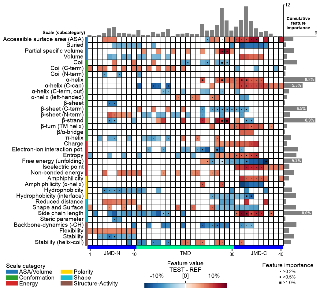
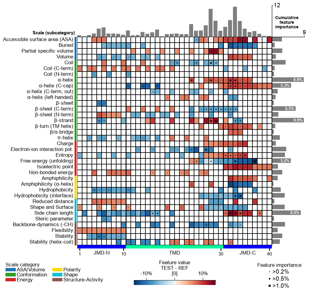
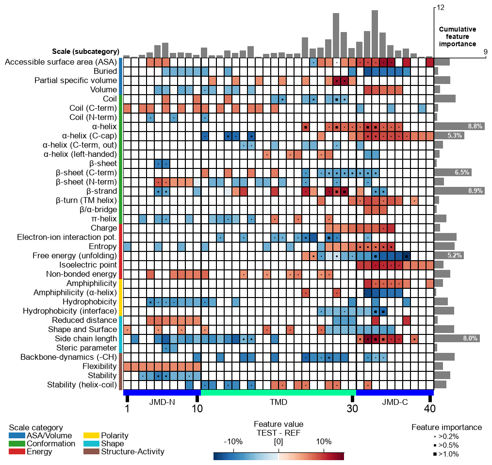
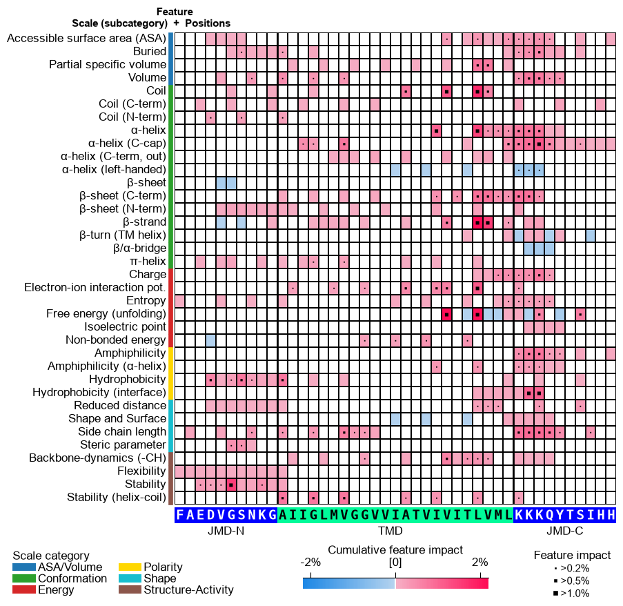
The group-level feature value difference per scale subcategory (y-axis) and residue position (x-axis) can be visualized by providing the
df_featDataFrame:# Plot CPP feature map at group-level (as originally introduced without feature importance bars on top) cpp_plot = aa.CPPPlot() aa.plot_settings(font_scale=0.7, weight_bold=False) cpp_plot.feature_map(df_feat=df_feat, add_imp_bar_top=False) plt.show()

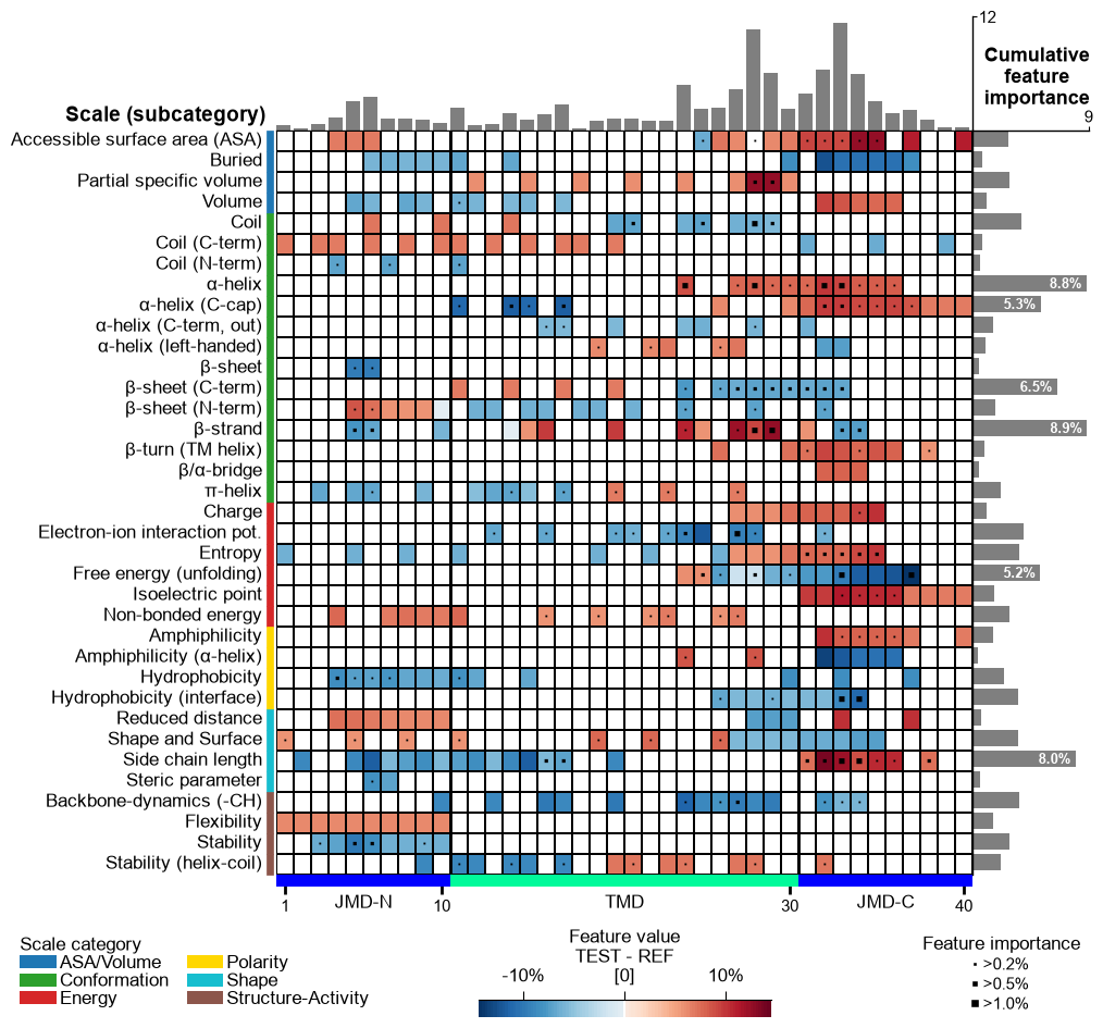
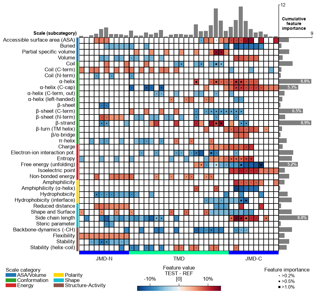
Version 1.0.2 introduced an enhanced CPP feature map that includes cumulative feature importance per residue, shown as a bar plot above the heatmap. This feature is enabled by default and can be disabled by setting
add_imp_bar_top=False(shown before).# Plot CPP feature map (v1.0.2+: with importance bars on top) aa.plot_settings(font_scale=0.7, weight_bold=False) cpp_plot.feature_map(df_feat=df_feat) plt.show()

You can select a subset of features by filtering
df_feat:# Plot top 15 features df_top15 = df_feat.head(15) cpp_plot.feature_map(df_feat=df_top15) plt.show()

Adjust the scale classification level (y-axis) using the
col_catparameter. Choose from the ‘category’, ‘subcategory’ (default), and ‘scale_name’ columns from thedf_feat:# Show feature map with scales classified by categories cpp_plot.feature_map(df_feat=df_feat, col_cat="category") plt.show()

The numerical value shown in the feature map can be adjusted by the
col_valparameter, which specifies one of the followingdf_featcolumns: ‘mean_dif’ (default), ‘abs_mean_dif’, ‘abs_auc’, or ‘feat_importance’:# Show feature map with absolute feature value difference cpp_plot.feature_map(df_feat=df_feat, col_val="abs_mean_dif") plt.show()

Adjust the names of the test and reference datasets using the
name_test(default=‘TEST’) andname_ref(default=‘REF’) parameters:# Adjust dataset names shown in colorbar cpp_plot.feature_map(df_feat=df_feat, name_test="Target group", name_ref="Control group") plt.show()

To visualize a subset of features, adjust the
figsize(default=(8, 8)). Change the annotation threshold for the cumulative feature importance (right bar chart) using theimp_bar_thparameter and the respective fontsize using thefontsize_imp_bar(default=9):# Show only top 15 features df_top15 = df_feat.head(15) cpp_plot.feature_map(df_feat=df_top15, figsize=(8, 4), imp_bar_th=7, fontsize_imp_bar=8) plt.show()

Hold each grid cell at a fixed physical size with
cell_size(width, height in inches). The figure then shrinks or grows to fit the grid, so the cells — and the sequence letters sized to them — stay consistent for any number of subcategories or residue positions.# Fix the grid cell size (width, height in inches) cpp_plot.feature_map(df_feat=df_feat, cell_size=(0.16, 0.2)) plt.tight_layout() plt.show()

You can adjust the
startposition and thetmd_len(default=20) by providing them as parameters. Change the length of thejmd_nandjmd_cusing theCPPPlotobject.# Start at residue position 10 and adjust the length each part cpp_plot = aa.CPPPlot(jmd_n_len=15, jmd_c_len=15) cpp_plot.feature_map(df_feat=df_feat, start=10, tmd_len=30) plt.show()

CPP Analysis (sample-level)
You can visualize how the general feature value difference is translated onto the sequence of a specific sample. To this end, you need to provide the corresponding sequence parameters:
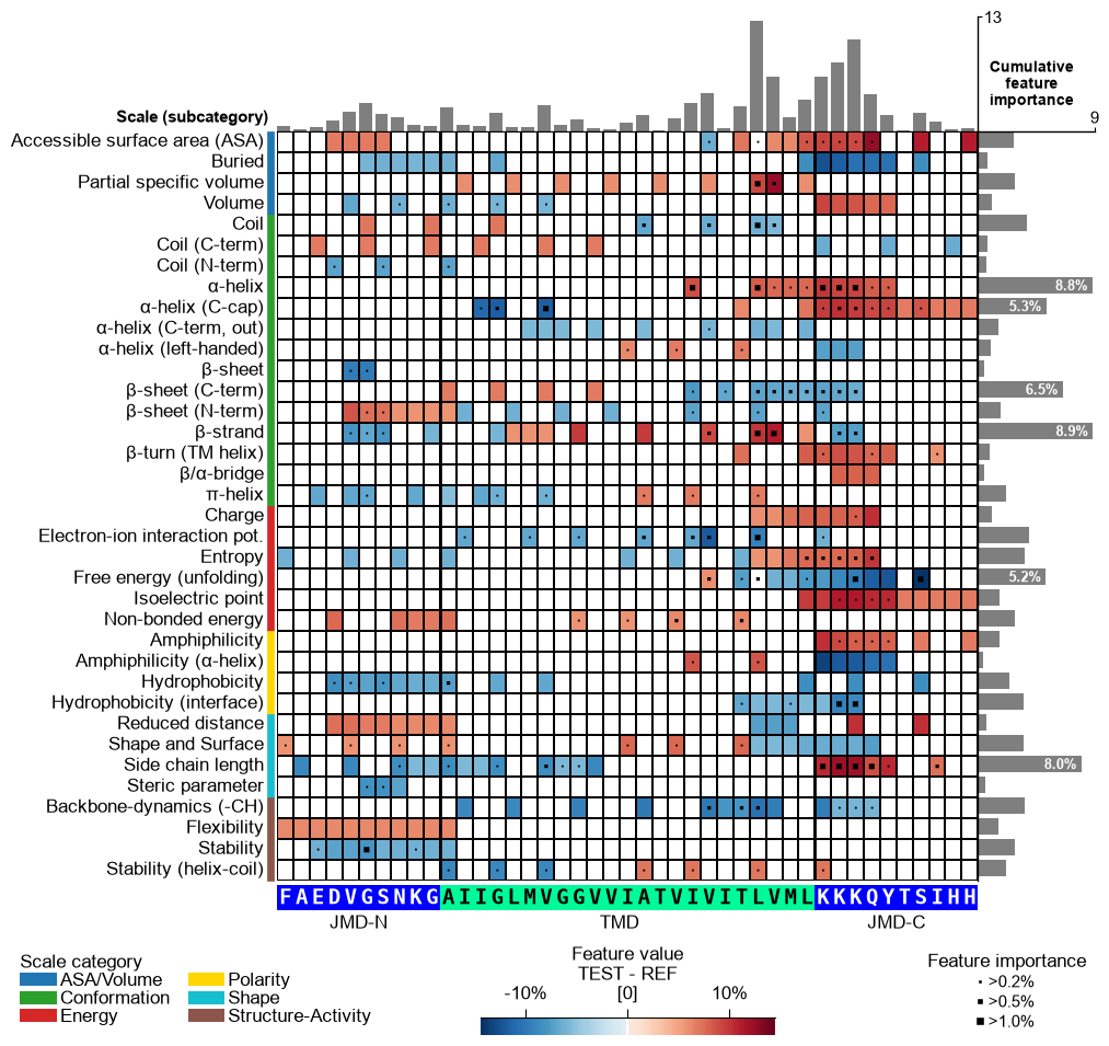
jmd_n_seq,tmd_seq, andjmd_c_seq:# Get sequence parts of first sample cpp_plot = aa.CPPPlot() sf = aa.SequenceFeature() df_parts = sf.get_df_parts(df_seq=df_seq) seq_kws = sf.get_seq_kws(df_seq=df_seq, df_parts=df_parts, sample=0) jmd_n_seq, tmd_seq, jmd_c_seq = seq_kws["jmd_n_seq"], seq_kws["tmd_seq"], seq_kws["jmd_c_seq"] print("Sequence parts of first sample") print(seq_kws) # Plot CPP profile for first sample cpp_plot.feature_map(df_feat=df_feat, **seq_kws) plt.show()
Sequence parts of first sample
{'jmd_n_seq': 'FAEDVGSNKG', 'tmd_seq': 'AIIGLMVGGVVIATVIVITLVML', 'jmd_c_seq': 'KKKQYTSIHH'}
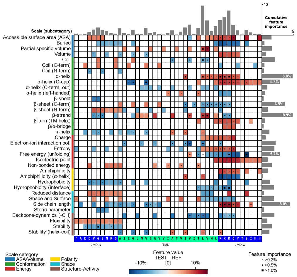
You can customize the following color parameters:
tmd_color(default=‘mediumspringgreen’),jmd_color(default=‘blue’),tmd_seq_color(default=‘black’), andjmd_seq_color(default=‘white’):# Change default TMD-JMD colors cpp_plot.feature_map(df_feat=df_feat, **seq_kws, tmd_color="orange", jmd_color="white", tmd_seq_color="blue", jmd_seq_color="blue") plt.show()

By default (
seq_size="auto") the residue letters are fit to the grid cell and stepped down for a short TMD; setverbose=Trueto see the chosen size. You can override it: a value in(0, 1]sets the letter height to that fraction of the cell (e.g.0.9), and a value> 1is an absolute font size in points.# seq_size accepts a cell-height fraction (<= 1) or an absolute point size (> 1) cpp_plot.feature_map(df_feat=df_feat, **seq_kws, seq_size=0.9) # 90% of the cell height plt.show() cpp_plot.feature_map(df_feat=df_feat, **seq_kws, seq_size=8) # 8 pt (absolute) plt.show()

This might result in suboptimal spacing among sequence characters. Adjust the font size of the part labels (‘JMD-N’, ‘TMD’, ‘JMD-C’) using
fontsize_tmd_jmd, which is set by default to the optimized sequence size. Change its weight usingweight_tmd_jmd(default=‘normal’)# Adjust the fontsize of the TMD-JMD characters cpp_plot.feature_map(df_feat=df_feat, **seq_kws, fontsize_tmd_jmd=16, weight_tmd_jmd="bold") plt.show()

Display the xtick positions in addition to the sequence by setting
add_xticks_pos=True(default=False):# Add the xticks indicating the sequence positions cpp_plot.feature_map(df_feat=df_feat, **seq_kws, add_xticks_pos=True) plt.show()

CPP Analysis
Use
fontsize_labels(default12) to set the size of the figure labels: the scale-subcategory row labels, the scale-category legend, and the colorbar. Pass a number, or"auto"to track theplot_settingsfont scale (capped so the subcategory rows never overlap):# Modify label size of legends and colorbar cpp_plot.feature_map(df_feat=df_feat, fontsize_labels=14) plt.show()
Change the fontsize of the titles (feature information on upper part of feature map) using
fontsize_titles(default=11):# Modify fontsize feature titles cpp_plot.feature_map(df_feat=df_feat, fontsize_titles=14) plt.show()
The fontsize of the feature importance percentages (excluding color bar) can be changed using the
fontsize_annotations(default=11) parameter:# Modify fontsize feature importance annotations cpp_plot.feature_map(df_feat=df_feat, fontsize_annotations=14) plt.show()
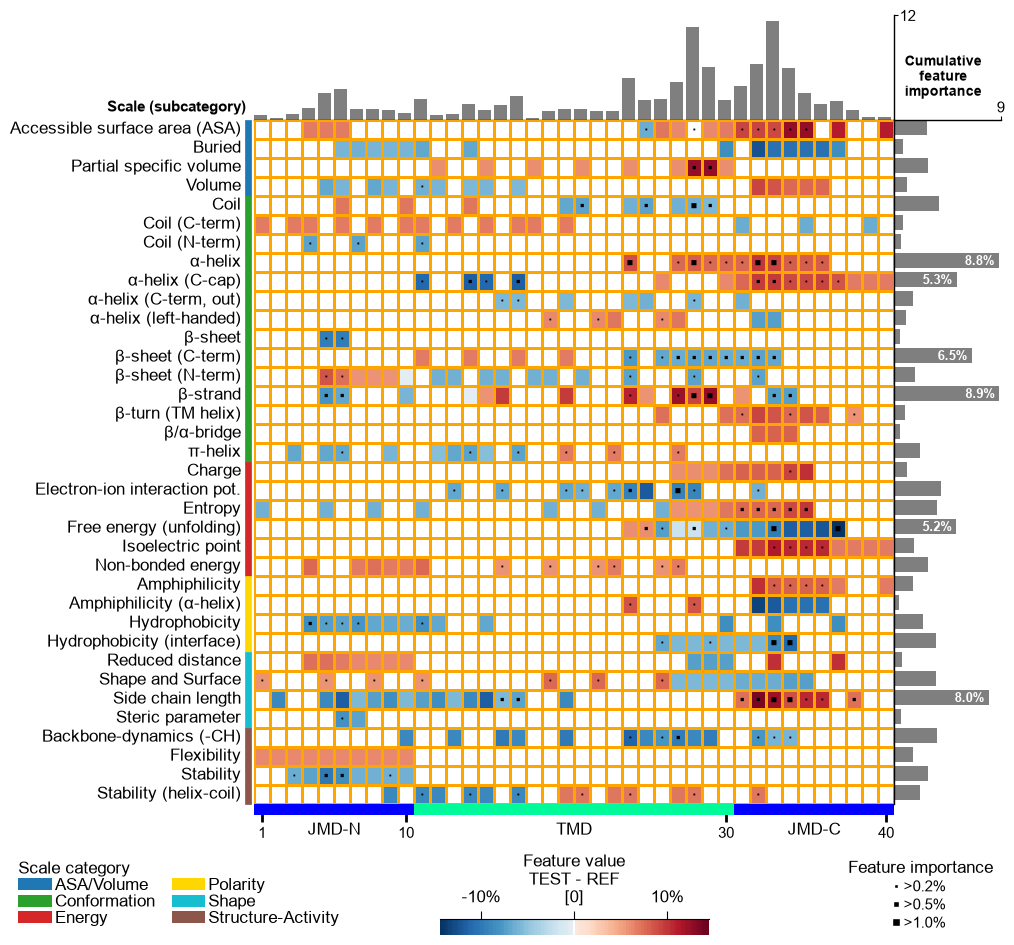
Adjust the feature map grid using the
grid_linewidth(default=0.01) andgrid_linecolor(set by default based onfacecolor_dark) parameters:# Adjust feature map grid cpp_plot.feature_map(df_feat=df_feat, grid_linewidth=1, grid_linecolor="orange") plt.show()
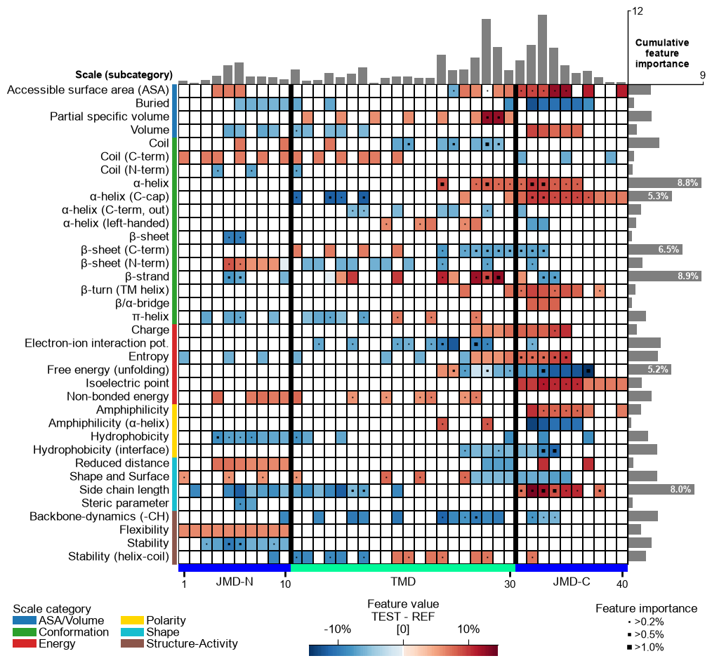
The TMD part borders are highlighted by an extra line, which width can be customized by
border_linewidth(default=2):# Increase width of TMD border cpp_plot.feature_map(df_feat=df_feat, border_linewidth=5) plt.show()
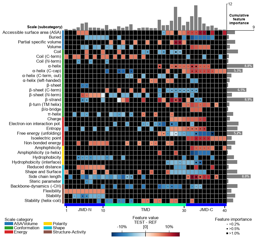
The background is set automatically basd on
shap_plot. You can set it to black byfacecolor_dark=True:# Set background to black cpp_plot.feature_map(df_feat=df_feat, facecolor_dark=True) plt.show()
Adjust the lower and upper end of the colormap using the
vminandvmaxparameters:# Change minimum and maximum values cpp_plot.feature_map(df_feat=df_feat, vmin=-10, vmax=20) plt.show()
You can provide any colormap from Matplotlib Colormaps using the
cmapparameter. The number of discrete steps can be adjusted bycmap_n_colors(default=101):# Use matplotlib color map with 7 color steps cpp_plot.feature_map(df_feat=df_feat, cmap="viridis", cmap_n_colors=7) plt.show()
Customize the colorbar using
cbar_kws. You can adjust its position (x-axis, y-axis), width, and height bycbar_xywh(default=(0.7, None, 0.2, None)), where default values are adopted ifNoneis provided. The position of the feature importance legend is set by thelegend_imp_xyparameter relative to the color bar:# Change colorbar title, position, width and height cbar_kws = dict(orientation="vertical") fig, ax = cpp_plot.feature_map(df_feat=df_feat, cbar_kws=cbar_kws, cbar_xywh=(0.88, 0.25, 0.01, 0.5), legend_imp_xy=(1, -0.3)) # Plot must be adjusted by plt.subplots_adjust and not by plt.tight_layout plt.subplots_adjust(right=0.84) plt.show()
Change the thresholds of the feature importance to be highlighted using the
imp_ths(default=(0.2, 0.5, 1). The respective marker size can be adjusted using theimp_marker_sizes(default=(3, 5, 8)) parameter:# Change threshold for highlighting feature importance cpp_plot.feature_map(df_feat=df_feat, imp_ths=(0.2, 1, 2), imp_marker_sizes=(2, 6, 10)) plt.show()

Adjust the scale legend by the
legend_kwsparameter and its position usinglegend_xy(default=(-0.1, -0.01)):# Adjust legend, colors can be changed by 'dict_color' legend_kws = dict(fontsize=13, fontsize_title=15, weight_title="bold") cpp_plot.feature_map(df_feat=df_feat, legend_kws=legend_kws, legend_xy=(None, 0.05)) plt.show()
Following x-tick parameters can be adjusted: xtick_size (default=11.0), xtick_width (default=2.0), and xtick_length (default=5.0):
# Adjust x-ticks
cpp_plot.feature_map(df_feat=df_feat, xtick_size=16, xtick_width=5, xtick_length=10)
plt.show()
X-ticks can be removed setting
xtick_size=0:# Remove x-ticks cpp_plot.feature_map(df_feat=df_feat, xtick_size=0) plt.show()
CPP Analysis (sample-level)
To visualize the sample-specific feature value difference, we create the feature matrix for the DOM_GSEC example dataset (see [Breimann25]) using the
SequenceFeature().feature_matrix()method:# Create feature matrix sf = aa.SequenceFeature() df_parts = sf.get_df_parts(df_seq=df_seq) X = sf.feature_matrix(features=df_feat["feature"], df_parts=df_parts)
/Users/stephanbreimann/Programming/1Packages/wt-410-dataset-metadata/aaanalysis/feature_engineering/_backend/cpp_run.py:164: UserWarning: CPP is using the Python kernel fallback — the compiled Cython extension is not available in this install. Output is bit-exact with the Cython path but ~2x slower. Reinstall via pip install --force-reinstall aaanalysis to fetch a prebuilt wheel.
  warnings.warn(
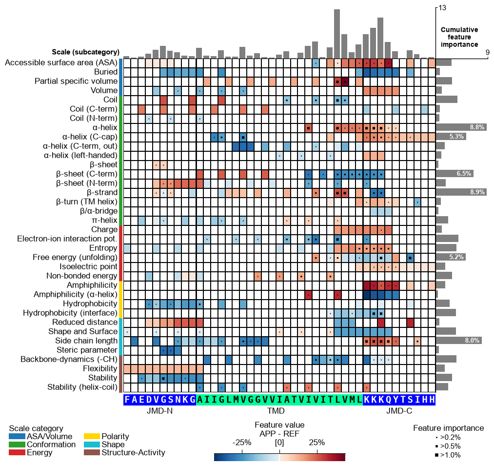
We now focus on a single sample, the Amyloid Precursor Protein (APP, UniProt
P05067) — the prototypical γ-secretase substrate and first entry of theDOM_GSECdataset. Using theShapModel, we add its sample-specific feature value difference (mean_dif_'name') todf_featby passingsample_positionsandnames:# Add the sample-specific feature value difference for APP (sample 0) vs the reference set labels = df_seq["label"].to_list() sm = aa.ShapModel() df_feat = sm.add_sample_mean_dif(X, labels=labels, df_feat=df_feat, samples=0, names="APP") aa.display_df(df_feat, n_rows=5, n_cols=15, show_shape=True)
DataFrame shape: (150, 16)
feature category subcategory scale_name scale_description abs_auc abs_mean_dif mean_dif std_test std_ref p_val_mann_whitney p_val_fdr_bh positions feat_importance feat_importance_std 1 TMD_C_JMD_C-Seg...,11)-LIFS790102 Conformation β-strand β-strand Conformational ...n-Sander, 1979) 0.189000 0.125674 0.125674 0.183876 0.218813 0.000001 0.000039 28,29 4.729200 4.776785 2 TMD_C_JMD_C-Seg...2,3)-CHOP780212 Conformation β-sheet (C-term) β-turn (1st residue) Frequency of th...-Fasman, 1978b) 0.199000 0.065983 -0.065983 0.087814 0.105835 0.000000 0.000016 27,28,29,30,31,32,33 4.106000 5.236574 3 TMD_C_JMD_C-Seg...3,4)-HUTJ700102 Energy Entropy Entropy Absolute entrop...Hutchens, 1970) 0.229000 0.098224 0.098224 0.106865 0.124608 0.000000 0.000001 31,32,33,34,35 3.111200 3.109955 4 TMD_C_JMD_C-Seg...2,3)-AURR980110 Conformation α-helix α-helix (middle) Normalized posi...ora-Rose, 1998) 0.211000 0.077355 0.077355 0.102965 0.107453 0.000000 0.000005 27,28,29,30,31,32,33 3.048800 3.623912 5 TMD_C_JMD_C-Pat...4,8)-JANJ790102 Energy Free energy (unfolding) Transfer free e...(TFE) to inside Transfer free e...y (Janin, 1979) 0.187000 0.144354 -0.144354 0.181777 0.233103 0.000001 0.000049 33,37 2.833600 3.640617 Option 1 — APP’s feature value difference. Provide APP’s
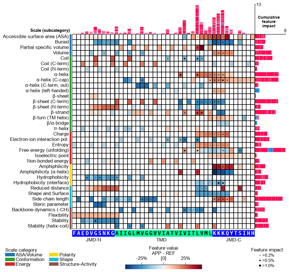
mean_dif_APPcolumn incol_valtogether with the sequence parameters to see how the feature value difference maps onto APP’s sequence (shap_plot=False). The bars and markers here still use the defaultfeat_importancecolumn, which is the dataset-wide (global) feature importance — not APP-specific. Options 2 and 3 below make the bars APP-specific.# Option 1: APP feature value difference (heatmap = mean_dif_APP; bars = global feat_importance) seq_kws = sf.get_seq_kws(df_seq=df_seq, df_parts=df_parts, sample=0) cpp_plot.feature_map(df_feat=df_feat, col_val="mean_dif_APP", name_test="APP", **seq_kws) plt.show()
CPP-SHAP Analysis (sample-level). To make the bars APP-specific, fit the
ShapModelexplainer and add APP’s signed feature impact (feat_impact_APP) todf_feat— the per-sample SHapley Additive exPlanations (SHAP) [Lundberg20]_ attribution. We keepdrop=Falseso the group-levelfeat_importancecolumn stays available for comparison:# Fit SHAP explainer and add APP's per-sample feature impact (keep the global feat_importance) sm.fit(X, labels=labels) df_feat = sm.add_feat_impact(df_feat=df_feat, samples=0, names="APP", drop=False)
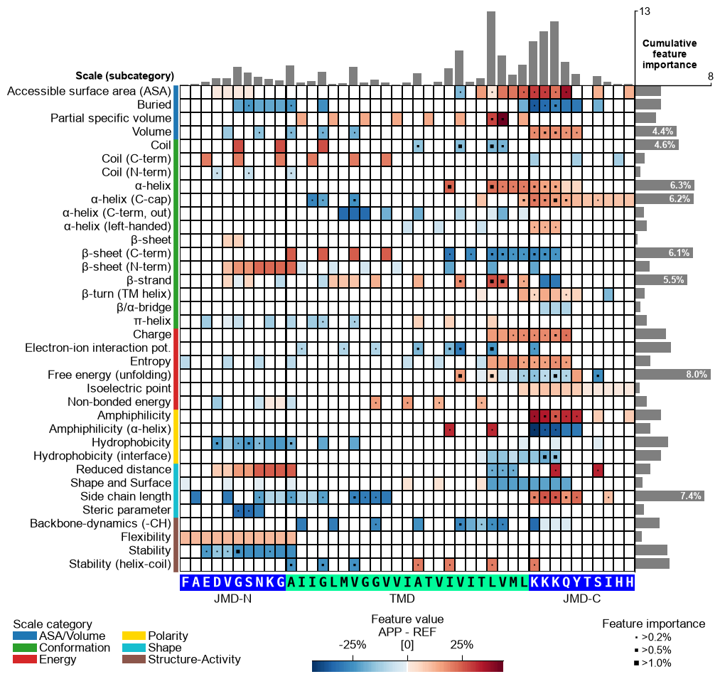
Option 2 — feature value difference + APP’s own importance. A sample’s importance is the magnitude of its impact,
abs(feat_impact_APP). Deriving it and passing it viacol_imp(withshap_plot=False) shows APP’s own cumulative importance — the correct sample-level counterpart to Option 1’s globalfeat_importance. This is the recommended way to show a single sample’s importance when you do not want the signed bars: impact → importance.# Option 2: a sample's importance is its absolute (unsigned) feature impact df_feat["feat_importance_APP"] = df_feat["feat_impact_APP"].abs() cpp_plot.feature_map(df_feat=df_feat, col_val="mean_dif_APP", col_imp="feat_importance_APP", name_test="APP", **seq_kws) plt.show()
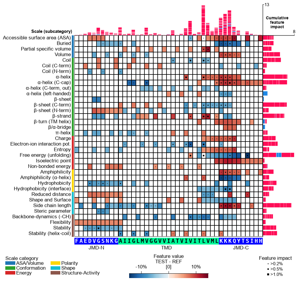
Option 3 — feature value difference + signed SHAP impact. Setting
shap_plot=Truewithcol_imp="feat_impact_APP"keeps the samemean_dif_APPheatmap but stacks the signed impact per feature in the bars (positive in red, negative in blue); the markers encode the absolute impact (magnitude):# Option 3: signed SHAP feature impact (stacked +/- bars), mean-difference heatmap cpp_plot.feature_map(df_feat=df_feat, shap_plot=True, col_val="mean_dif_APP", col_imp="feat_impact_APP", name_test="APP", **seq_kws) plt.show()
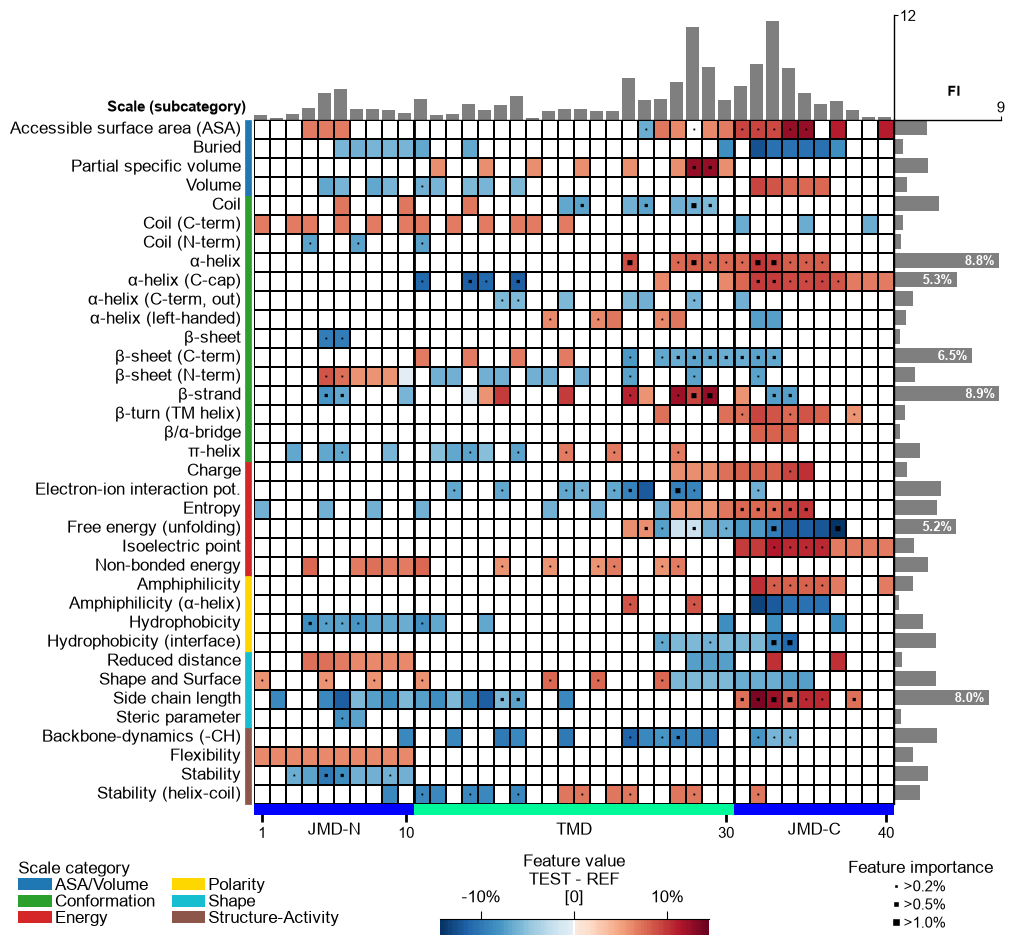
As a further variant, pass a
feat_impact_'name'column incol_valto show APP’s SHAP feature impact directly in the heatmap (diverging SHAP colormap). In this case the cumulative-impact bars are switched off, since the impact is already encoded in the cells:# Plot CPP-SHAP feature map for APP with the impact shown in the heatmap (bars off) cpp_plot.feature_map(df_feat=df_feat, shap_plot=True, col_val="feat_impact_APP", col_imp="feat_impact_APP", name_test="APP", **seq_kws) plt.show()
Shortcut — the ``sample=`` parameter. Everything above was done by hand: name the per-sample impact column, resolve the sample’s TMD-JMD parts with
SequenceFeature.get_seq_kws, and passcol_imp, the parts, andshap_plot=Trueexplicitly. When the impact column is keyed by the entry name (asShapModel.add_feat_impactwrites it), CPPPlot bundles all three into a singlesample=argument: pass the sample as its entry name (or row index) together withdf_seqanddf_parts, andcol_imp='feat_impact_<entry>', the sequence parts, andshap_plot=Trueare resolved for you. The explicit call and the shortcut below are equivalent:# Name the per-sample impact column after the entry so the shortcut can resolve it entry = df_seq["entry"].iloc[0] # 'P05067' (APP), the first DOM_GSEC entry df_feat = sm.add_feat_impact(df_feat=df_feat, samples=0, names=entry, drop=True) # The explicit way: resolve the impact column and the TMD-JMD parts by hand seq_kws = sf.get_seq_kws(df_seq=df_seq, df_parts=df_parts, sample=0) cpp_plot.feature_map(df_feat=df_feat, shap_plot=True, col_imp=f"feat_impact_{entry}", **seq_kws) plt.tight_layout() plt.show() # The shortcut: sample= resolves col_imp, the sequence parts, and shap_plot=True in one argument. # 'sample' now accepts the readable gene name too -- load_dataset bundles a 'gene' column, so # 'APP' resolves to its entry 'P05067' (and 'feat_impact_P05067'). cpp_plot.feature_map(df_feat=df_feat, sample_kws=dict(sample="APP", df_seq=df_seq, df_parts=df_parts)) plt.tight_layout() plt.show()

Further parameters.
CPPPlot.feature_mapalso accepts:imp_bar_label_type— Label type for cumulative feature importance bar chart;cbar_pct— IfTrue, colorbar is represented in percentage and thecol_valvalues are converted accordingly by multiplying with 100 if necessary.# Further parameters: cbar_pct renders the colorbar in percent; imp_bar_label_type sets the # cumulative-importance bar label style ('long', 'short', or None) import matplotlib.pyplot as plt df_feat_fm = aa.load_features(name="DOM_GSEC") cpp_plot.feature_map(df_feat=df_feat_fm, cbar_pct=True, imp_bar_label_type="short") plt.show()
Further parameters. The
seq_char_fillparameter controls how the residue sequence is drawn beneath the feature map when a sequence is shown. Withseq_char_fill=True(the default under theauto_fontoption) the sequence is a continuous, gap-free colored band (one full-width cell per residue) with the residue letters drawn on top; withseq_char_fill=Falseeach residue gets its own glyph-sized colored box separated by a small gap. In both cases the letters are sized to the grid cell and never overlap.# seq_char_fill controls how the residue sequence is drawn beneath the feature map df_feat_fill = aa.load_features(name="DOM_GSEC") # seq_char_fill=False: each residue gets its own glyph-sized colored box with a small gap cpp_plot.feature_map(df_feat=df_feat_fill, **seq_kws, seq_char_fill=False) plt.tight_layout() plt.show() # seq_char_fill=True: a continuous, gap-free colored band (one full-width cell per residue) cpp_plot.feature_map(df_feat=df_feat_fill, **seq_kws, seq_char_fill=True) plt.tight_layout() plt.show()

