CPPPlot.heatmap
- CPPPlot.heatmap(df_feat, shap_plot=False, col_cat='subcategory', col_val='mean_dif', name_test='TEST', name_ref='REF', figsize=None, cell_size=None, start=1, tmd_len=20, tmd_seq=None, jmd_n_seq=None, jmd_c_seq=None, tmd_color='mediumspringgreen', jmd_color='blue', tmd_seq_color='black', jmd_seq_color='white', seq_size='auto', seq_char_fill=None, fontsize_tmd_jmd=None, weight_tmd_jmd='normal', fontsize_labels=12, add_xticks_pos=False, grid_linewidth=0.01, grid_linecolor=None, border_linewidth=2, facecolor_dark=None, vmin=None, vmax=None, cmap=None, cmap_n_colors=101, cbar_pct=True, cbar_kws=None, cbar_xywh=(0.7, None, 0.2, None), dict_color=None, legend_kws=None, legend_xy=(-0.1, -0.01), xtick_size=11.0, xtick_width=2.0, xtick_length=5.0, sample_kws=None)[source]
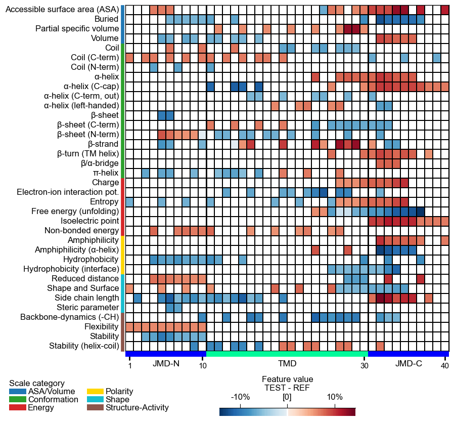
Plot a CPP/-SHAP heatmap showing the feature value mean difference/feature impact per scale subcategory (y-axis) and residue position (x-axis).
For each (subcategory, position) cell the chosen
col_valfromdf_featis colour-coded, giving a two-dimensional view of the physicochemical signature produced byCPP.run(). At sample level (shap_plot=True) the same layout visualises per-residue SHAP feature impact.Added in version 0.1.0.
- Parameters:
df_feat (pd.DataFrame, shape (n_feature, n_feature_info)) – Feature DataFrame with a unique identifier, scale information, statistics, and positions for each feature. Can also include feature impact (
feat_impact) column.shap_plot (bool, default=False) –
Set the analysis type: CPP Analysis (if
False) for group-level or CPP-SHAP Analysis for sample-level (or subgroup-level) results:CPP Analysis
col_val: Displays typically the difference of feature values, either at group-level when the mean_dif column is selected or at sample-level (group-level) when a mean_dif_’name’ column is provided.
CPP-SHAP Analysis
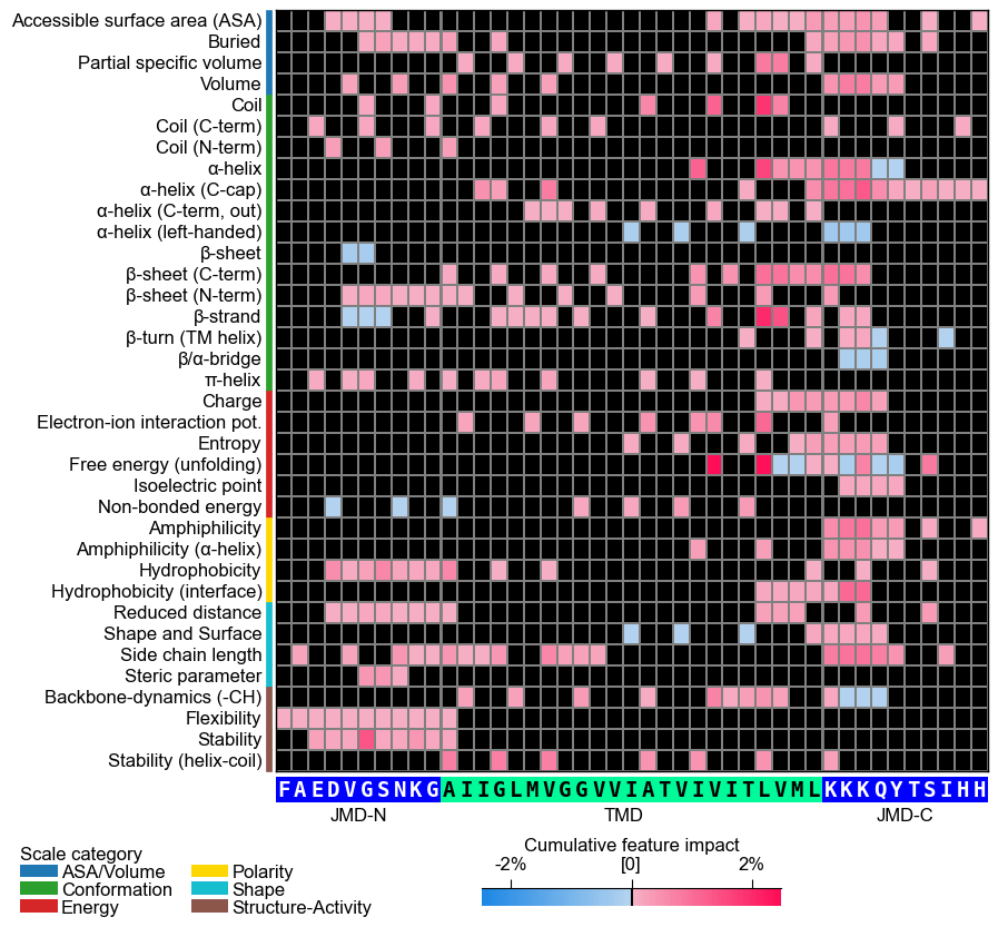
col_val: Enables typically the selection of specific feature impacts from a feat_impact_’name’ column for an individual sample, where positive (red) and negative (blue) feature impacts are indicated.
col_cat ({'category', 'subcategory', 'scale_name'}, default='subcategory') – Column name in
df_featfor scale classification (y-axis).col_val ({‘mean_dif’, ‘abs_mean_dif’, ‘abs_auc’, ‘feat_importance’,
mean_dif_'name',feat_impact_'name'}, default=’mean_dif’) – Column name indf_featfor numerical values to display. Must match with theshap_plotsetting.name_test (str, default="TEST") – Name for the test dataset.
name_ref (str, default="REF") – Name for the reference dataset.
figsize (tuple, optional) – Figure dimensions (width, height) in inches. When
None(default) and the globalauto_fontoption is enabled, the size is derived from the grid shape so cells stay a constant size (the figure shrinks for a small grid and grows for a large one); any explicitfigsize(including(8, 8)) is honored as a fixed size. Withauto_fontdisabled,Nonefalls back to(8, 8).cell_size (tuple, optional) –
Target physical size
(width, height)in inches of one grid cell. When given, the figure is sized so every cell renders at this exact size (shrinking or growing as needed, nothing clipping) regardless ofauto_font;None(default) uses a calibrated default cell on theauto_fontpath. The standalone heatmap’s default cell is taller than the feature map’s so row labels do not crowd.Added in version 1.1.0.
Changed in version 1.1.0: Defaults to
Noneand participates inauto_font; explicitfigsizewins.start (int, default=1) – Position label of first residue position (starting at N-terminus).
tmd_len (int, default=20) – Length of target middle domain (TMD) to be depicted (>0). Must match with all feature from
df_feat.tmd_seq (str, optional) – TMD sequence for specific sample.
jmd_n_seq (str, optional) – Juxta middle domain (JMD) N-terminal sequence for specific sample. Length must match with ‘jmd_n_len’ attribute.
jmd_c_seq (str, optional) – JMD C-terminal sequence for specific sample. Length must match with ‘jmd_c_len’ attribute.
tmd_color (str, default='mediumspringgreen') – Color for TMD.
jmd_color (str, default='blue') – Color for JMDs.
tmd_seq_color (str, default='black') – Color for TMD sequence.
jmd_seq_color (str, default='white') – Color for JMD sequence.
seq_size (str, int, or float, optional) – Residue-letter size.
"auto"(default) fits the letters to the grid cell and steps the size down for short TMDs. A value in(0, 1]sets the letter height to that fraction of the cell height (e.g.0.9); a value> 1is an absolute font size in points. The"auto"and fractional modes keep the letters from overlapping; an absolute point size is used as given.seq_char_fill (bool, optional) –
If
True, the sequence renders as a continuous, gap-free colored band (one full-width cell per residue) with the letters drawn on top. IfFalse, each residue gets its own glyph-sized colored box. IfNone(default), follows theauto_fontoption (on when auto-sizing is enabled, off otherwise).Added in version 1.1.0.
fontsize_tmd_jmd (int or float, optional) – Font size (>=0) for the part labels: ‘JMD-N’, ‘TMD’, ‘JMD-C’. If
None, optimized automatically.weight_tmd_jmd ({'normal', 'bold'}, default='normal') – Font weight for the part labels: ‘JMD-N’, ‘TMD’, ‘JMD-C’.
fontsize_labels (str, int, or float, default=12) –
Font size (>= 0) for the figure labels (the scale-subcategory row labels, the scale-category legend, and the colorbar). A number sets the size directly (the default
12leaves the output unchanged)."auto"scales the size with theplot_settingsfont scale, caps it at about 13 pt, and shrinks it further if the subcategory rows would overlap, so the rows never collide.Changed in version 1.1.0: Accepts
"auto"to track theplot_settingsfont scale without row overlap.add_xticks_pos (bool, default=False) – If
True, include x-tick positions when TMD-JMD sequence is given.grid_linewidth (int or float, default=0.01) – Line width for the grid.
grid_linecolor (str, optional) – Color for the grid lines. If
None, automatically determined based onfacecolor_dark.border_linewidth (int or float, default=2) – Line width for the TMD-JMD border.
facecolor_dark (bool, optional) – Sets background of heatmap to black (if
True) or white. IfNone, automatically determined fromshap_plotsetting. Affects grid cells for missing or near-zero data based oncol_val.vmin (int or float, optional) – Minimum
col_valvalue setting the lower end of the colormap. IfNone, determined automatically.vmax (int or float, optional) – Maximum
col_valvalue setting the upper end of the colormap. IfNone, determined automatically.cmap (matplotlib colormap name or object, optional) – Name of the colormap to use. If
None, automatically determinedcol_valdata and ‘shap_plot’ setting.cmap_n_colors (int, default=101) – Number of discrete steps (>1) in diverging or sequential colormap.
cbar_pct (bool, default=True) – If
True, colorbar is represented in percentage and thecol_valvalues are converted accordingly by multiplying with 100 if necessary.cbar_kws (dict of key, value mappings, optional) – Keyword arguments for colorbar passed to
matplotlib.figure.Figure.colorbar().cbar_xywh (tuple, default=(0.7, None, 0.2, None)) – Colorbar position and size: x-axis (left), y-axis (bottom), width, height. Values are optimized if
None.dict_color (dict, optional) – Color dictionary of scale categories classifying scales shown on y-axis. Default from
plot_get_cdict()withname='DICT_CAT'.legend_kws (dict, optional) – Keyword arguments for the legend passed to
plot_legend().legend_xy (tuple, default=(-0.1, -0.01)) – Position for scale category legend: x- and y-axis coordinates. Values are set to default if
None.xtick_size (int or float, default=11.0) – Size of x-tick labels (>0).
xtick_width (int or float, default=2.0) – Width of the x-ticks (>0).
xtick_length (int or float, default=5.0) – Length of the x-ticks (>0).
sample_kws (dict, optional) – Structured bundle selecting one sample to draw its TMD-JMD sequence band — the bundled alternative to providing the sequences directly. Fixed keys:
sample(anentryname orname-column valuestr, or a row-positionint),df_seqanddf_parts. The TMD-JMD parts are read fromdf_partsviaSequenceFeature.get_seq_kws()and override any explicitly passedtmd_seq/jmd_n_seq/jmd_c_seq. Because the displayed sequence must stay faithful to thedf_partsthe features map to, the sequence’s own lengths set the grid geometry;tmd_len/jmd_n_len/jmd_c_lenapply only when no sequence is shown. See the keyword-dict parameters overview.
- Returns:
fig (Figure) – The Figure object for the CPP heatmap.
ax (Axes) – Axes object for the CPP heatmap.
Notes
tmd_seq_colorandjmd_seq_colorare applicable only whentmd_seq,jmd_n_seq, andjmd_c_seqare provided.The returned figure is self-contained: the scale-category legend and the “Feature value” colorbar are arranged automatically below the grid. The method manages its own layout, so calling
plt.tight_layout()afterwards is unnecessary (it is neutralized on the returned figure to keep this furniture from being pulled back onto the heatmap);fig.savefig(..., bbox_inches="tight")andplt.show()work as usual.When no sequence is supplied (
tmd_seqisNone), the TMD and JMD regions are drawn as a thin solid colored bar below the grid, kept at a constant height (a fixed fraction of a grid cell-row) at any figure size.See also
CPP.run()for details on CPP statistical measures of thedf_featDataFrame.SequenceFeaturefor definition of sequenceParts.CPPPlot.feature()for visualization of mean differences for specific features.seaborn.heatmap()for seaborn heatmap.matplotlib.figure.Figure.colorbar()for colorbar arguments.Matplotlib Colormaps for further
cmapoptions.plot_legend()used for setting scale category legend.
Examples
To demonstrate the
CPPPlot().heatmap()method, we first load the exampleDOM_GSECdataset and its respective features (see [Breimann25]):import matplotlib.pyplot as plt import aaanalysis as aa aa.options["verbose"] = False df_seq = aa.load_dataset(name="DOM_GSEC") df_feat = aa.load_features(name="DOM_GSEC") df_feat = df_feat.sort_values(by="feat_importance", ascending=False).reset_index(drop=True) aa.display_df(df_feat, show_shape=True, n_rows=7)
DataFrame shape: (150, 15)
feature category subcategory scale_name scale_description abs_auc abs_mean_dif mean_dif std_test std_ref p_val_mann_whitney p_val_fdr_bh positions feat_importance feat_importance_std 1 TMD_C_JMD_C-Seg...,11)-LIFS790102 Conformation β-strand β-strand Conformational ...n-Sander, 1979) 0.189000 0.125674 0.125674 0.183876 0.218813 0.000001 0.000039 28,29 4.729200 4.776785 2 TMD_C_JMD_C-Seg...2,3)-CHOP780212 Conformation β-sheet (C-term) β-turn (1st residue) Frequency of th...-Fasman, 1978b) 0.199000 0.065983 -0.065983 0.087814 0.105835 0.000000 0.000016 27,28,29,30,31,32,33 4.106000 5.236574 3 TMD_C_JMD_C-Seg...3,4)-HUTJ700102 Energy Entropy Entropy Absolute entrop...Hutchens, 1970) 0.229000 0.098224 0.098224 0.106865 0.124608 0.000000 0.000001 31,32,33,34,35 3.111200 3.109955 4 TMD_C_JMD_C-Seg...2,3)-AURR980110 Conformation α-helix α-helix (middle) Normalized posi...ora-Rose, 1998) 0.211000 0.077355 0.077355 0.102965 0.107453 0.000000 0.000005 27,28,29,30,31,32,33 3.048800 3.623912 5 TMD_C_JMD_C-Pat...4,8)-JANJ790102 Energy Free energy (unfolding) Transfer free e...(TFE) to inside Transfer free e...y (Janin, 1979) 0.187000 0.144354 -0.144354 0.181777 0.233103 0.000001 0.000049 33,37 2.833600 3.640617 6 TMD_C_JMD_C-Pat...4,8)-KANM800103 Conformation α-helix α-helix Average relativ...sa-Tsong, 1980) 0.176000 0.087846 0.087846 0.140464 0.157561 0.000004 0.000113 24,28 2.704000 4.076269 7 TMD_C_JMD_C-Pat...,10)-LEVM760105 Shape Side chain length Side chain length Radius of gyrat... (Levitt, 1976) 0.149000 0.073526 0.073526 0.133612 0.157088 0.000090 0.000714 31,34,38 2.050800 2.338278 CPP Analysis (group-level)
The group-level feature value difference per scale subcategory (y-axis) and residue position (x-axis) can be visualized by providing the
df_featDataFrame:# Plot CPP heatmap at group-level cpp_plot = aa.CPPPlot() aa.plot_settings(font_scale=0.7, weight_bold=False) cpp_plot.heatmap(df_feat=df_feat) plt.show()

You can select a subset of features by filtering
df_feat:# Plot top 15 features df_top15 = df_feat.head(15) cpp_plot.heatmap(df_feat=df_top15) plt.show()

Adjust the scale classification level (y-axis) using the
col_catparameter. Choose from the ‘category’, ‘subcategory’ (default), and ‘scale_name’ columns from thedf_feat:# Show heatmap with scales classified by categories cpp_plot.heatmap(df_feat=df_feat, col_cat="category") plt.show()

The numerical value shown in the heatmap can be adjusted by the
col_valparameter, which specifies one of the followingdf_featcolumns: ‘mean_dif’ (default), ‘abs_mean_dif’, ‘abs_auc’, or ‘feat_importance’:# Show heatmap with absolute feature value difference cpp_plot.heatmap(df_feat=df_feat, col_val="abs_mean_dif") plt.show()

Adjust the names of the test and reference datasets using the
name_test(default=‘TEST’) andname_ref(default=‘REF’) parameters:# Adjust dataset names shown in colorbar cpp_plot.heatmap(df_feat=df_feat, name_test="Target group", name_ref="Control group") plt.show()

You can adjust the
figsize(default=(8, 8)), useful if only a subset of features is shown:# Show only top 15 features df_top15 = df_feat.head(15) cpp_plot.heatmap(df_feat=df_top15, figsize=(8, 4)) plt.show()

Hold each grid cell at a fixed physical size with
cell_size(width, height in inches); the figure resizes to fit the grid at any density.# Fix the grid cell size (width, height in inches) cpp_plot.heatmap(df_feat=df_feat, cell_size=(0.16, 0.3)) plt.tight_layout() plt.show()

You can adjust the
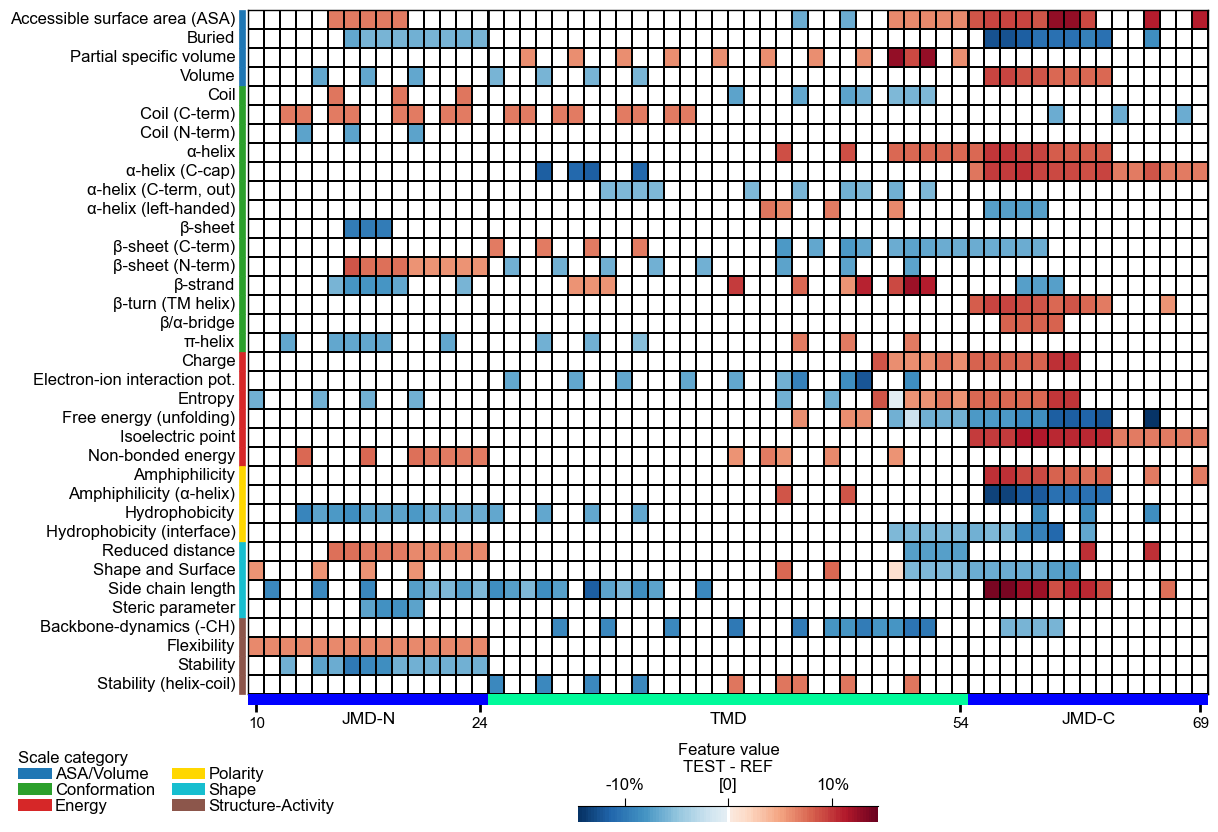
startposition and thetmd_len(default=20) by providing them as parameters. Change the length of thejmd_nandjmd_cusing theCPPPlotobject.# Start at residue position 10 and adjust the length each part cpp_plot = aa.CPPPlot(jmd_n_len=15, jmd_c_len=15) cpp_plot.heatmap(df_feat=df_feat, start=10, tmd_len=30) plt.show()
CPP Analysis (sample-level)
You can visualize how the general feature value difference is translated onto the sequence of a specific sample. To this end, you need to provide the corresponding sequence parameters:
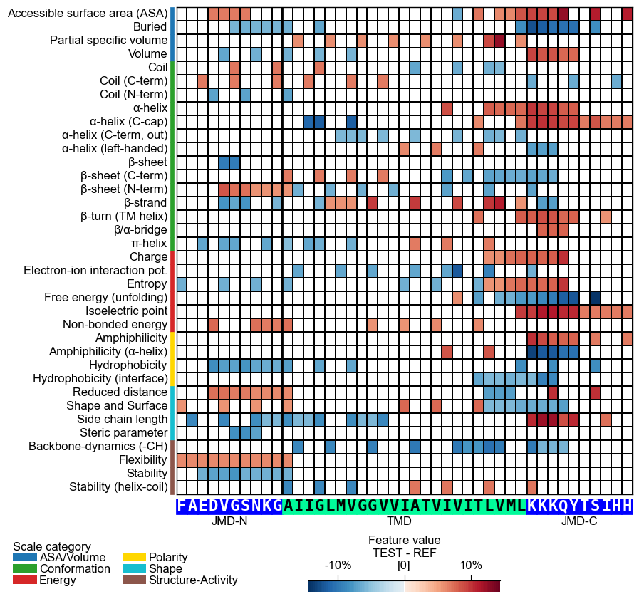
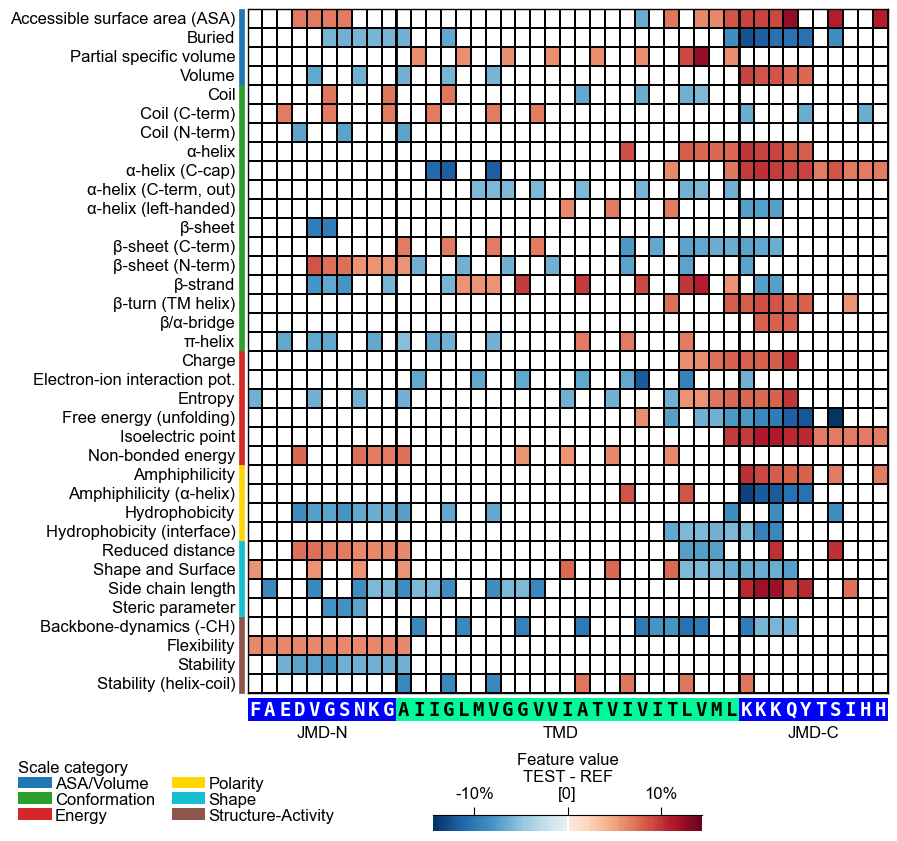
jmd_n_seq,tmd_seq, andjmd_c_seq:# Get sequence parts of first sample cpp_plot = aa.CPPPlot() sf = aa.SequenceFeature() df_parts = sf.get_df_parts(df_seq=df_seq) seq_kws = sf.get_seq_kws(df_seq=df_seq, df_parts=df_parts, sample=0) jmd_n_seq, tmd_seq, jmd_c_seq = seq_kws["jmd_n_seq"], seq_kws["tmd_seq"], seq_kws["jmd_c_seq"] print("Sequence parts of first sample") print(seq_kws) # Plot CPP profile for first sample cpp_plot.heatmap(df_feat=df_feat, **seq_kws) plt.show()
Sequence parts of first sample
{'jmd_n_seq': 'FAEDVGSNKG', 'tmd_seq': 'AIIGLMVGGVVIATVIVITLVML', 'jmd_c_seq': 'KKKQYTSIHH'}
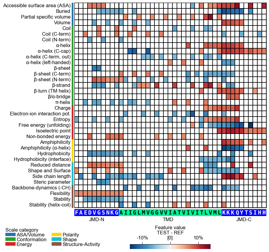
# 'sample_kws' bundles the same per-sample lookup into one dict -- the alternative to passing
# the TMD-JMD sequences directly. 'sample' accepts an entry name (or a 'name'-column value in
# df_seq) or a row position; df_seq and df_parts resolve its sequence (faithful to the df_parts
# the features map to).
cpp_plot.heatmap(df_feat=df_feat, sample_kws=dict(sample=0, df_seq=df_seq, df_parts=df_parts))
plt.show()
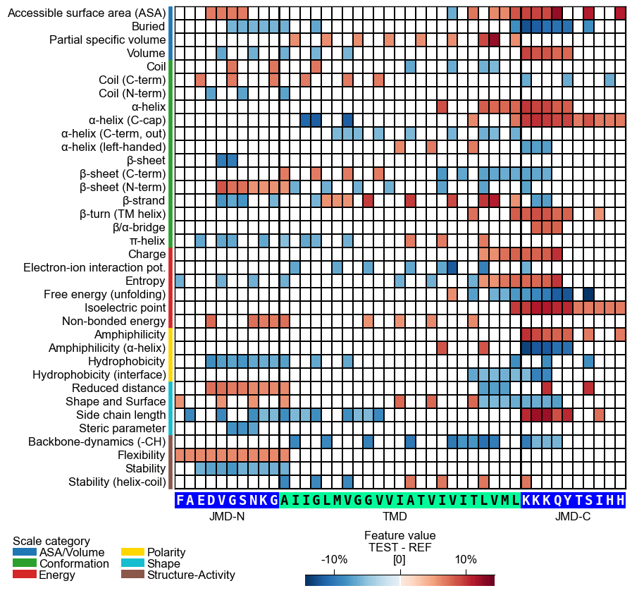
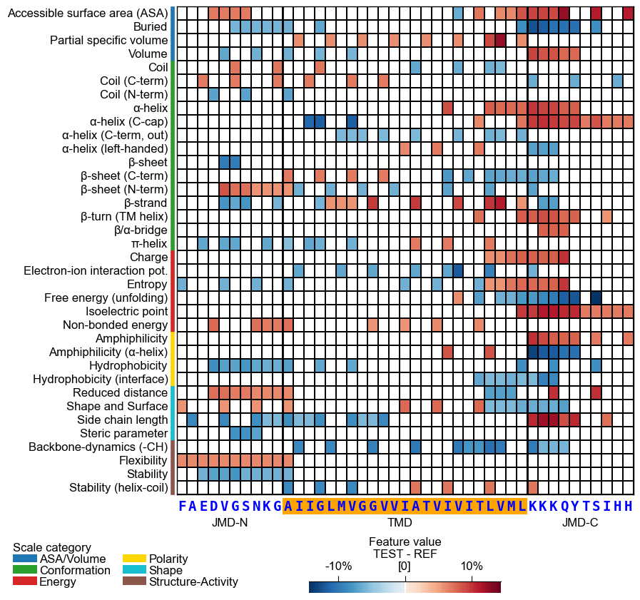
You can customize the following color parameters:
tmd_color(default=‘mediumspringgreen’),jmd_color(default=‘blue’),tmd_seq_color(default=‘black’), andjmd_seq_color(default=‘white’):# Change default TMD-JMD colors cpp_plot.heatmap(df_feat=df_feat, **seq_kws, tmd_color="orange", jmd_color="white", tmd_seq_color="blue", jmd_seq_color="blue") plt.show()
By default (
seq_size="auto") the residue letters are fit to the grid cell and stepped down for a short TMD; setverbose=Trueto see the chosen size. You can override it: a value in(0, 1]sets the letter height to that fraction of the cell (e.g.0.9), and a value> 1is an absolute font size in points.# seq_size accepts a cell-height fraction (<= 1) or an absolute point size (> 1) cpp_plot.heatmap(df_feat=df_feat, **seq_kws, seq_size=0.9) # 90% of the cell height plt.show() cpp_plot.heatmap(df_feat=df_feat, **seq_kws, seq_size=8) # 8 pt (absolute) plt.show()
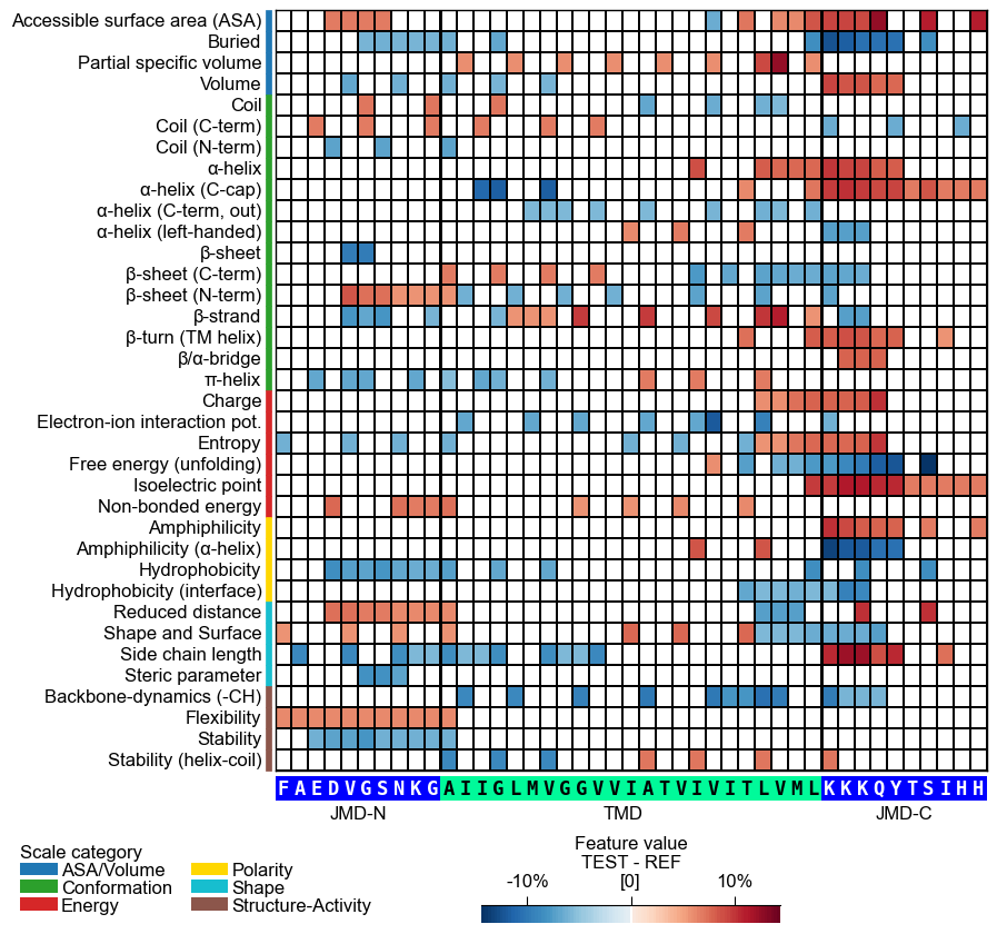
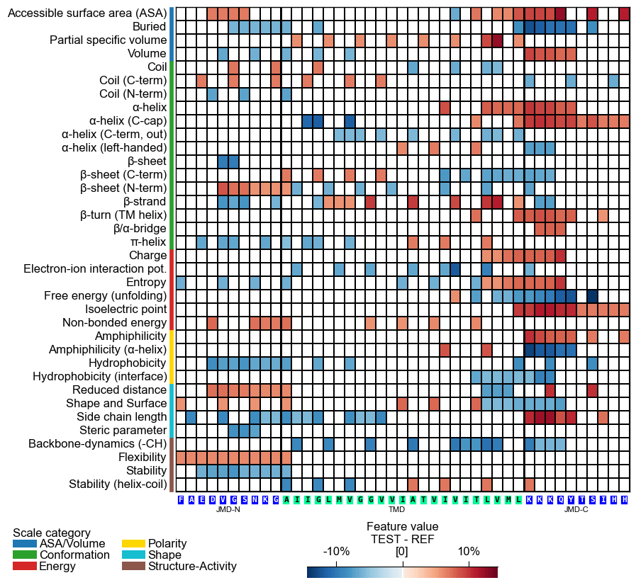
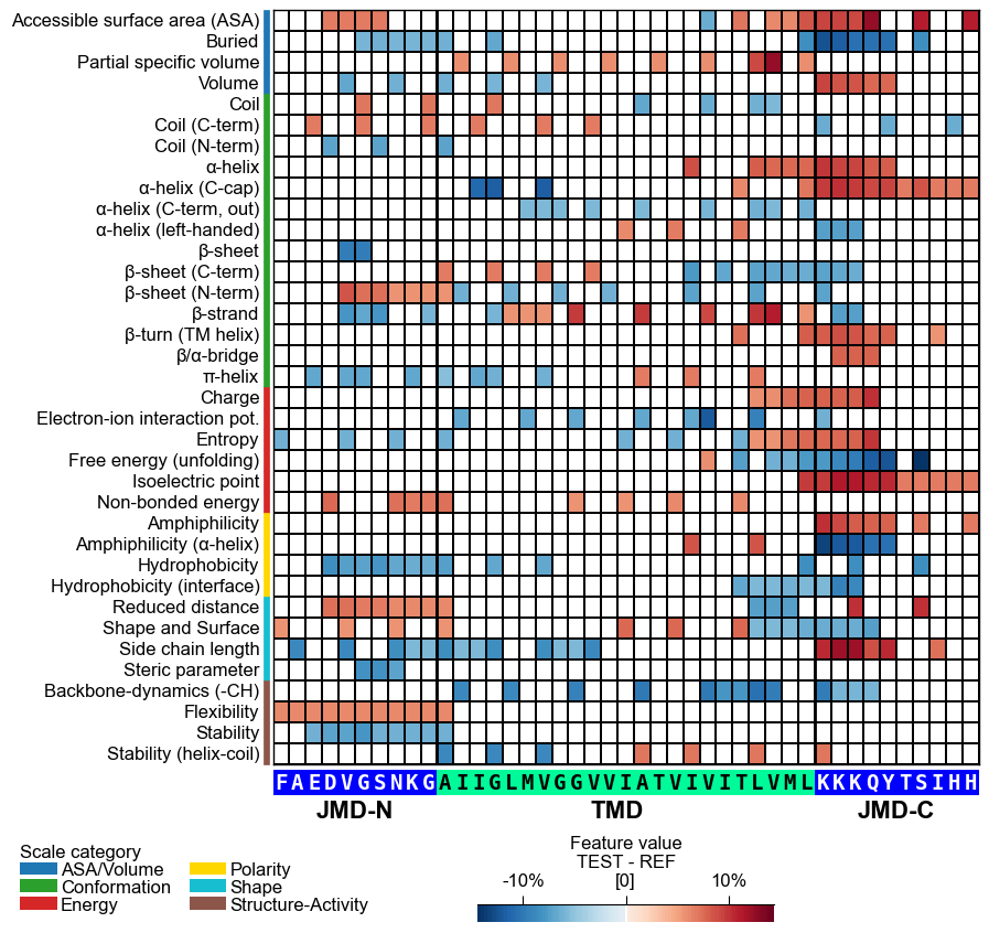
This might result in suboptimal spacing among sequence characters. Adjust the font size of the part labels (‘JMD-N’, ‘TMD’, ‘JMD-C’) using
fontsize_tmd_jmd, which is set by default to the optimized sequence size. Change its weight usingweight_tmd_jmd(default=‘normal’)# Adjust the fontsize of the TMD-JMD characters cpp_plot.heatmap(df_feat=df_feat, **seq_kws, fontsize_tmd_jmd=16, weight_tmd_jmd="bold") plt.show()
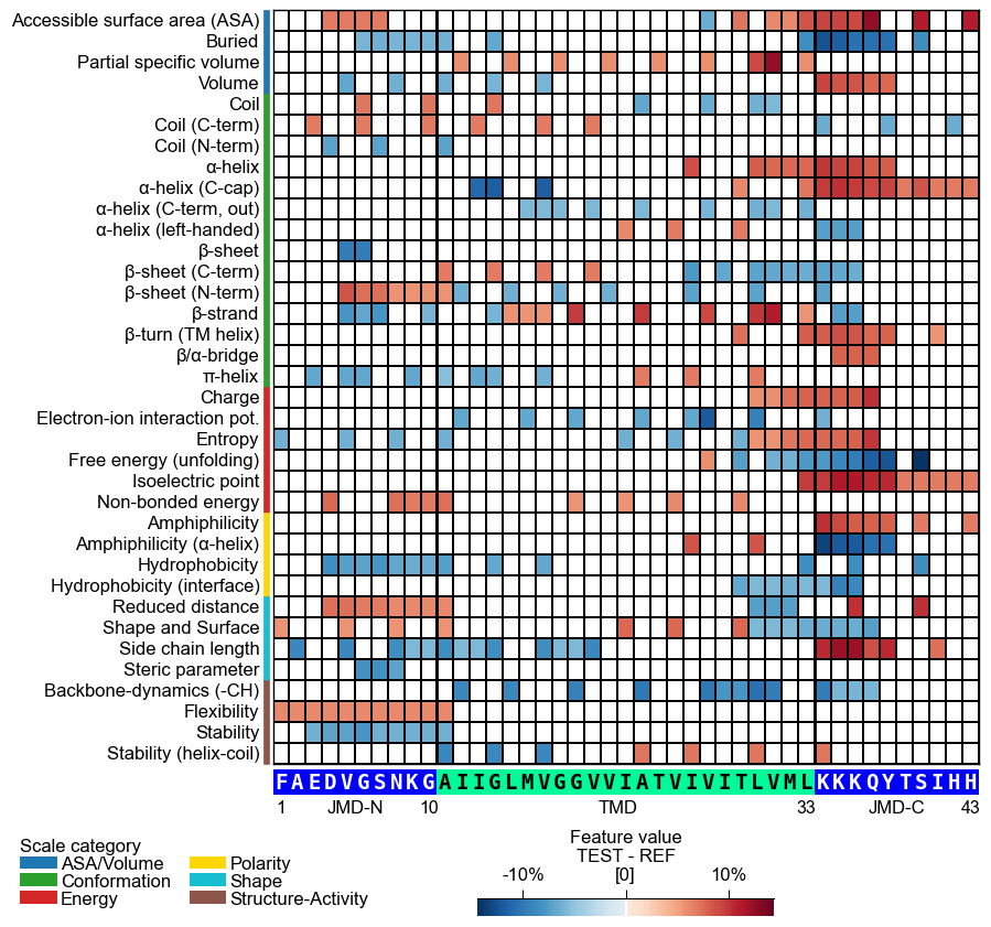
Display the xtick positions in addition to the sequence by setting
add_xticks_pos=True(default=False):# Add the xticks indicating the sequence positions cpp_plot.heatmap(df_feat=df_feat, **seq_kws, add_xticks_pos=True) plt.show()
CPP Analysis
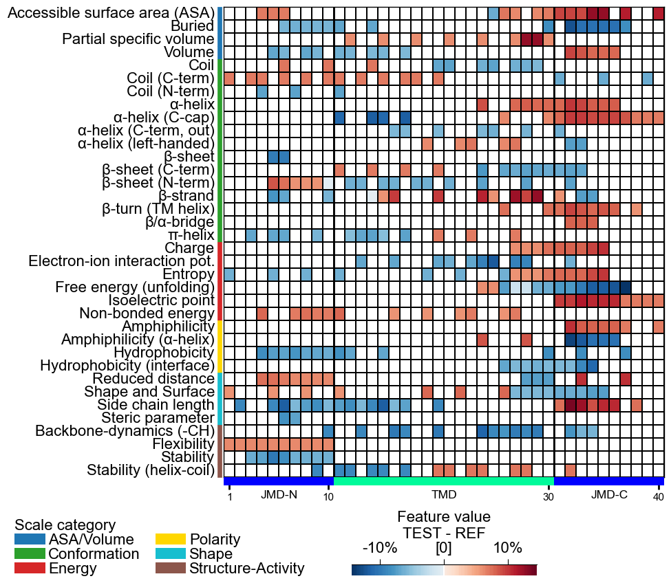
Use
fontsize_labels(default12) to set the size of the figure labels: the scale-subcategory row labels, the scale-category legend, and the colorbar. Pass a number, or"auto"to track theplot_settingsfont scale (capped so the subcategory rows never overlap):# Modify label size of legend and colorbar cpp_plot.heatmap(df_feat=df_feat, fontsize_labels=16) plt.show()
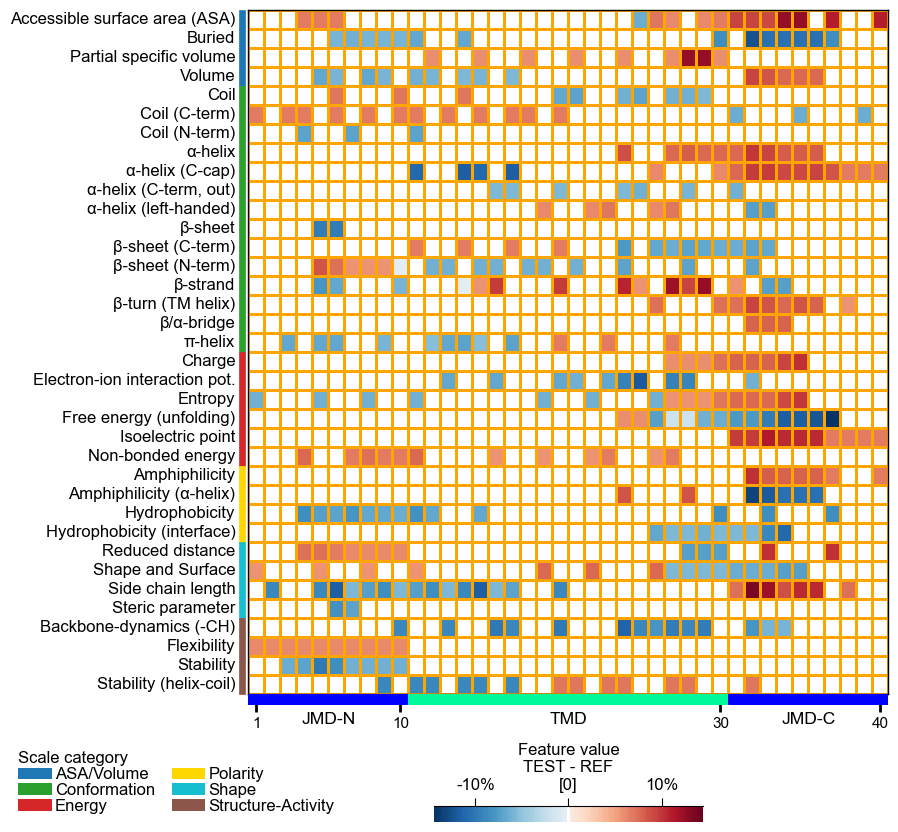
Adjust the heatmap grid using the
grid_linewidth(default=0.01) andgrid_linecolor(set by default based onfacecolor_dark) parameters:# Adjust heatmap grid cpp_plot.heatmap(df_feat=df_feat, grid_linewidth=1, grid_linecolor="orange") plt.show()
The TMD part borders are highlighted by an extra line, which width can be customized by
border_linewidth(default=2):# Increase width of TMD border cpp_plot.heatmap(df_feat=df_feat, border_linewidth=5) plt.show()
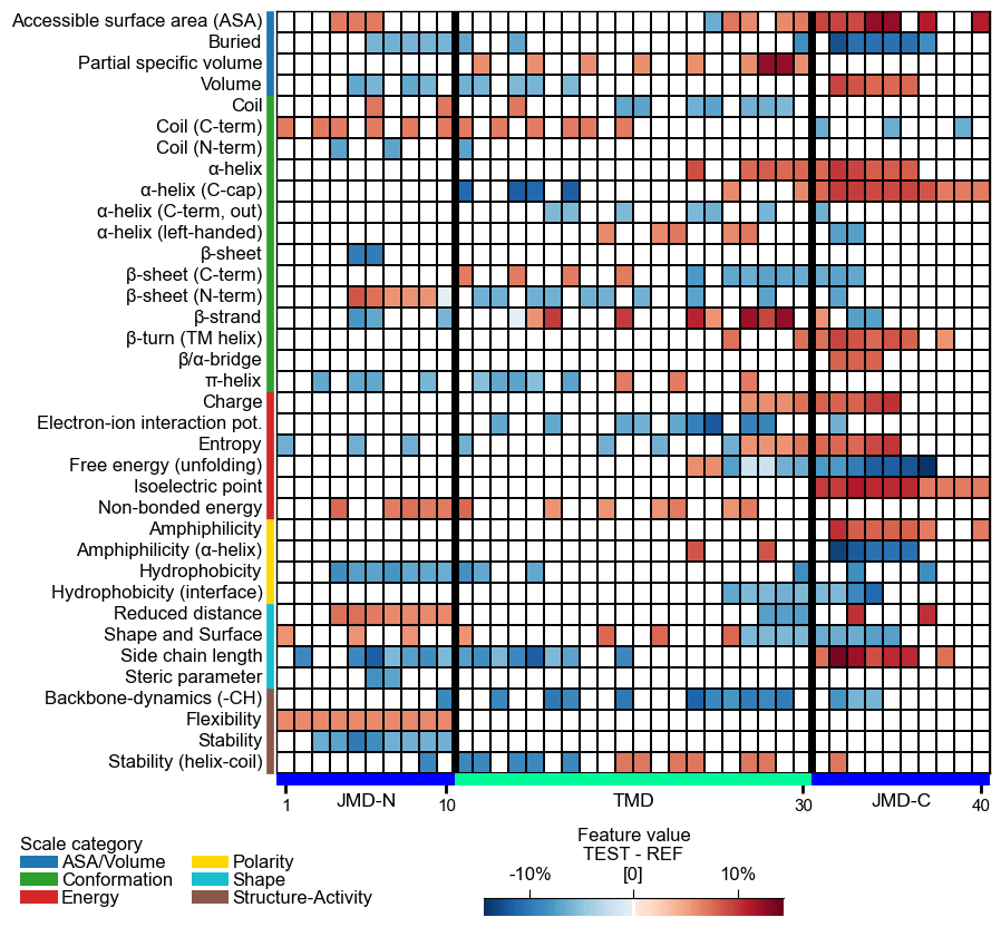
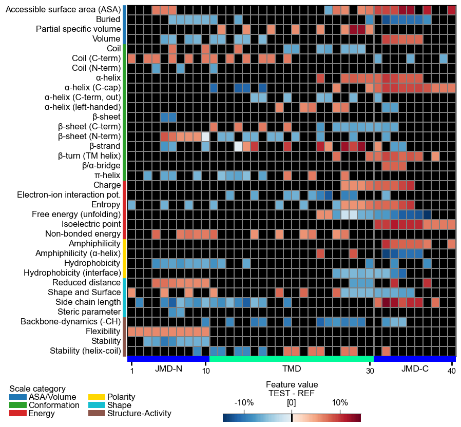
The background is set automatically basd on
shap_plot. You can set it to black byfacecolor_dark=True:# Set background to black cpp_plot.heatmap(df_feat=df_feat, facecolor_dark=True) plt.show()
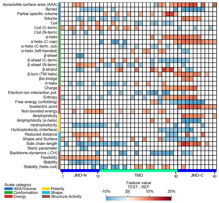
Adjust the lower and upper end of the colormap using the
vminandvmaxparameters:# Change minimum and maximum values cpp_plot.heatmap(df_feat=df_feat, vmin=-10, vmax=20) plt.show()
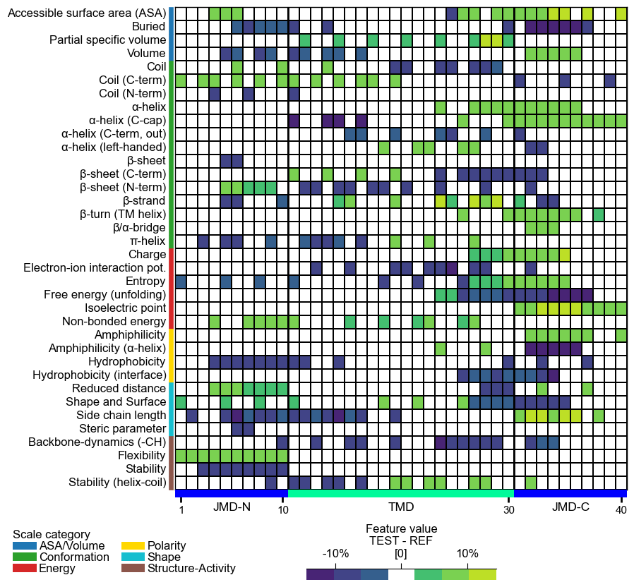
You can provide any colormap from Matplotlib Colormaps using the
cmapparameter. The number of discrete steps can be adjusted bycmap_n_colors(default=101):# Use matplotlib color map with 7 color steps cpp_plot.heatmap(df_feat=df_feat, cmap="viridis", cmap_n_colors=7) plt.show()
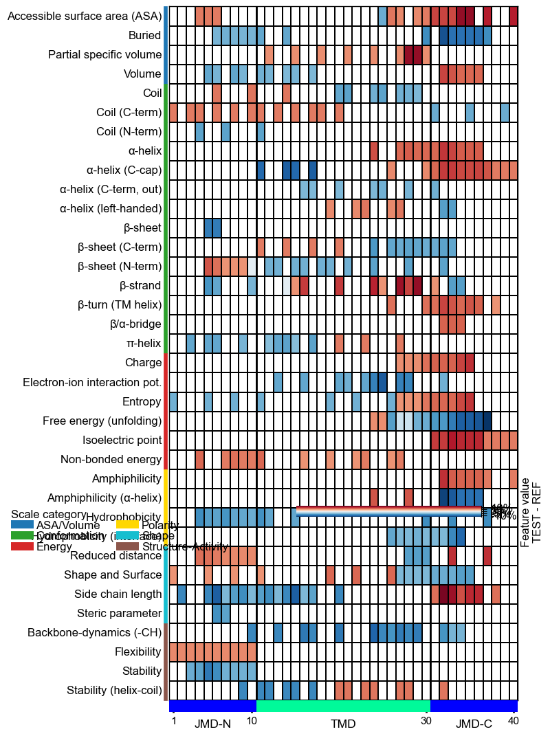
Customize the colorbar using
cbar_kws. You can adjust its position (x-axis, y-axis), width, and height bycbar_xywh(default=(0.7, None, 0.2, None)), where default values are adopted ifNoneis provided.# Change colorbar title, position, width and height cbar_kws = dict(orientation="vertical") fig, ax = cpp_plot.heatmap(df_feat=df_feat, cbar_kws=cbar_kws, cbar_xywh=(0.86, 0.25, 0.01, 0.5)) # Plot must be adjusted by plt.subplots_adjust and not by plt.tight_layout plt.subplots_adjust(right=0.84) plt.show()
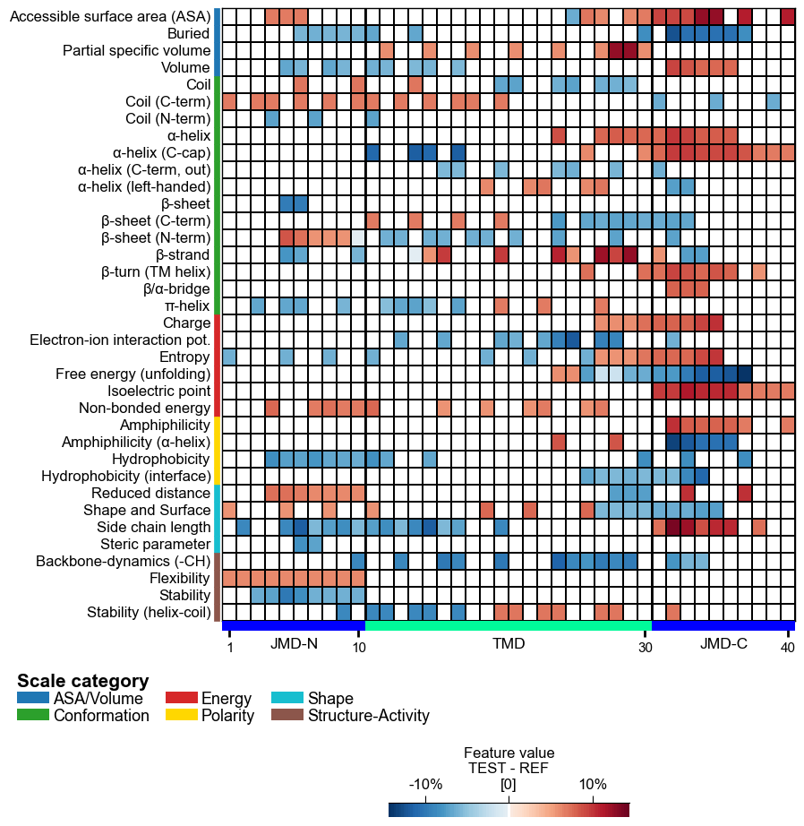
Adjust the scale legend by the
legend_kwsparameter and its position usinglegend_xy(default=(-0.1, -0.01)):# Adjust legend, colors can be changed by 'dict_color' legend_kws = dict(n_cols=3, fontsize=13, fontsize_title=15, weight_title="bold") cpp_plot.heatmap(df_feat=df_feat, legend_kws=legend_kws, legend_xy=(None, 0.05)) plt.show()
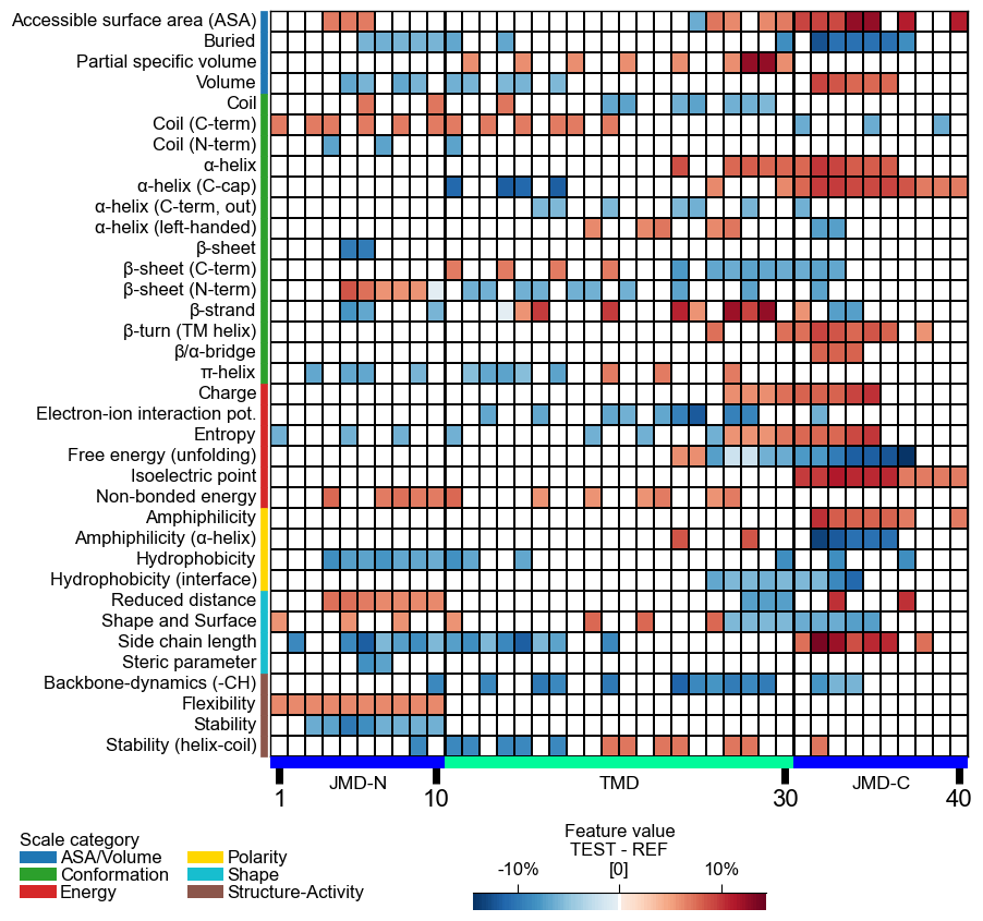
Following x-tick parameters can be adjusted: xtick_size (default=11.0), xtick_width (default=2.0), and xtick_length (default=5.0):
# Adjust x-ticks
cpp_plot.heatmap(df_feat=df_feat, xtick_size=16, xtick_width=5, xtick_length=10)
plt.show()
CPP-SHAP analysis
Set
shap_plot=Truefor visualizing the sample-specific feature impact instead of the overall feature importance. To demonstrate this, we create the feature matrix for the DOM_GSEC example dataset (see [Breimann25]) using theSequenceFeature().feature_matrix()method:# Create feature matrix sf = aa.SequenceFeature() df_parts = sf.get_df_parts(df_seq=df_seq) X = sf.feature_matrix(features=df_feat["feature"], df_parts=df_parts)
Next, we must include the feature impact into the df_feat for all samples using the
ShapModelmodel:labels = df_seq["label"].to_list() # Fit SHAP explainer to obtain SHAP values sm = aa.ShapModel() sm.fit(X, labels=labels) # Include feature value difference and feature impact for all samples df_feat = sm.add_sample_mean_dif(X, labels=labels, df_feat=df_feat, drop=True) df_feat = sm.add_feat_impact(df_feat=df_feat, drop=True) aa.display_df(df_feat, n_rows=5, n_cols=15, show_shape=True)
DataFrame shape: (150, 265)
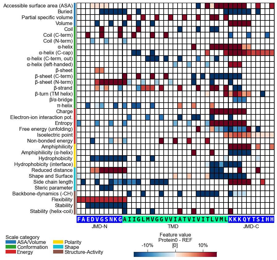
feature category subcategory scale_name scale_description abs_auc abs_mean_dif mean_dif std_test std_ref p_val_mann_whitney p_val_fdr_bh positions mean_dif_Protein0 mean_dif_Protein1 1 TMD_C_JMD_C-Seg...,11)-LIFS790102 Conformation β-strand β-strand Conformational ...n-Sander, 1979) 0.189000 0.125674 0.125674 0.183876 0.218813 0.000001 0.000039 28,29 0.364754 0.379754 2 TMD_C_JMD_C-Seg...2,3)-CHOP780212 Conformation β-sheet (C-term) β-turn (1st residue) Frequency of th...-Fasman, 1978b) 0.199000 0.065983 -0.065983 0.087814 0.105835 0.000000 0.000016 27,28,29,30,31,32,33 -0.244818 -0.224388 3 TMD_C_JMD_C-Seg...3,4)-HUTJ700102 Energy Entropy Entropy Absolute entrop...Hutchens, 1970) 0.229000 0.098224 0.098224 0.106865 0.124608 0.000000 0.000001 31,32,33,34,35 0.162838 0.243838 4 TMD_C_JMD_C-Seg...2,3)-AURR980110 Conformation α-helix α-helix (middle) Normalized posi...ora-Rose, 1998) 0.211000 0.077355 0.077355 0.102965 0.107453 0.000000 0.000005 27,28,29,30,31,32,33 0.203609 0.120469 5 TMD_C_JMD_C-Pat...4,8)-JANJ790102 Energy Free energy (unfolding) Transfer free e...(TFE) to inside Transfer free e...y (Janin, 1979) 0.187000 0.144354 -0.144354 0.181777 0.233103 0.000001 0.000049 33,37 -0.254103 -0.180103 Finally, we can visualize the feature impact for a selected sample by providing the respective column name in
col_valand its sequence parameters together with settingshap_plot=True:# Plot CPP heatmap for selected protein (use similar value range for comparability) cpp_plot.heatmap(df_feat=df_feat, shap_plot=True, col_val="mean_dif_Protein0", name_test="Protein0", tmd_seq=tmd_seq, jmd_n_seq=jmd_n_seq, jmd_c_seq=jmd_c_seq, vmin=-15, vmax=15) plt.show()
# Plot CPP-SHAP heatmap for selected protein
cpp_plot.heatmap(df_feat=df_feat, shap_plot=True,
                 col_val="feat_impact_Protein0",
                 tmd_seq=tmd_seq, jmd_n_seq=jmd_n_seq, jmd_c_seq=jmd_c_seq)
plt.show()
Further parameters.
CPPPlot.heatmapalso accepts:cbar_pct— IfTrue, colorbar is represented in percentage and thecol_valvalues are converted accordingly by multiplying with 100 if necessary.# Further parameters: cbar_pct renders the colorbar in percent (values scaled x100 as needed) import matplotlib.pyplot as plt cpp_plot = aa.CPPPlot() df_feat_hm = aa.load_features(name="DOM_GSEC") cpp_plot.heatmap(df_feat=df_feat_hm, cbar_pct=True) plt.show()
# seq_char_fill controls how the residue sequence is drawn below the heatmap
cpp_plot.heatmap(df_feat=df_feat_hm, **seq_kws, seq_char_fill=False)  # per-residue box, small gap
plt.tight_layout()
plt.show()

cpp_plot.heatmap(df_feat=df_feat_hm, **seq_kws, seq_char_fill=True)  # continuous gap-free colored band
plt.tight_layout()
plt.show()